Ask Jane: How to update your kitchen to make it appear large
Christian asks: “I need to update my tiny kitchen. How can I make it appear larger? Do I need to change the layout or just the colours?”
Jane says: “Tiny” is never the word you want to use to describe your kitchen, but when you’re limited with space, a few clever design tricks and simple changes can make a world of difference.
Neutral, light colours are your friend in a small space; add interest with texture not colour. I love an all-white kitchen, but this can be too sterile without elements that provide depth and texture. In your situation a very light grey colour for the lower cupboards will help add depth and interest to the small space. Keep the kick-strip the same colour as the cupboards to extend the design line-of-sight for the kitchen and make it seem larger through continuity.
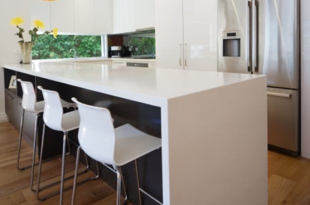
Give this little U-shape kitchen a modern and light-enhancing touch with a white stone bench top and white over-cupboards or shelves. Going for white offers low colour contrast with the grey blending the bench to the shelves to the walls, making things feel more spacious.
Keep the tile splash-back white, but introduce a geometric pattern with texture (either a textured tile or a small tile where texture is created by the grout lines).
Continue the clean lines theme by using recessed or discreet handles. Fussy cabinetry can intrude into the space whilst sleek details can create a roomier feel to it.
Whilst the current layout of this kitchen is the best for the space and shape, an option is to minimise the over-cupboards or incorporate open-shelving to reduce the visual weight of the room. Think about keeping them to just one wall and providing plenty of under-cupboard space to ensure the benchtop doesn’t become too crowded.
Finally, flood the space with light; both artificial and natural if possible. Reflective (glossy) surfaces can be a great way to make a space appear lighter and brighter. In this case strip lighting underneath the over-cupboards will work wonders, bouncing light off the white stone bench top and highlighting the texture of the splashback to visually “push” the walls outwards.
As usual; light, bright, clean and contemporary design reigns. Use this idea as your canvas but then add a bit of you and your personality into the details to create a kitchen that you’ll love to spend time in.
Jane Eyles-Bennett is an interior designer and renovation consultant. She’s the creator and driving force behind Hotspace Consultants and has consulted on more than 550 property renovations.
We recommend
We thought you might like
States
Capital Cities
Capital Cities - Rentals
Popular Areas
Allhomes
More
