Australia's ten best houses of 2016: amazing design and architectural ingenuity
It’s impossible to be definitive about calling the 10 best houses for 2016 because of the old one man’s castle being another man’s ruin rule governing individual taste.
But being so recently and so widely acknowledged by peers and numerous awards – none more important than the 2016 AIA National Architecture Awards for New Residential Architecture, the jury has spoken and is absolutely right in selecting the extraordinary Sydney townhouse, Indigo Slam, as Australia’s best house of the year.
 Indigo Slam in Sydney’s Chippendale.
Photo: Supplied
So the small 1823 Dawes Point terrace with the convict-etched sandstone was finally revealed as a jewel-box of sumptuous colourations that are different in every atmospherically-laden room. The owners wanted colour and that suited Smart — its credo is “longevity is about not following fashion”.
 Dawes Point interior by Smart Design Studio.
Photo: Supplied
An experience of total sensory surround is also how architect Craig Rossetti’s stunningly original family house shapes up on a Hawthorn block subdivided so it fronts a quiet bluestone lane.
The four-bedroom, three-bathroom, two-living space home under a roof that cascades towards its garden is set beside a swimming pool that amplifies the Hockney-esque effect of the huge north window Rossetti compares to “a collapsing soap bubble”.
Beyond comfort and function, every element of this home becomes especially enlivened during wet weather; and, he says, is “about engagement in the environment”.
 Architect Craig Rossetti’s stunningly original family house.
Photo: Andrew Ashton
In an inner-suburban Sydney neighbourhood of old terraces, developer and architect Oliver Steele, of Steele Associates, built three conjoined houses of conversant scale that stand out because of their thermally and acoustically-buffering living green roofs.
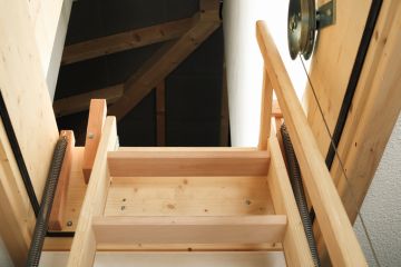
Inside what appear to be modest three-bedroom, two-bathroom homes, clever vertical light feeds from retractable skylights over staircases, and a room arrangement set over four levels. It duly won the Angel Street project’s three top building and sustainability awards.
 These living green roofs are a standout in inner suburban Sydney. Photo: Anna Zhu
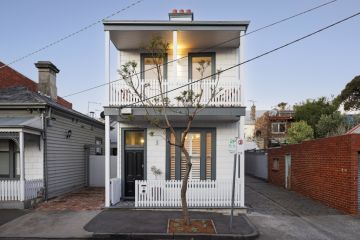
Robert Simeoni’s own Carlton home, an 1888 time-weathered Victorian brick terrace, is delightful for what he hasn’t done to it.
Lightly repairing the fabric and changing only the kitchen to have benches of stainless steel, and to make the quaint backyard toilet accessible from the house, the Melbourne architect appreciated the antique layout and the way light entered rooms.
“We didn’t want to lose the quiet, peaceful quality of the spaces as they existed,” he says. “So there are no places of light shock and the mystery is retained”
 This Arnold Street House by Robert Simeoni Architects makes the list for what hasn’t been done to it.
Photo: Trevor Mein
When Justin Hamilton of Newcastle’s Shac Architecture added a house for his father to his own Hunter Valley rural acreage, he referenced the dairy farming locale and his dad’s background as a shearer and wool-classer.
The symmetrical pair of Zincalume pavilions with the deep front porches – and, at the rear frame a water tank that appeared as if it were an art installation – “was not about applying a forced aesthetic,” he tells.
“It was about a lovely, simple idea that connects back to what we’re comfortable with.” His premise is warm: “A home should be recognisable and familiar.”
 Hunter Valley Farmhouse, by architect Justin Hamilton.
Photo: Supplied
The setting nudges the wilds of Sydney’s Royal National Park giving glimpses of the Pacific and Port Hacking. In such a natural place, landscape designer Ken Lamb, and house designer Julius Bokor, of Bokor Architecture and Interiors, saw scope to create an Australian-style Zen.
Situated to embrace an existing Angophera gum, the Bundeena house has an entrance path leading through the ostensibly natural stone garden towards a building that is, in a way, a secular temple. Bokor’s square-set, four bedroom house is made, he says, to have multi-functional rooms while maintaining “a humility about it in terms of scale and materiality.
“The building is not pretentious. We don’t do pretentious.”
 Bundeena house designed by Julius Bokor, of Bokor Architecture and Interiors.
Photo: Supplied
In a gracious 1890s Newtown terrace, Eva-Marie Prineas, of Architect Prineas, created a roomy new living, kitchen/dining and storage amenity by digging underneath the old house to better connect where its residents spend their quality time to its back garden.
She did so much more in refining spaces throughout the three levels without ever creating irreversible scars because, she believes, “it is good heritage practise”.
“The design intent was to keep as much of the existing character of the room as we could.”
 A roomy new living, kitchen/dining and storage amenity was built by digging in underneath the old house. Photo by Chris Warnes.
The owners of a Portsea beach compound wanted a new guest house but didn’t want it to look like a house. In fact they didn’t want to see it from the main residence.
So in a brilliant contrivance by Mitsuori Architects, they scored a 17-by-6 metre “sleepout” that uses a glass-roofed staircase as a vertical corridor to cover five levels, and that, clad in a water-resisting Radiata pine product to present a blank face to the tennis court edge, pretends to be a tall fence. It should shortly disappear completely behind a screen of greenery.
“We were going for an unpretentious building,” says architect Matthew Murfett. “One that felt comfortable and natural but looked least like a building.”
 Portsea Sleepout, designed by Mitsuori Architects, is an intriguingly screened rectangular and detached addition to a Portsea beach house compound.
Photo: Michael Kai
In Sydney’s Mascot, young interior designer Sarah Jayne Marriott, who operates as Sarah Jayne Studios, converted a boring furniture showroom into a beguiling business premises for Crosspoint Telecommunications, who “wanted industrial with a Scandinavian feel. They wanted comfortable”.
They also wanted their HQ to look more like a home than a corporate office and to have apartment-style accommodation for erstwhile business guests who formerly stayed in hotels.
In a two-level premises often used by 20-plus employees, the hybrid home/office has some quirky features, the best being the stainless steel slide used most often during Friday night drinks.
 Photo by Simon Whitbread.
We recommend
We thought you might like
States
Capital Cities
Capital Cities - Rentals
Popular Areas
Allhomes
More
- © 2025, CoStar Group Inc.


