Common mistakes to avoid when updating your home's exterior

When it comes to first impressions, it’s all about “wow” at first sight. And the exterior of your home is no exception.
Not only is it the first thing people see when they visit, but it’s often the image that convinces buyers to click on your listing. With this in mind, there are a few pitfalls to be aware of when updating the front of your home.
Mistake one: Choosing the wrong fence
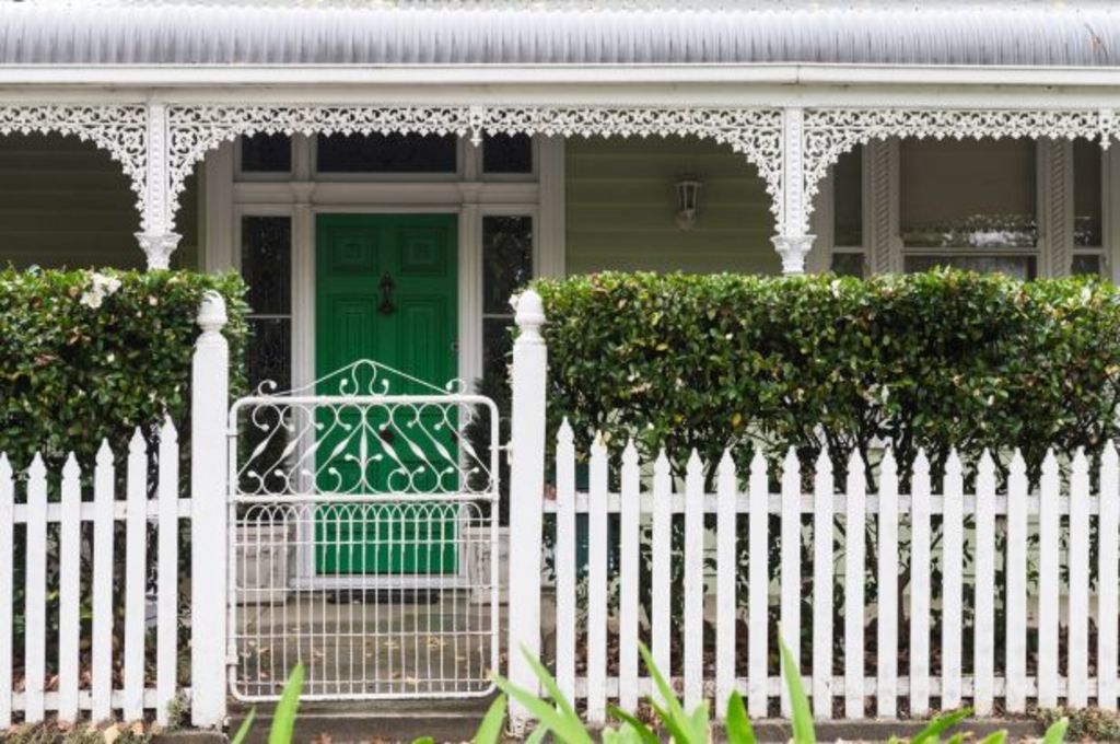
Fencing frames a property and, if done well, can provide a great first impression. But before you go erecting the latest and greatest of fence style, take into account the aesthetic of your home. Some people see a nice fence on a TV reno show and decide that’s the one for them. However, if it doesn’t work with the architectural style of your house, it can look disjointed and out of place.
That’s not to say that a 1970s house needs a 1970s fence! Instead, take an architectural element of your home and use that to link to the style of your fence.
Mistake two: Not creating a focal point
One of the reasons a well-designed home looks great is that there is generally a strong focal point. The purpose of a focal point is to draw the eye in and direct the viewer to a certain location (in this case, the entrance). It could be created by an entry portico, decking, a paved area, planter boxes, or a timber and tile feature.
It doesn’t have to be front and centre, it might be on the side of the house if that’s where your entrance is situated. There needs to be only one main focal point per “view” so don’t be tempted to create more than this. Less is more; and multiple focal points can result in a busy feeling with the viewer not knowing where to look first.
- Related: How to transform a bathroom without renovating
- Related: The renovation Cherie Barber advises against
- Related: How to design your dream kitchen
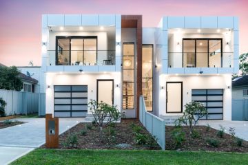
Again, the style of your house is important here. If you have a 1960s style house, don’t go adding a modern 2017 portico. Instead, aim for cohesion by creating a contemporary version of the portico using the existing architectural style of the house as the link.
Mistake three: Neglecting your front yard
Landscaping softens a house and assists with the overall appeal. If your landscaping has too much going on, pare it back, but don’t strip completely. There is nothing worse than a bare and barren landscape. Even a tiny bit around the base of a house looks better than nothing.
Your landscaping design should complement the fence, the focal point and the house colours and materials. Keep in mind that design is not always about symmetry. More often than not, it is about balancing the visual weight of things. For a heavy, chunky two-storey brick house, for example, you would need something dense with big thick glossy leaves. Conversely, if you have a dainty timber cottage with delicate fretwork, you can get away with a finer style of plant such as roses.
Think about the surface the landscape will be butting up against. If it’s a heavy surface such as a dark brick or a dark charcoal colour, don’t use dark plants; they will get lost against the background. Choose plants with a lighter leaf colour instead, and vice versa if you have a light coloured house.
Gardens and landscaping do not need to include flowering plants. I usually favour a more structured design and prefer to add “colour” (greens, purples, blacks) and variety through grasses and plants like Cordyline and Xanadu, to name a few.
In summary, create your wow moment through cohesive fencing, well-balanced landscaping, and an aesthetically appealing focal point to entice the viewer to venture further and look inside.
Jane Eyles-Bennett is one of Australia’s leading home renovation and interior design experts. She is an award-winning interior designer with more than 25 years’ experience designing the interiors and exteriors of homes, specialising in kitchens, bathrooms and living spaces.
Contact Jane at jane@hotspaceconsultants.com or via her website.
We recommend
States
Capital Cities
Capital Cities - Rentals
Popular Areas
Allhomes
More


