Seven designer paint colours for your home ... and where to use them
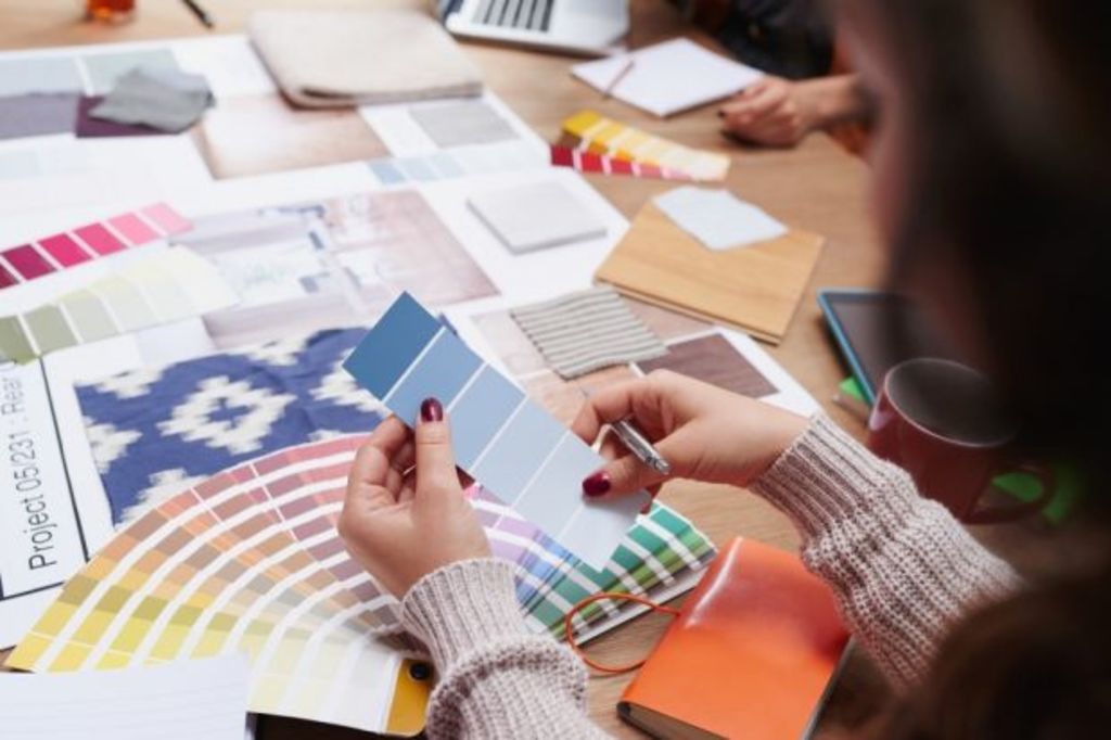
Whether it’s 50 shades of white or 50 shades of grey, picking colours for your home can send you into a spin. If you’re sick of going around in circles with colour selections, here are some of my top tips for choosing the best colours for each room.
Light colours
Light, bright colours work best for areas such as living rooms, dining areas and kitchens. Light colours are also important for hallways, where you don’t tend to get a lot of natural light. My personal design style often relies on light walls with slightly darker floors. I prefer to add colour and personality through the furniture and accessories.
Regardless of the look you’re trying to achieve, this formula works well if you’ve hit a roadblock in your colour selections.
This is a lovely light grey that looks almost white on the wall, but isn’t too clinical. This is a fantastic option for living spaces, bedrooms and hallways.
A warmer white with a slightly creamy base. I love to use this colour alongside white trims, such as skirting boards, doors and door/window frames – particularly on older homes.
This is a really white, white. Great for modern homes where wall surfaces are perfectly smooth. I’d tend not to use this in bedrooms as it can be a little cool. Great for living spaces and kitchens where you want a blank canvas before adding furniture and accessories.
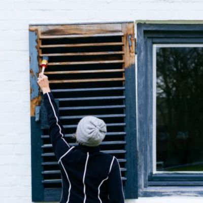
Darker colours
It’s true that light colours do make a space look larger, but don’t let that stop you using darker colours on the exterior of your home or in spaces where you want to create a different mood.
Spice up your home by choosing at least one room with a contrasting colour to the rest. This could be your master bedroom or a media room. I’ve even done a dark-coloured bathroom with matching wall paint/wall tiles and gorgeous pendant lights – a beautiful mood indeed.
This is a very dark charcoal and looks amazing inside or out. It’s certainly a daring option, but a great way to make an impact. I’ve used this on the exterior walls of an art deco-style home and it looked incredible. It won’t suit every home (nothing will), but if you’re after something dramatic, this will work on and in many different styles of house.
Another dark colour to use on the exterior walls and trims of your home. I love that this colour provides punch but isn’t too heavy or light. Internally, this could be used on walls in one room. I’m not personally a fan of feature walls, but you could use it this way if you prefer.
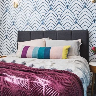
Where’s the colour?
If you want to add some colour to your walls, I recommend you still keep it fairly neutral. I generally steer clear of really bright or bold colours such as primary blues, yellows or reds. A more subtle injection of colour will help your home feel more serene and relaxing.
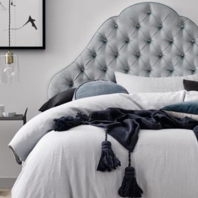
It’s a gorgeous bluey-grey colour that works with many different furniture and bedding options. I would only use this in a bedroom to help create the feeling of a sanctuary.
This is a lovely green that works beautifully in a master bedroom or in the living spaces of a period home. Teamed with white trims, this colour pops.
There are literally thousands of colour options out there. To make sure you’re using the right one for your home, talk to a colour consultant or grab some test pots and paint at least a two by two-metre area before spending mega-bucks on the wrong colour.
Jane Eyles-Bennett is one of Australia’s leading home renovation and interior design experts. She is an award-winning interior designer with more than 25 years’ experience designing the interiors and exteriors of homes; specialising in kitchens, bathrooms and living spaces.
Contact Jane at jane@hotspaceconsultants.com or via her website.
We recommend


States
Capital Cities
Capital Cities - Rentals
Popular Areas
Allhomes
More
