The most common home decorating mistakes revealed

1. Over-cluttering the bedroom
The bedroom should be a restful, uncluttered space – a sanctuary from daily life and a peaceful place to start and finish the day.
“The colours and textures used in a bedroom should also reflect those moods and not be too loud and overbearing,” says Natalie James, interior stylist at The Stylesmiths.
 Photo: The Stylesmiths
2. Choosing monotonous flooring
Many people are told that there should be a single flooring solution in a room to make the space seem cohesive and bigger.
“This comes at great expense to the homeowner, and can actually work against the design intent by creating a vacuous space. It often also means that good quality flooring, such as original floorboards, are hidden under cheaper flooring options like laminate or carpet,” says Rohan Little, Principal of Oxide Design.

Photo: Oxide Design
3.
Placing carpet on carpet
“High up on Julia Green’s list of decorating mistakes is placing thick rugs on thick carpet.
“It’s counterproductive, a tripping hazard and looks ridiculous,” says Julia Green of Greenhouse Interiors.

Photo: Pinterest
4. Selecting an overly dark palette
Dark, bold or strong colour schemes can often make spaces appear smaller.
“My advice is keep things bright and clean and integrate those eclectic items you like in small doses; that way they can be seen and shown off,” says Georgia Ezra of G.A.B.B.E Interior Design.

Photo: (Brand) Balwyn Home by G.A.B.B.E Interior Design (Photography) Stewart Leishman
5.
Pushing furniture against the walls
Contrary to popular practice, bringing furniture in from the walls creates intimacy and balance.
“Never push furniture right up against the walls, particularly in small spaces,” says Bec Astrinakis of Nathan + Jac.

Photo: Pinterest
6. Mixing natural and faux materials
Limit the palette of your materials for a refined outcome.
“If you are looking to use natural materials such as marble surfaces or timber veneer finishes, avoid faux finishes in close proximity,” says Clare Kwok, Associate at ClarkeHopkinsClarke.

Photo: Pinterest
7. Forgetting the light
A sun-filled area is imperative to creating an environment that’s both aesthetically pleasing and enjoyable.
“If you don’t have a lot of natural light, you need to invest in lots of mirrors. Mirrors will reflect and increase the light in the room, giving the illusion that the room is light-filled,” says Georgia Ezra of G.A.B.B.E Interior Design.

Photo: (Brand) Balwyn Home by G.A.B.B.E Interior Design (Photography) Stewart Leishman
8. Choosing a small rug
Go for the largest rug you can afford in your space.
“My pet hate is rugs that are too small; they float around the middle of the room and don’t do anything,” says Lauren Macer of Sisalla Interior Design.
“If you’re putting a rug underneath a dining table, don’t forget to allow at least 50 centimetres extra width on each side of the table so the chairs stay on the rug even when you’re seated at the table,” says Victoria Baker of Temple & Webster.

Photo: Sisalla Interior Design
9. Placing gloss on gloss
When thinking about kitchen finishes, gloss finishes should not be used on every surface but rather as ‘highlights.’
“Gloss on gloss on gloss tends to look a bit tacky,” says Fei Chau, Associate at ClarkeHopkinsClarke.

Photo: Pinterest
10.
Not going the extra mile
Adding a final layer of decoration gives your room personality.
“The key is mixing ‘like’ items together from various sources to avoid the showroom look. Mix decor according to material…or arrange by colour or theme,” says Lauren Macer of Sisalla Interior Design.

Photo: Sisalla Interior Design
11.
Not choosing a theme
Successful interior decorating and styling has a strong sense of purpose and continuity that brings a space together.
“The most common decorating mistake people can make starts with not having a sense of the story or theme the decorating will follow,” says Nicholas Travers, Director at Technē Architecture + Interior Design.

Photo: Pinterest
12.
Hanging art too high
Homeowners should arrange art at eye level to attract the most attention.
“The average eye level is 150 centimetres from the ground up and this is where you should be centring your artwork on your walls. You don’t want to strain your neck to see your beautiful artwork,” says interior stylist, Emma Blomfield.
“Always hang the middle of the art at eye level. Or, for a modern take, lean your artwork instead of hanging it,” says Bec Astrinakis of Nathan + Jac.

Photo: Nathan + Jac
13.
Going overboard on the trends
Your scheme will generally work better by choosing only a select few ‘on trend’ pieces.
“Think about walking off the runway in full Gucci; it looks amazing on the catwalk but not so great in real life,” says Fei Chau, Associate at ClarkeHopkinsClarke.

Photo: IKEA
14.
Pancake flat cushions
Invest in feather inserts for your scatter cushions.
“Polyester-filled inserts will flatten down within moments of stuffing your new cushion covers, plus they aren’t comfy to snuggle into. Feather inserts make your cushions look better and mould to your body,” says interior stylist, Emma Blomfield.

Photo: Pinterest
15.
Not being clever with colour
Rooms with strict colour schemes run the risk of looking predictable and unimaginative.
“Stick to a colour story but add depth and visual interest by working with a mix of lighter and darker shades in your chosen colours,” says Jessica Bellef of Temple & Webster.

Photo: Pinterest
16.
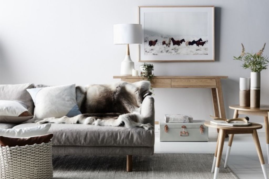
Selecting disproportionate furnishings
Achieving the right proportions to a room is vital, but can be very tricky business.
“You can achieve the right proportion with layers – furniture and accessories of varying heights and sizes, the placement of artwork, layering soft furnishings, throws and animal skins,” says Bec Astrinakis of Nathan + Jac.

Photo: Nathan + Jac
We recommend
We thought you might like
States
Capital Cities
Capital Cities - Rentals
Popular Areas
Allhomes
More


