The unique challenges of renovating a two-storey home
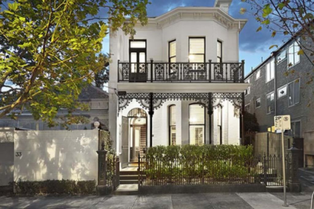
Every house has its own unique challenges when it comes to renovating, but a two-storey home comes with some that are very different to a single-storey.
Anchoring your house
A two-storey home can often look heavy and needs to be visually “anchored” in place. Anchoring is a subtle thing to achieve but can mean the difference between your home looking fantastic or looking a bit off.
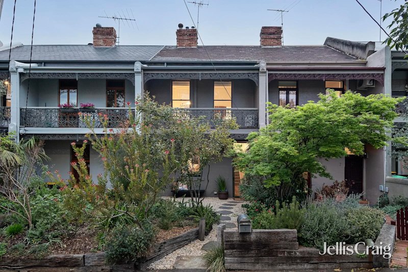
The easiest way to visually anchor a two-storey house is to do some solid planting around the base. Dark coloured plants, with chunky leaves, planted densely is a good start. Avoid anything too light and delicate like roses or any sparse plants.
If planting and landscaping are not achievable, try adding pot plants or planter boxes; making sure the visually heavy items are at the base of the house.
If you have a heavy material like brick on the bottom and a visually light material like timber on top, it will naturally look anchored and so would need less attention than a house with timber on the bottom and brick on the top.
Balustrades
You can significantly modernise a two-storey house by updating any balustrades. Older style homes often have illegal balustrades, or stair handrails, so it would be worthwhile spending the money, not only to modernise them, but to make them legal, too.
- Related: Fences: The great neighbourly divide
- Related: Two-storey homes make best use of space
- Related: Nine things you should know before you renovate
Try to match the visual weight of the house, but contrast the colour. For example, if you have a brick house, ensure your balustrade is also made from a heavy-style material, and in a contrasting colour so that it stands out (or completely blends in, like glass).
There’s not a cookie cutter answer to what looks good for every home, so employing the principles of good design (balance, cohesion, symmetry, focal point) is critical for a well-designed aesthetic.
Flat facades
A double-storey house can look flat and uninteresting if the front of the house is all in one plane, for instance, if the lounge and bedroom windows on both levels line up and are all flush and on the same face.
A new entry portico can help here by giving depth and interest to the look of the facade. The solid entrance adds contrast and depth by breaking up the uniformity of the facade by giving it some shape.
If a new portico is not an option, adding “wow” factor with window awnings could be a good option. These can be made out of any number of materials including canvas, timber or corrugated iron, but the style of house should dictate what material you use and whether you go for something funky or something more traditional.
Fences
Another way to spruce up the facade is to add a front fence or prominent front boundary. This works to encase and frame the property. Most properties have side and back fences, but a front fence is also important because it demarcates your home from the common ground beyond your front boundary.
The aesthetic of your front fence is incredibly important, so make sure the style is in line with the architectural style of the house. Think about visual weight and ensure you select materials that are the same or similar to the house itself.
Jane Eyles-Bennett is one of Australia’s leading home renovation and interior design experts. She is an award-winning interior designer with more than 25 years’ experience designing the interiors and exteriors of homes, specialising in kitchens, bathrooms and living spaces.
Contact Jane at jane@hotspaceconsultants.com or via her website.
We thought you might like
States
Capital Cities
Capital Cities - Rentals
Popular Areas
Allhomes
More
