Tricky living rooms: What to do if your living room is out of the norm

Author: Susannah Hutchison
In living rooms – just as in life – the perfect shape may well be the ideal, but the reality for most is anything but perfection. And, hey, perfection can be boring.
Many rooms don’t conform to the rectangular norm (think sloping roofs and strange angles), but they still need to be furnished with all the usual living-room requirements. Don’t fret – there are plenty of clever ways to get the most out of a difficult shape, as these ideas prove.

Emphasise with colour
Highlight an odd-shaped segment in a toning shade to turn it into a feature. Here, a sofa slots neatly into the angular recess and the grey shade behind makes it stand out, rather than blend in.
Clear a path
This narrow living room also provides the access point to the kitchen. Rather than creating a treacherous obstacle course of chairs and tables, a clear strip has been left to ease the way. Long, low furniture helps to “elongate” the compact space, and a footstool multi-tasks as a seat and coffee table, reducing the need for extra furniture, as does the built-in alcove storage.

Choose chairs
With stairs, pillars and railings already breaking up the flow of this room, the owners skipped a bulky sofa and picked chairs and a two-seater sofa for seating. Chairs are always a smart option for awkward rooms as they can be more easily angled to work with the room’s dimensions. Opting for pieces with narrow legs rather than blocky bases is another good way to ensure a smallish space doesn’t look too hemmed in.
Be part of the picture
A glass-walled, light-filled living room is a dream for many, but where do you actually put stuff? Sometimes there is no choice but to position the sofa in front of the window – you’ve got to sit somewhere, after all. Choosing a sofa that complements, rather than fights against, the view is the way to go. Here, the yellowy-green of the seating merges into the green of the garden, while even the shaggy rug and cushions reflect the texture of the bark on the palm tree in the distance.

Build into a nook
A sloping roof can be a hassle, but it can also be the ideal spot for bookshelves. Built-in furniture is always a winning design choice as it maximises available space and can be designed to fit exactly around a room’s angles.
Turn back
Lots of period homes have the front door opening straight into the living room, which can prove tricky for furniture placement. Here, the back of the L-shaped sofa actually creates a little “corridor” and its extended arm forms a mini “entrance hall”.
Step to it
Different levels present an issue in many homes, and here the step up to the courtyard is quite extreme. Rather than eating into the living space with solid stairs, two step-up stools do the job, and they can also double up as tables and extra seats. In a room with defined architectural features, such as these doors, picking up the key details in the other furniture – here the slate-grey sofa and sideboard – gives a space a considered, thought-through feel.

Use an alcove
A fireplace is an amazing feature, but in a compact room it can limit the amount of wall space you have to position furniture against. Instead of opting for just shelving in the alcoves either side of the chimney breast, go one step further with a desk. Choose the same wood as other furniture in the room – here the coffee table – and pick a design with drawers so any work in progress can be tidied away.
Throw in a curve
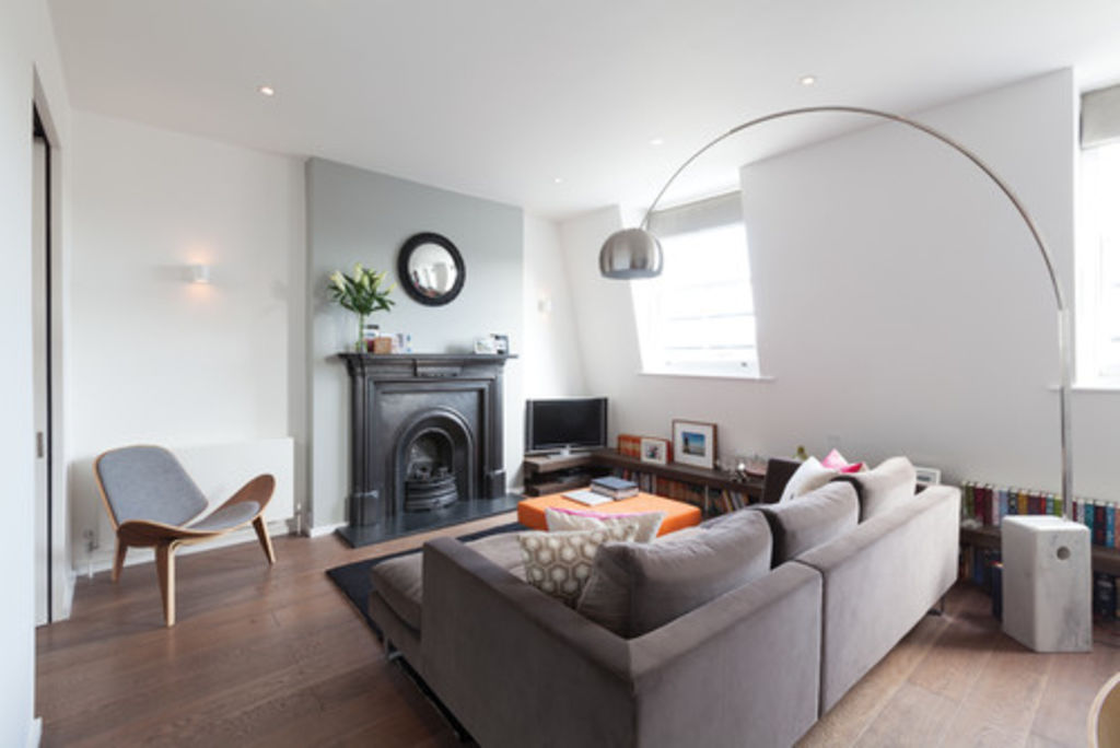
Lots of sharp angles? Try adding a curve (or two) to provide a contrast to all the straight lines. A tall, arching lamp, as here, a round table or even a circular mirror can all be the softening element your room needs.

Use one shade
Narrow rooms are a common dilemma, and this example shows how keeping everything simple and in one tone can be very effective. White walls, a white blind and white, linear furniture are the key to this room’s success and tranquil charm. A couple of colour accents stop it looking bland, and the “L” section of the sofa draws the eye away from the wall, creating an impression of more width.
We recommend
States
Capital Cities
Capital Cities - Rentals
Popular Areas
Allhomes
More


