Want to extend your home? Make sure you don't lose more than you gain

We’ve all seen those extensions that look a bit off. While it might not be immediately obvious why they lack appeal, on closer inspection it becomes apparent that the extension looks like a random box that’s been dropped into the yard and then attached to the house. It’s rarely a good look and seldom reflects the amount of money spent on it.
Adding a bad extension can actually decrease the value of the property.
So, how do you ensure your extension doesn’t look like something that’s been tacked on? First of all, it’s essential to get the layout right. If you’re lucky enough to be able to put a box-like structure on the back of your house and have it blend naturally with the rest of the house, that’s great. But, if it’s pretty clear that the box will look like, well, a box, and nothing more, it’s time to give some thought to the layout of the extension. After all, you’re going to be spending a pretty penny on the extension; you might as well get the layout right.
You don’t want to end up losing more than you’re gaining, so if the existing layout of the house is not going to suit the extension, adjust the layout. Consider hiring an expert to help you with this.
After you’ve got the layout working for you, it’s time to ensure there is consistency throughout the property. You might be renovating the entire house as well as adding an extension, or you might just be adding on to the existing property. Either way, consistency and flow is the key to making sure the extension doesn’t look like an after-thought.
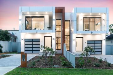
How do you do this? Here’s an example. Imagine you have a heritage-style house, but you need a bit more room and you want to update the interior. Adding a sleek, modern room or two onto it could look really out of place. However, you could add an extension that has a visually similar (or at least complementary) exterior, but with an interior that is more contemporary and contains all the latest fixtures and finishes. You could then renovate or revamp the interior of the original property to match the modern look of the interior of the extension. Doing it this way would ensure the property maintained flow and consistency both inside and out.
Alternatively, if you have a reasonably modern home that needs extending, you might be able to link the two through your choice of paint, landscaping, flooring or lighting without needing to do a complete overhaul. From colours and shapes to textures and finishes, good design employs numerous elements to create a visual flow and consistency throughout a home.
If you’re not confident you can achieve this, consider hiring an expert so that your extension, and renovation, becomes a cohesive whole rather than a patchwork of different ideas.
Jane Eyles-Bennett is one of Australia’s leading home renovation and interior design experts. She is an award-winning interior designer with more than 25 years’ experience designing the interiors and exteriors of homes; specialising in kitchens, bathrooms and living spaces.
Contact Jane at jane@hotspaceconsultants.com or via her website.
We recommend
We thought you might like
States
Capital Cities
Capital Cities - Rentals
Popular Areas
Allhomes
More

