The Block 2018: The contestants' worst renovating mistakes so far
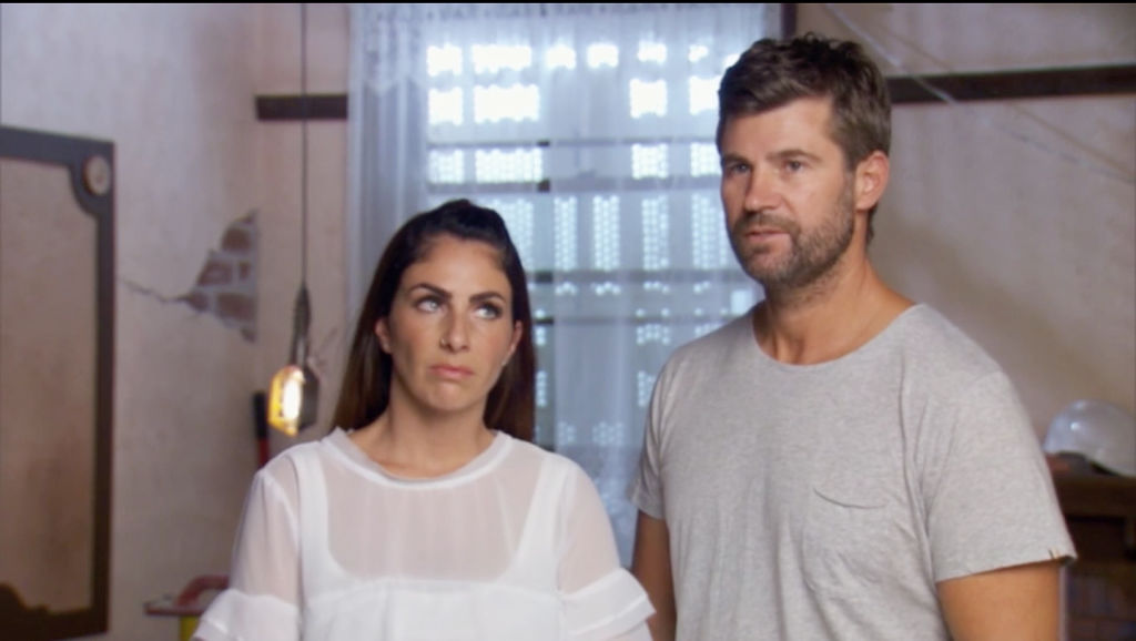
What do you get when you take a bunch of rookie renovators and put them to work building luxury apartments in a rundown old hotel? A whole lot of mistakes, that’s what.
Contestants make their fair share of blunders on every season of The Block, and this year is no exception.
From design disasters that frustrated the judges to technical errors that required remediation, these are some of the worst renovating mistakes on The Block this year.
1. The overwhelming vertical garden
In an effort to inject luxury and wow-factor into their main bathroom, Hayden and Sara decided to install a huge vertical garden on one of the walls.
However, the lack of a watering system coupled with its enormous size and odd positioning meant the judges weren’t pleased.
Neale Whitaker felt “completely overwhelmed” by the garden, describing it as “so over the top”.
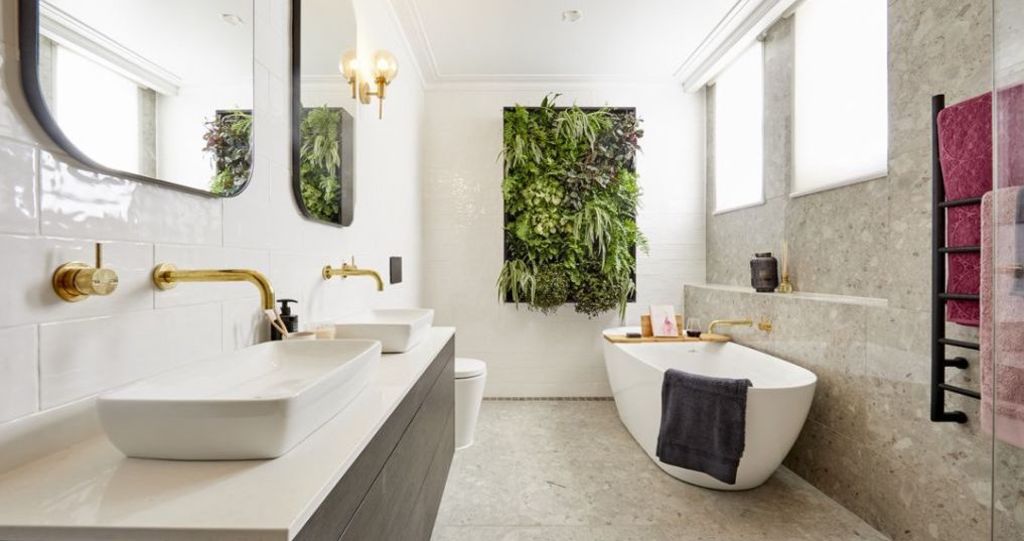
Vertical gardens have the potential to look stunning, but all too often they’re simply bolted on rather than incorporated naturally into the space.
And without proper irrigation, green walls can be high maintenance and will easily turn into a dead, brown mess when neglected.
Solution: A single feature specimen is more practical than a whole wall of greenery and is more suitable for a small space like a bathroom. Keep vertical gardens to exterior walls where irrigation is simpler and easier.
Related: View the five Gatwick apartments for sale
- Kerrie and Spence: 1/34 Fitzroy Street, St Kilda
- Hans and Courtney: 2/34 Fitzroy Street, St Kilda
- Sara and Hayden: 3/34 Fitzroy Street, St Kilda
- Norm and Jess: 4/34 Fitzroy Street, St Kilda
- Bianca and Carla: 5/34 Fitzroy Street, St Kilda
2. The non-compliant ceiling
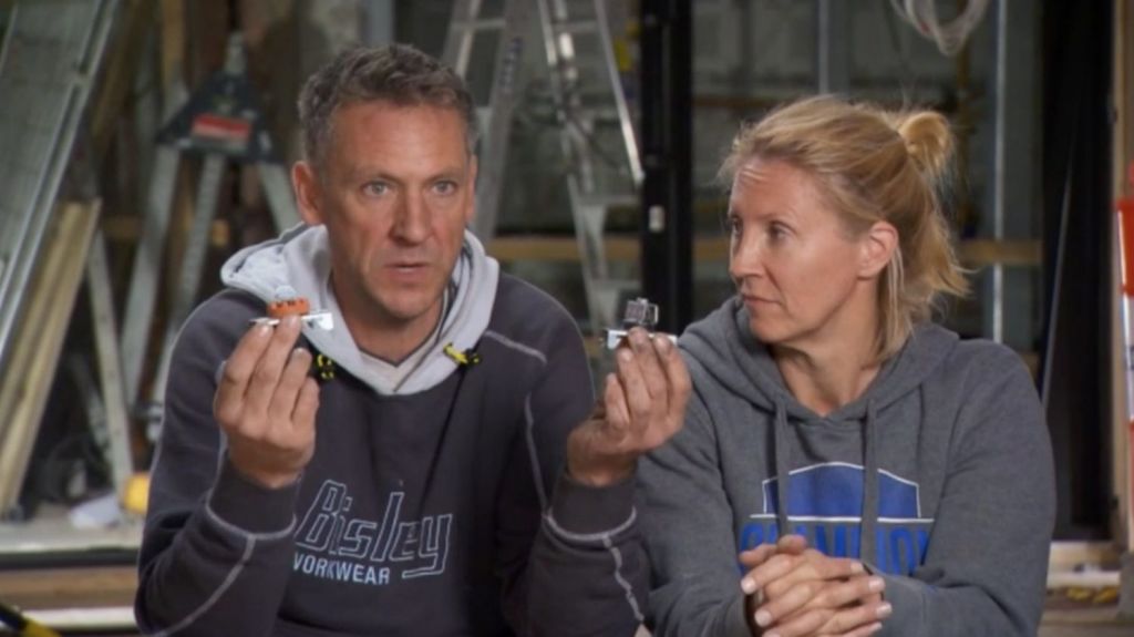
Kerrie and Spence’s grand plans for a coffered ceiling in the living and dining area required a framework and panels to be suspended from the building framework using a series of clips, also known as acoustic mounts.
However, their plasterer installed a different type of mount to the one specified by The Block sound engineers, meaning every single clip had to be replaced, a task that took an extra day of work.
In the end the judges applauded the ceiling, but criticised the pairing of an ultra-modern light fitting and ceiling fan with an old-world heritage feature.
Solution: If an engineer requests a specific component, stick to it to avoid budget and timeline blowouts. And to avoid clashing styles, pick one theme and execute it well.
3. The awkward kitchen
Positioned across the hall from the dining area, Hans and Courtney’s kitchen felt disconnected, especially in an age where a seamlessly connected open-plan kitchen, dining and living area is at the top of the list for many buyers.
A relatively small island bench featuring a huge pillar also caused concern, and the inclusion of a butler’s pantry along the only windowed wall meant the kitchen was darker than it needed to be, while the closed-off butler’s pantry was flooded with natural light.
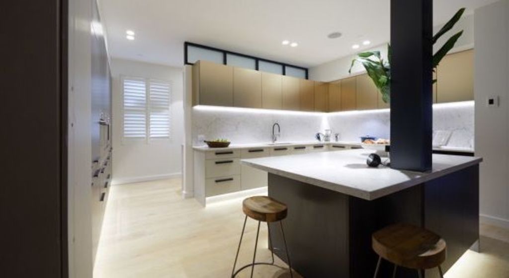
Any architect or interior designer will reinforce the importance of natural light in an interior. In this case, ticking the butler’s pantry box created a compromised layout that missed the mark.
Solution: Design the room to maximise natural light, and try to work with the constraints of the building rather than against them.
4. The imposter bath tub
A buyer paying $2.75 million for an apartment expects finishes to be of the highest standard, which is why Norm and Jess’s faux stone bathtub may prove problematic.
Jess originally bought a fibreglass tub, mistakenly thinking it was stone. In trying to replace it, she was again caught out by a bargain bathtub on Gumtree, buying a tub advertised as stone that was, in fact, plastic.
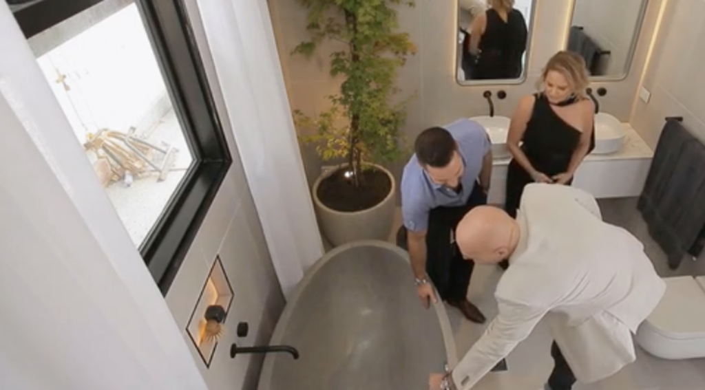
While Darren Palmer said it was a more practical option, it could feel a little cheap compared to the rest of the luxury inclusions in the apartment, especially for discerning buyers who only expect the best.
Solution: Keep the target buyer front of mind when renovating for profit, and watch out for deals that sound too good to be true, because they probably are.
5. The conspicuous toilet
When you walk into a bathroom, the first thing you want to see is the most impressive or welcoming feature, such as a luxurious bathtub or beautiful vanity.
The toilet should definitely not be the focal point, yet several of The Block bathrooms feature the throne taking pride of place.
Hayden and Sara made this mistake in their master ensuite. While their expensive, decadent brass bathtub is the star of the room, the toilet detracts from the room because it’s the first thing you see when walking in.
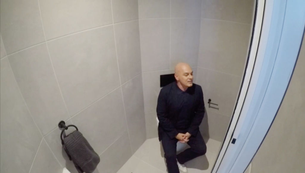
Courtney and Hans made the same mistake in the powder room, and Jess and Norm’s powder room features a clear view of the throne from the dining table.
Solution: Carefully consider the bathroom layout and always tuck the toilet out of view behind the door or vanity.
We recommend
We thought you might like
States
Capital Cities
Capital Cities - Rentals
Popular Areas
Allhomes
More
- © 2025, CoStar Group Inc.

