1960s brick house gets huge makeover inspired by camping trips
Think you are stuck with a boring brick and tile house from the 1960s?
You could take inspiration from this Melbourne family – it was their family camping holidays that inspired the design of a stunning annexe to their traditional brick and tile house.
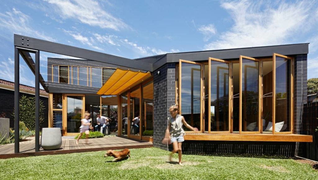
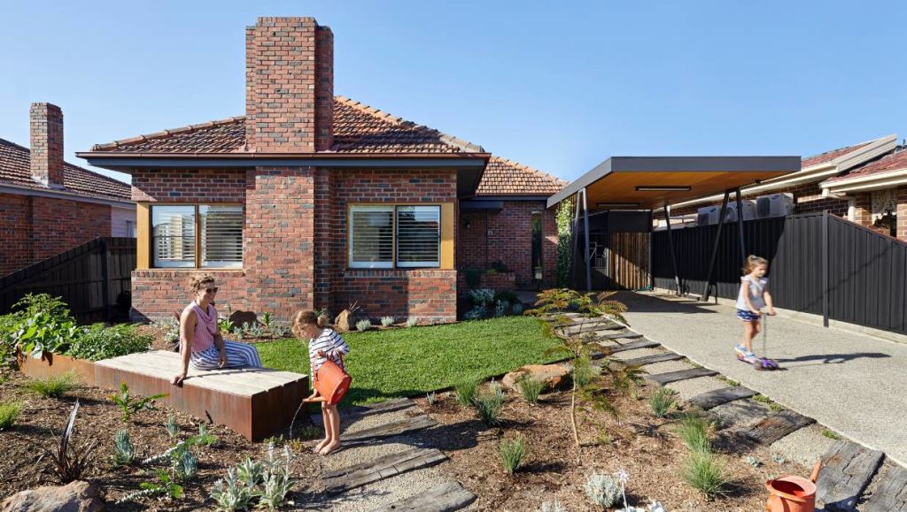
Although the front of the house gives little away, the rear is completely transformed to suit a young family of four and their two “adorable” dachshunds.
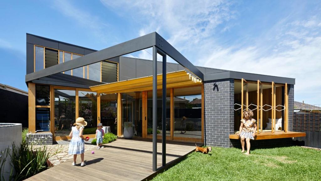
The team at Bent Architecture says the concept was conceived so the owners could “step out of their caravan into the shade and fresh air, protected by a canvas annexe, which frames a view of the lush landscape beyond – because every day should feel like a breath of fresh air”.
Several ad-hoc additions at the rear of the 1960s house were removed first, leaving only the generously proportioned rooms of the original home, which, the architects say, created a great base to start from.
The additional living space was added to give the family more room, but also to better connect the house to the garden.
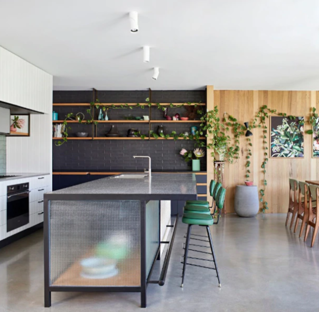
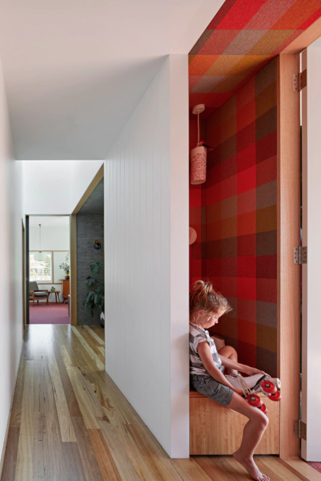
“In contrast to the heaviness and introspective nature of the original home, this new, light-weight and light-filled annexe is open and outward-looking, feeling more like a sheltered place in the garden that a traditional living space.”
The new living areas hug the outdoors, giving the impression of a garden creeping inside. Brick walls to the east and west provide privacy from neighbours either side, and focus attention back to the garden.
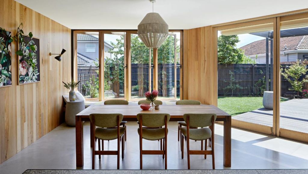
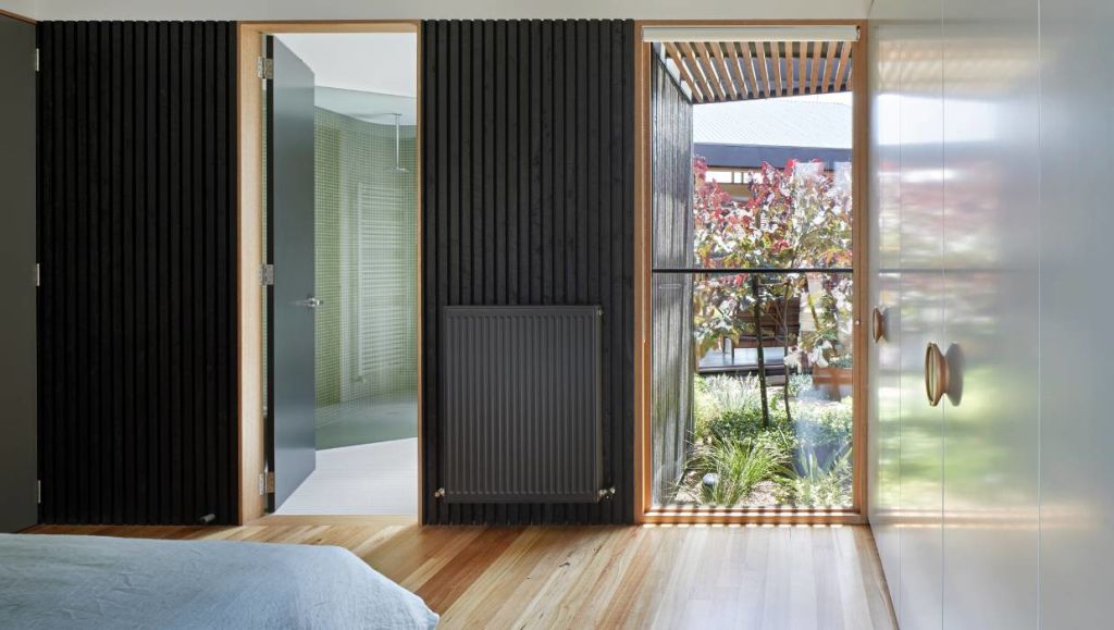
“The trick to make the annexe feel like a part of the garden is to create green spaces on both sides, by separating the addition from the original home with a courtyard. Of course, the central courtyard improves cross-flow ventilation and lets north light into the master bedroom. With full-height windows on both sides of the living area it also creates the illusion of one continuous space, blurring the boundary between inside and outside.
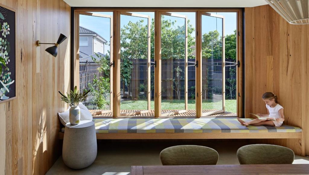
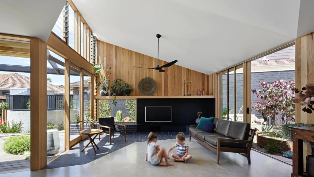
A brick plinth in the living room – at just the right height for sitting – extends out into the garden. Brick paving also crosses the threshold between inside and out, further blurring the boundaries.
The annexe has a long window seat that pops out from the dining room to bring light into the kitchen and dining areas, and views of the backyard. “Casement windows open onto the backyard, and the special seat is bathed in golden north light, making it the perfect spot to sit with a cuppa and a book.”
A retractable awning provides shade to the outdoor deck. And there’s a plunge pool close by, making this the perfect place for entertaining outdoors.
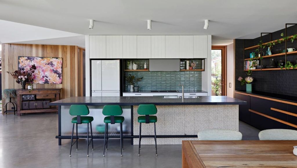
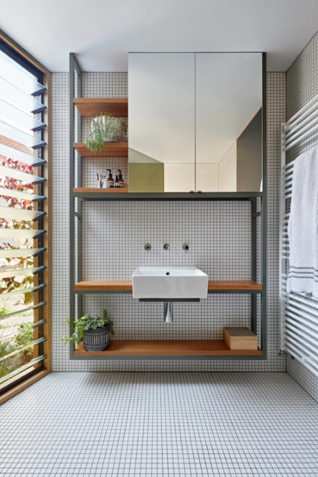
The home’s passive design reduces the need for heating and cooling. High windows in the living area capture views of the sky and let north light deep into the home, warming the concrete floors for passive heating. Meanwhile, louvre windows can be opened up to encourage a breeze for passive cooling.
As well as adding the annexe, Bent Architecture restored and revitalised the original rooms in the house, creating bedrooms, while a second living area in the front room takes advantage of the existing corner windows and a feature fireplace.
Architect and interior design: Bent Architecture; project team – Paul Porjazoski, Lana Blazanin, Tilde Sheppard, Merran Porjazoski, Ian Wilson
Builder: Poles-A-Part Design and Construction
Structural engineer: Marcon Tedesco O’Neill
Photographer: Tatjana Plitt
– This originally appeared on Stuff
We recommend
States
Capital Cities
Capital Cities - Rentals
Popular Areas
Allhomes
More
