5 biggest design blunders people make (and how to avoid them)
I’d need a higher word limit for this article to get through all the design blunders I see being made. Some of them are more forgiving than others. All are understandable. If you didn’t work with a qualified designer on your home upgrade and you’re new to renovating, it’s a case of you don’t know what you don’t know.
Like most things, good design comes from experience and trial and error, but if you’re planning to update or renovate your home, here are five things to avoid.
Massive kitchen island benches
Just because you can doesn’t mean you should. The size of a kitchen bench needs to make sense and be proportionate to the countertop space and under-bench storage you actually need. Don’t let a monolithic island bench come at the expense of what could be a better use of space, such as a breakfast nook or sitting room.
Thoughtless kitchen storage
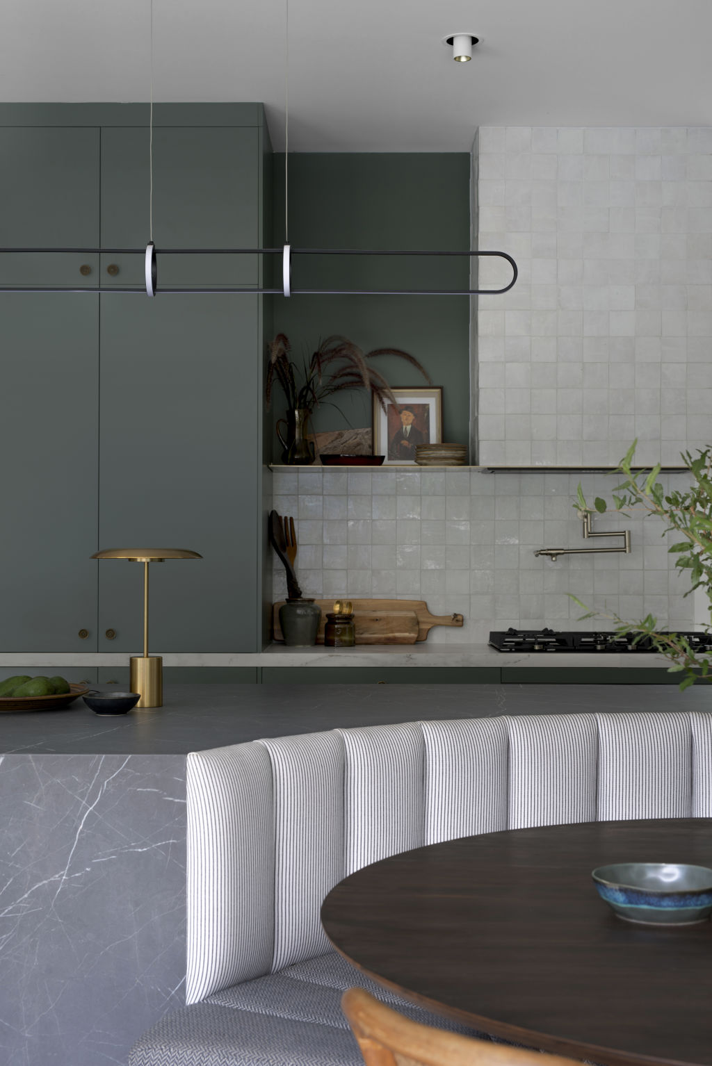
When designing your kitchen joinery, think about what you have and where everything will be stored. Make a list. Lots of small drawers, for instance, won’t cater to your big pots, slow cooker and stand mixer, so you need a combination of small drawers and larger, deeper drawers.
Similarly, many kitchen designs don’t give thought to managing the clutter of small countertop appliances like toasters, kettles and Thermomixes. A dedicated appliance cupboard is a good way to store these high-use appliances – just shut the cupboard door when you’ve finished and there’s no need to put them away after each use.
Another frequent kitchen faux par is not allowing enough room on either side of your sink and cooktop. These two areas work very hard in your kitchen, and you should have sufficient space on them for stacking dishes and utensils.
Feature walls
Argh, they kill me! I’ve talked about this plenty of times before, but a feature wall spells fear.
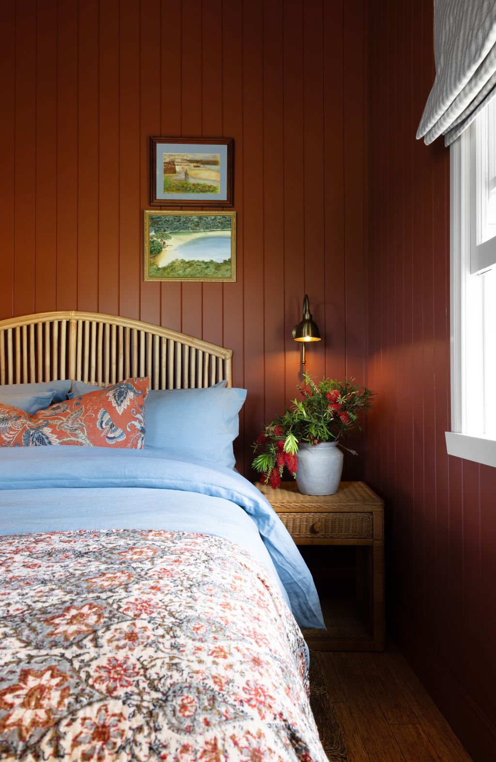
I do understand the fear, but if you paint only one wall and leave the others white, what you end up creating is a space that feels jarring.
By painting all the walls in your space the one colour you will create a room that is calm, cohesive and sophisticated – and that’s something you just can’t achieve with a feature wall.
No electrical plan
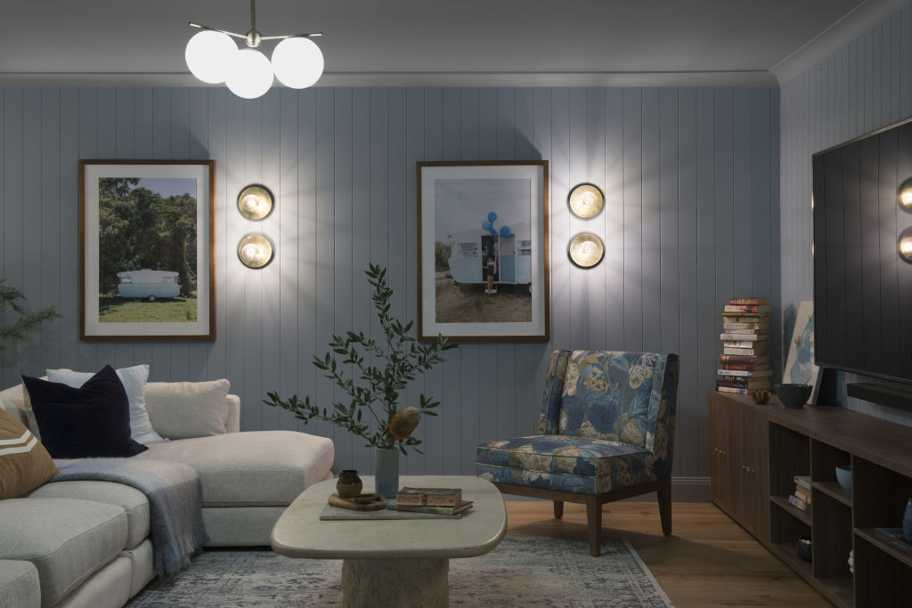
An electrical plan sets out where all of the lighting and power points will be in your home. If you don’t take the time to consider it thoughtfully, you may have regrets after you’ve moved in. I am guilty of this in our own home and I’m kicking myself for not having enough GPOs (general power outlets) in our living room.
At the least, ask your electrician to have provisions for GPOs at rough-in, even if you decide not to fit them in the end. The same goes for wall lights. These, like table and floor lamps, provide mood and are incredibly effective for adding dimension and creating ambience.
The other things that people often don’t consider in their electrical plan are floor lights and art lights. You may decide you don’t need this sort of lighting, but you want to have at least considered it.
Ineffective window design
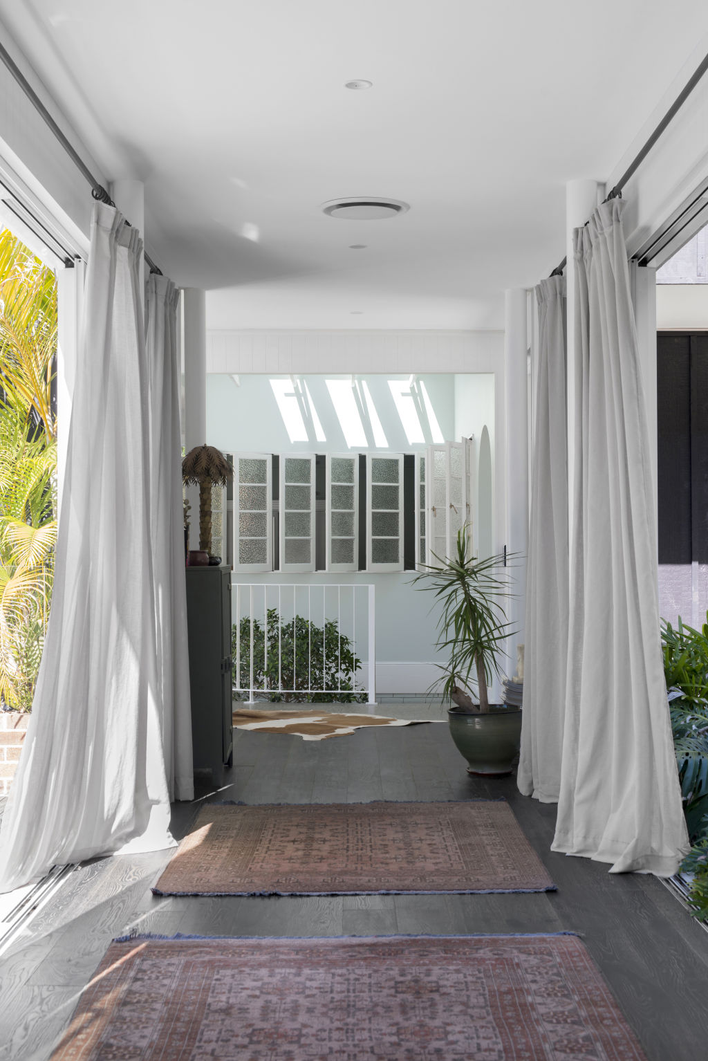
We often come across designs where we see lots of small-scale windows that feel like they’ve been plonked into a building design with little thought as to how they will impact the interior of the home or the facade. In general, fewer large windows look far more effective than lots of small ones.
There are so many things to think about. Let’s consider a living room design, for example. Have you thought about how those windows will affect the living room joinery? Where will the TV fit? Does your window leave you enough space around it to add artwork?
But that’s not all. Then there are the window furnishings to consider.
Does the window placement on the wall allow for enough curtain stack-back (the space you need on the wall to pull back the curtains)? Will you have a roller blind that sits inside your window reveal and a sheer curtain that is face-fixed, or will your window reveal not be deep enough? If you want face-fixed curtains, is there enough wall space between the top of your window and ceiling to fix a track or rod?
The list goes on, but my point is, you should think about your window dressings during the window design phase so that you can pivot before it’s too late.
We recommend
We thought you might like
States
Capital Cities
Capital Cities - Rentals
Popular Areas
Allhomes
More
- © 2025, CoStar Group Inc.
