5 mistakes to avoid when combining old and new

Author: Anne Ellard
Creating an eclectic mix of old and new is a very striking and effortless look when done correctly, however it is probably the most difficult look to pull off effectively. Handpicking a select few feature pieces of furniture or accessories for your home can be difficult, especially when you fall in love with so many. The key is knowing which pieces will work in your home, and how you will pull the whole look together so it doesn’t look disjointed or cluttered.
Whether you live in a traditionally styled home but have a love for modern furniture, or live in a contemporary home but love the charm of old world furniture, you can easily combine these two looks to create a stunning interior. All you have to do is avoid the mistakes listed below.
1. Mismatched chaos
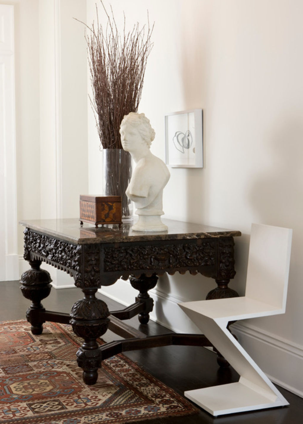
Choose your furniture and accessories carefully. Always keep the overall look in mind, so everything works well together and creates a cohesive look – you don’t want to create a sense of chaos. Don’t be tempted to fill the room with eclectic op shop finds. Instead, choose a couple of key pieces that will act as main features in the room.
In the entryway above, the crisp clean lines of the stark white contemporary chair are simplistic and don’t demand attention. It perfectly contrasts the main feature in the space, which is the antique-style, ornately-decorated solid table.
Contrasting black and white works well in almost any setting. The addition of the white bust on the table matches the white chair and white wall, pulling the whole look together.

2. Using too much colour
A white or neutral backdrop is the perfect canvas to show off key pieces of furniture and accessories.
Mixing old and new pieces together in a room can sometimes create a busy feeling, so try to avoid using too many colours as this will only add to the busyness.
Here, the white walls, neutral tiles and white chairs all blend together, allowing the colonial-style timber table and the black and white artwork to be a focal point. The black in the artwork also ties in with the black legs of the dining table, in turn creating a cohesive look.
If you love colour and are looking for a way to create a colourful mix of old and new, choose pieces that are either the same colour or are complementary colours. Avoid mixing too many colours or using colours that are too busy as they will overpower the space.
Find the perfect set of dining chairs

3. Thinking old equals antique
The Collins Dictionary definition of antique is “a decorative object, piece of furniture, or other work of art created in an earlier period, that is collected and valued for its beauty, workmanship, and age.” That, to me, doesn’t imply ‘old’!
Take inspiration from thousands of bathroom ideas
Choose your old pieces wisely. They don’t have to be antiques, but they should have some character and charm about them. Removing old chipped paint or varnish, updating rusted and worn handles or reupholstering faded fabric will give the piece a new lease on life and will help it fit in better in its new contemporary setting.
This beautiful chest of drawers is a striking feature in this bathroom. It is elegant and well-maintained against the crisp, white backdrop.
Shop more beautiful chests of drawers

4. Dated upholstery
I love antique furniture. However, in a contemporary style room, a beautiful antique piece of furniture can look completely out of place (and just plain old) if it has worn and dated upholstery. Give it a new lease on life, and even a new look by reupholstering it.
The antique-looking love seat in this lounge room blends perfectly with the simple, contemporary couch.
Find out how you can give an old chair a new lease on life with upholstery.

5. Ignoring permanent features
The devil is in the detail when it comes to creating an interior that contains a mix of old and new styling and finishes. Don’t overlook the more permanent features in your interior, such as the wall finishes and flooring.
The crisp contrast of wooden floors and old exposed brick walls with modern glass and metal railings (as seen here) looks wonderful and has a very architectural feel to it.
This look works because all the texture and interest is in the brick and the timber. The glass and metal almost disappear, allowing the warmth of the brick and timber to be the real wow features. They don’t fight each other for attention; instead, they work to compliment each other.
However, mixing an old terracotta tiled floor with a modern geometric patterned wallpaper just wont have the same effect. Instead, paint the walls a crisp, contemporary white or off-white. The contrast will be striking and will allow the floor to be the centrepiece of the room.
We recommend
We thought you might like
States
Capital Cities
Capital Cities - Rentals
Popular Areas
Allhomes
More


