6 things to avoid when designing a kitchen
You might have heard that kitchens are the hub of the home. It’s a cliche, but it’s true.
It’s not just where we cook; it’s where we gather and linger, and they take up a lot of space in our floor plans. It’s for this reason that kitchens are typically afforded a lot more design time and budget than any other space in the home.
It’s also the reason that you don’t want to be making design choices that you might regret. Avoiding these mistakes will ensure you have a functional as well as beautiful kitchen.
1. Forced butler’s pantries
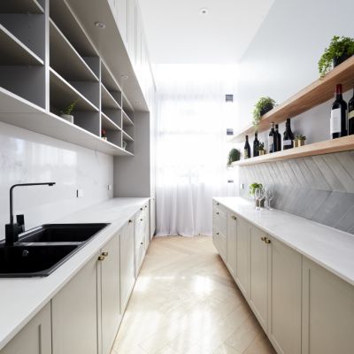
If you’ve been watching The Block this season, you’ll have observed a lot of chat from the judges on butler’s pantries.
Do they make sense? Have they been forced? Do they compromise the space? Are they warranted?


The butler’s pantry has become such a popular inclusion in kitchens that it’s easy to mistake them as a staple. They’re not.
Not all floor plans will be able to handle a butler’s pantry and when they are forced into a plan it’s often at the expense of something like bench space or functional storage. If you’re going to include a butler’s pantry it should be because the space allows for it.
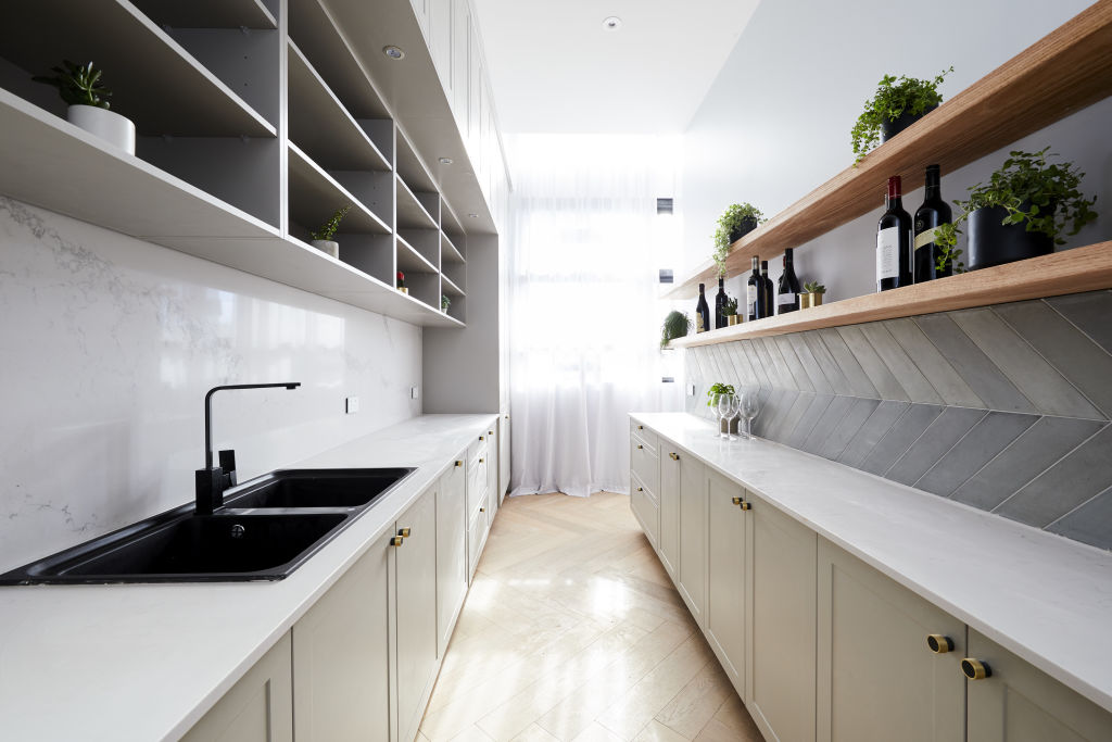
You need to ask yourself how it serves you. Will it just hold pantry items? If so, it’s more of walk-in pantry and if that’s the case, do you have the luxury of space for this, or would you be better off doing a pull-out pantry?
Will it hold a second sink? If so, for what purpose? Will it include your only sink? In this case, the space should be large enough to handle a full-size double sink as well as a dishwasher and bin, and be highly accessible to both the fridge and stove and have adequate bench space.
Do you just want somewhere to keep your benchtop appliances? Perhaps all you’ll need then is an appliance cupboard?
2. Confusing design longevity and ‘boring’
I once had a client try to convince me that they needed a shade of white on their cabinets so that they wouldn’t have to change it in the next six years. It’s frustrating that this mindset still dictates home owners’ choices.
I’ve seen plenty of white dated kitchens. It’s not colour alone that dates. There’s far more to it than that.
What dates fastest typically is trends that have been employed in unoriginal ways, or trends that feel forced and employed with a lack of regard to the building design and origins of the home.
If you love buttermilk yellow kitchen cabinets and it makes sense to the style of the home, for the love of Pete, go with buttermilk yellow kitchen cabinets.
3. Engineered stone splashbacks
Splashbacks should be given more weight. They are a key feature of almost all kitchens, and they’re often not given the same consideration as your other surfaces.
It’s not uncommon for home owners to continue their engineered stone benchtop material up to act as their splashback.
Here’s the thing with engineered stone, it looks very different on a vertical surface than it does on a horizontal surface. On your bench you can justify it because it’s durable and accessible. But when you use engineered stone on a splashback, you’re making it a hero and it tends not to have hero qualities.
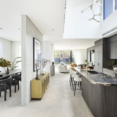
With an alternative such as a natural stone, you’re able to achieve character and impact via beautiful colours and irregular, naturally-occurring veining. By pairing it with a small-scale tile you can achieve interest through the combination of pattern and colour.
Stick to this if you want your kitchen to sing.
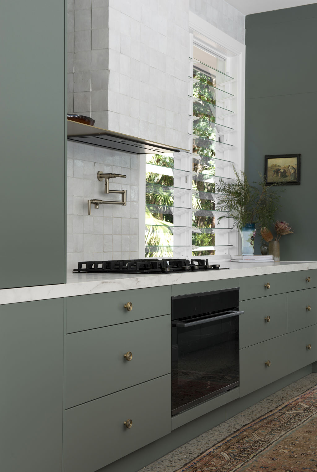
4. Cheap hardware
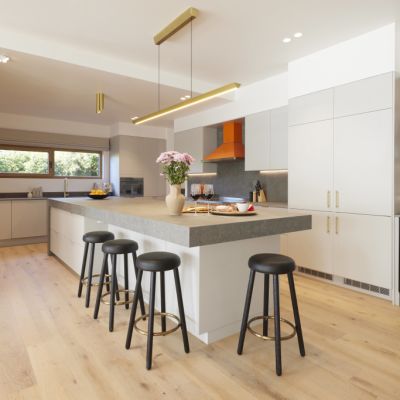
You know the bright gold hardware that has been dominating interiors in recent years, it’s time to rethink it. It’s appealing because it’s cheap to buy but it also looks cheap and it’s a sure way to cheapen your kitchen.
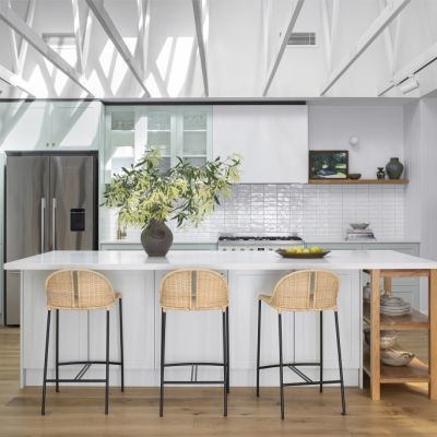
If you don’t have the budget for high quality electroplated or organic brass tapware and handles, skip it altogether and instead opt for a gunmetal or chrome, which tend to blend more with your space rather than pull focus.
5. Lack of lighting
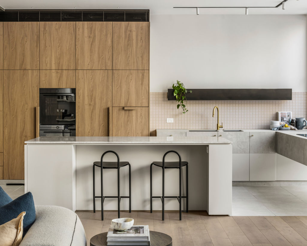
The kitchen is a utilitarian space and a place of high function, and, therefore, requires considered task lighting, but mood lighting should have a place here, too.
The kitchen might sound like an odd place to want to create mood, but when the work is done at night, I love nothing more than switching off all my overheads and allowing my accent lighting to work its magic.
In the kitchen, this will typically come in the form of wall lights.
It’s shocking to think that only about eight years ago good wall lights were almost impossible to find. Now the challenge comes in having too many options.
Look for something that also adds to the design of the space in the daytime when the lights are off.
6. Open shelves
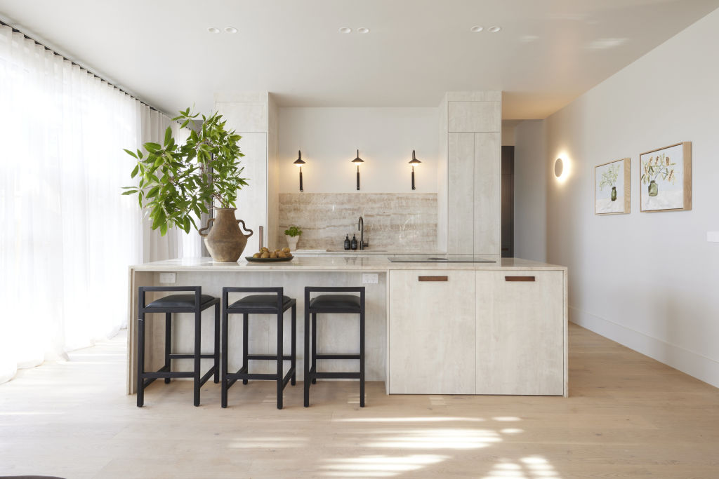
There is nothing wrong with open shelves in your kitchen if you’re a collector and curator and have cherished items you want to display, but this isn’t the case for most people.
Lots of people design open shelves into their kitchen because it looks good in home magazines. These magazines employ stylists to make those open shelves look the way they look.
Many home owners will end up with shelves that they fill with uninteresting pieces from big-box retailers for no other reason than they need to fill their shelves and the result can lead to visual clutter.
Skip the shelves. Add a beautiful wall light instead.
Interior design, styling and renovation expert Carlene Duffy first appeared on our TV screens in 2014 with husband Michael as part of Channel 9’s The Block Glasshouse and Reno Rumble.
Since then, she has been a constant on Australian screens as host of 9 Life’s Ready Set Reno, Open Homes Australia and Renovate or Rebuild.
Led by a passion for interior design, Carlene runs Cedar and Suede, a full-service interior design studio based on the Gold Coast.
We recommend
We thought you might like
States
Capital Cities
Capital Cities - Rentals
Popular Areas
Allhomes
More
