7 styling habits that you need to break right now

So you’re not a professional stylist and your home isn’t quite hitting your desired chic-spot. We asked the experts to reveal the most common styling fails and how you can successfully resolve them for an en-point home – styling credentials or not.
1. Clutter
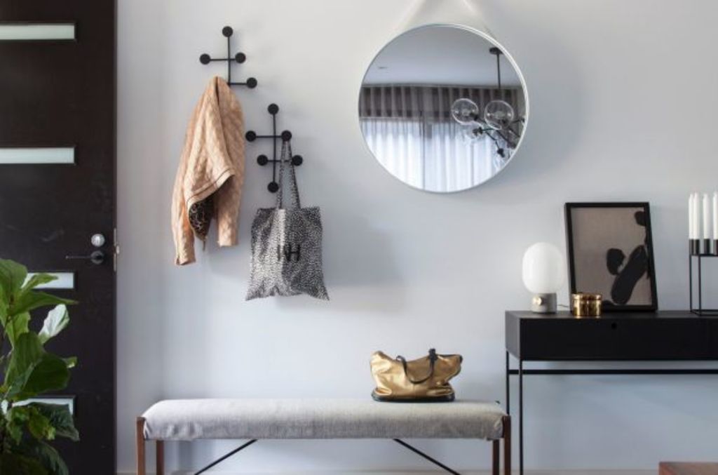
Many homes can be instantly improved by reducing excess furniture, artwork and overall clutter. “Not every wall needs artwork or a piece of furniture in front of it,” says stylist Zarina Fernandez. “Nor does every surface or tabletop need a decor item.”
Solution: “Negative space allows your eye a place to rest and gives your home room to breathe, so declutter as much as possible,” Fernandez says. “Think about your home when you are about to sell and realise, after emptying it, how amazing it looks with less in it.”
2. Too trendy
“People get carried away with the latest trend and rush out and buy without giving it context,” says interior designer Georgie Shepherd. “They forget the bones of a space should inform its styling.”
Solution: Create a mood board and let it guide the styling process. “Let it direct your colour palette and work throughout the whole space,” Shepherd says. “Decide on a key piece, like art or a rug, to pull these colours from. Gather your decor items together and have a play in the space while keeping your palette simple and restrained and add in textures and layers from here. Less is more in some situations and having a bit of restraint can make a huge difference in the end result.”
 A mood board ensures a cohesive style. Photo: Susan Papazian
3. Minuscule rug
Fernandez says when it comes to purchasing a floor rug, size matters.
“Small rugs draw the eye inward and makes a room feel smaller,” she says.
Solution: “Always ensure your furniture sits on your rug or at least the front feet of the furniture does. A large rug makes your eye look outward and makes a room feel larger.”
4. Lack of restraint
“Over or under-styling or decorating is a mistake I often see,” says stylist Jason Grant. “I like relaxed lived-in spaces that feel like home.”
Solution: Simplicity is key and less is always more. “It’s all in the edit,” Grant says. “Always show restraint! Keep things timeless and classic, and only buy what you love. Always avoid fads and passing trends.”
 Less is always more when it comes to the home. Photo: Tess Kelly
5. Losing your personal style
“I am all for outside influence, but not when it takes over your own style,” says Keyth Jackson from District. “It’s important to find the balance between learning from others and your individuality.”
Solution: Jackson suggests setting some homework for yourself that ensures your space is authentic to your own style. “Compile images and items that represent your aesthetic,” he says. “It can be a Pinterest board, scrapbook, pile of textiles, or magazine cut-outs. It should reflect you and provide a visual reference to follow.”
6. One-stop shop
“The biggest styling issue we see is spaces where all the furniture and objects are bought at the same time from the same store,” says designer Suzanne Gorman from Studio Gorman. “It makes the space feel contrived, uninspired and more often highlights a current trend that will eventually date.”
Solution: Gorman advises against playing it safe, and instead allow your home to express your personality. “Styling shouldn’t be uniform or overly planned,” she says. “Become a collector of anything you love, be it art, objects or textiles. Hard-covered coffee table books, for example, add warmth to a home and can be useful styling aids when stacked in a pile horizontally, or topped with eye-catching decor. Vary the way you display art, not only hanging on the walls but leaning on shelves too.”
 Hard-covered coffee table books help add warmth. Photo: Susan Papazian
7. Bad grouping
“I don’t like to see objects that aren’t grouped close enough together,” says creative director at Sisällä Lauren Li. “Even when they are stunning decor pieces and artwork they look disjointed when they’re not thoughtfully arranged.”
Solution: Consider height and a connecting theme between the pieces.
“Vessels, books, sculptures and plants should be grouped in a cluster to create a layered look of varying heights,” Li says. “Make sure there is a common thread with the grouping pieces. Colour or materials like glass, metal, ceramics or wood is always effective.”
We recommend
We thought you might like
States
Capital Cities
Capital Cities - Rentals
Popular Areas
Allhomes
More
- © 2025, CoStar Group Inc.


