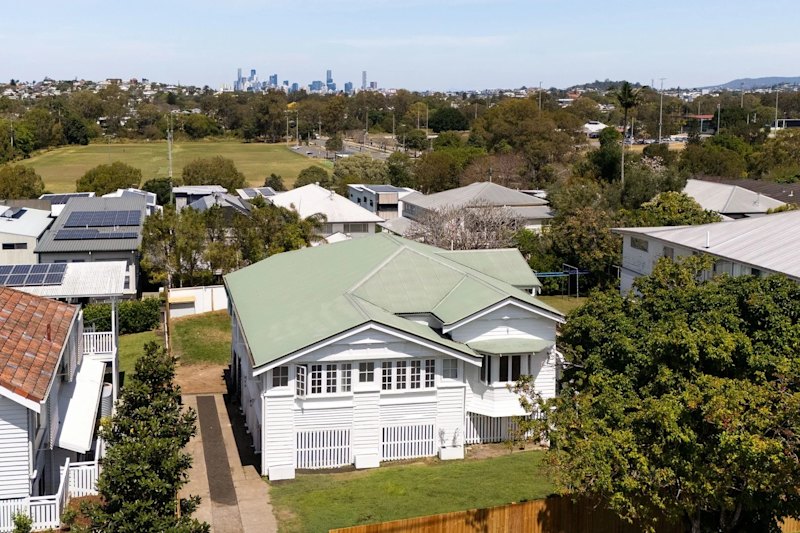
A former '80s Gold Coast display home gets a modern makeover
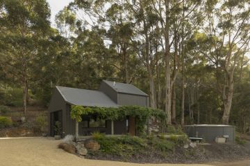
Hailing from the early 1980s, this original G.J. Gardner display home was built as Surfer’s Paradise became an international glitter strip and the Gold Coast’s skyline soared. Today, the modestly scaled Currumbin Waters home is a clever contemporary family abode.
Reimagined by Brisbane firm Nielsen Jenkins, it was lauded at the 2022 Australian Institute of Architects’ Regional Architecture Awards for its “appropriate, functional, and humble response to the brick and tile typology of the Gold Coast’s 1980s stock housing”.
Purchased over 13 years ago for just under $400,000, the owners needed more space for their young family. In a market where renovated houses on their street are now selling for almost triple this, they wanted to spend their modest budget as efficiently as possible.
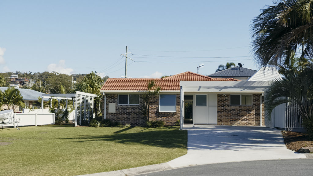
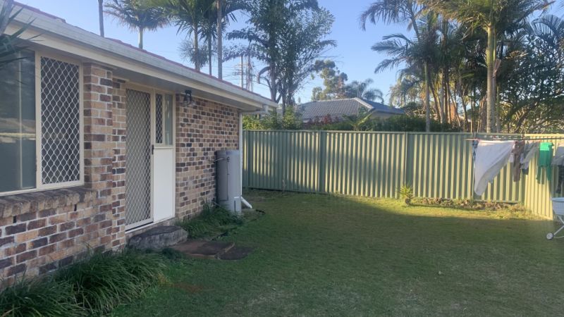
The single-story home was well maintained but poorly planned, with a carport at the side, a semi-open-planned living area, three small bedrooms, a bathroom, and laundry.
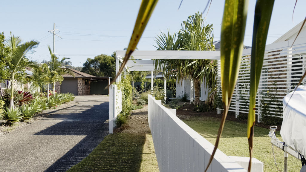
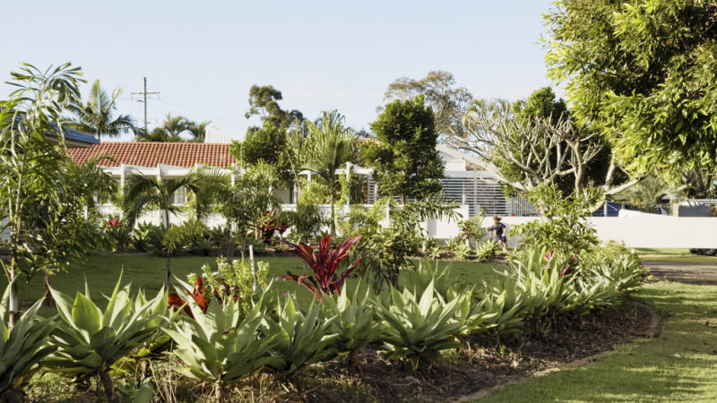
One of four homes sharing a central driveway and sited on an unusually shaped block, addressing its lack of privacy was a priority. New entry thresholds and fence lines were introduced to shield traffic and allow the family the space and privacy to enjoy their leafy north-facing courtyard. “The garden was reinstated with plants native to the area that will become dominant in time,” says architect Morgan Jenkins from Nielsen Jenkins. “We didn’t just surround the house with turf; we wanted dynamic landscaping that’s interesting but also filters in sunlight and provides privacy.”
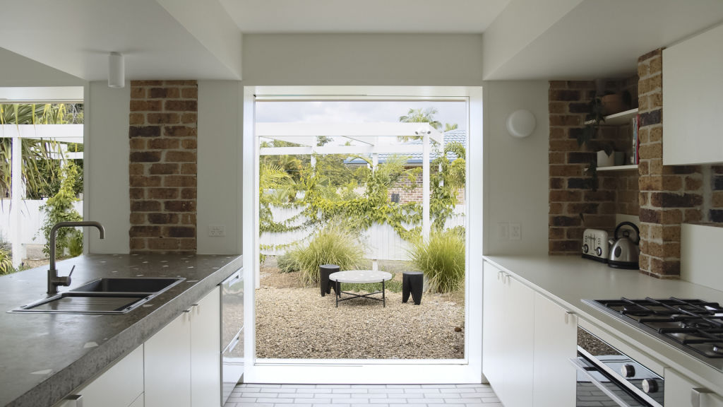
Inside, the once limited floor plan was opened up and reconfigured to create a sense of space and make the garden feel like a part of the home.
To get a spatially accurate idea of what their budget could stretch to, floor plans were roughed out. Changes included swapping the carport for a kitchen and rumpus room, relocating the laundry to allow for open north-south access, an en suite for the main bedroom, and an additional child’s bedroom. “Originally, the layout didn’t allow airflow from one side of the house to the other, but by creating openings to the east-west and north-south, the home breathes and enjoys passive ventilation all the time,” he says.
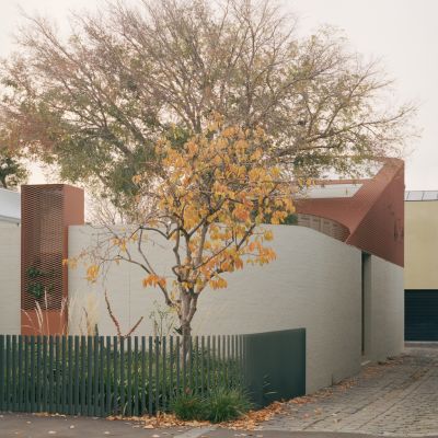
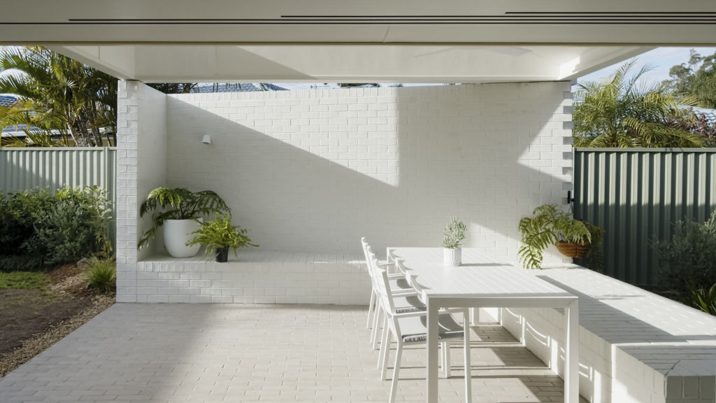
An external addition in the form of a sculptural-looking outdoor living room was made to the existing home. “It was much cheaper to build the room externally than internally as it meant we didn’t need to touch the existing roof,” he says. “The new space cantilevers over the existing roofline, capturing northern light over the top. The brick wall at the back follows the boundary’s geometry, and the new roof follows the line of the house. The two different angles draw in light and breezes and provide privacy.”
/http%3A%2F%2Fprod.static9.net.au%2Ffs%2F36fc81d9-216e-41be-a0d7-7b4a1bba637d)
/http%3A%2F%2Fprod.static9.net.au%2Ffs%2Fe927c668-2645-4d7a-ad6a-0d1e945bb5e0)
Jenkins revisited the home’s original ’80s brick veneer in a more modern fashion. “We used bricks with a sculptural, three-dimensional quality on the floors, new walls and plinths,” he says. “Unlike the existing brickwork cladding, it has mass, structure and volume.”
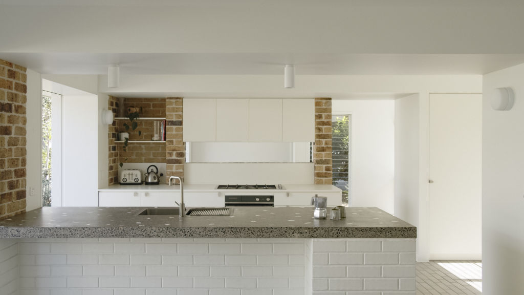
Inside, the spaces are small but feel anything but poky thanks to a pared-back design and clean light palette. A key design feature is the kitchen bench crafted by Five Mile Radius, which is made of the excess concrete pour, smashed leftover bricks and white tile samples.
The result is a home with top design cred that proves astute architecture can deliver, even on a limited budget. “Many wouldn’t have taken on this project or demolished and built again,” says Jenkins. “It just goes to show you can transform a home efficiently and economically.”
How to make an ’80s brick home contemporary
Prioritise your renovation budget. Instead of spending it on fancy cabinetry, fixtures and fittings, use it on openings like doors and windows that provide natural light and ventilation throughout.
Outside, use cheap simple materials cleverly. Install fence palings or paint old bricks white, then grow lush green plants over the top of them.
Open the house up to the garden for plenty of natural light, breezes and a verdant outlook.
Keep the spaces strong and simple, adding interest with robust materials like brick, timber and concrete.
Old homes have the potential to feel dark and heavy, especially small cellular spaces with low ceilings. Keep things light and bright by using a clean, crisp colour palette.
Sliding doors look generous but don’t work passively when locked up. Pair with banks of louvres on either side so that even when the house is secured, there is plenty of ventilation.
We recommend

We thought you might like
States
Capital Cities
Capital Cities - Rentals
Popular Areas
Allhomes
More
