A new angle on the old port: The home designed on a 'wonky square'

After being a Victorian-era port peopled by the working class and wharfies, Port Melbourne has some of the smallest, most oddly-shaped house blocks in the inner city.
The new three-bedroom home Anthony Chan designed to replace “a falling apart 1960s cream brick house” is on one of them. He reckons “the wonky square” warping into a triangle shape “is made up of a patchwork of the leftover backyards of other properties. It’s got all sorts of funny angles”.
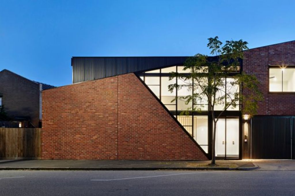
The recycled red brick, glass and Colorbond steel building he made as a replacement is doing its own interesting things with angles, especially along the 19-metre long street-front boundary.
“One of the most exciting and different projects” Chan Architecture has completed, he says it attempts to recall the industrial/residential nature of the structural boundary road on which it sits.
“We tried to reference the red-brick, saw-toothed warehouse look,” he says, and, with part of the steel-clad square poking above the facade on the second floor, “it also has the shipping container profile that you see in parts of this suburb”.
The charcoal wedge – or “the peeled away section of the facade” – is made up of a darkly perforated screen that sits in front of the two-level insertion of clear glass that surprisingly, considering its veiling effect, “filters light like sunglasses but still allows an interesting view out, especially in the morning”.
The stairwell immediately behind it in the entry/circulation space introduces an experience of soaring head height that lowers in the narrow, darker hallway that then steps through to the ground level living areas. With 3.8-metre high ceilings, “the kitchen, dining and family room then really opens up as one big space”.
- Related: Inside the home of artist Rachel Castle
- Related: The importance of place in architecture
- Related: The trends taking over Australia’s gardens
As “striking” as it is from the street, and as crisply simple as it is throughout the interiors, Chan believes “the main event” is the 45-square-metre courtyard. “The house was all designed around getting light into the courtyard.”
The fitout that includes the charcoal-veneered and white kitchen under a long skylight is refined, almost recessive. “The clients didn’t want any brassy statements.”
But to the street it takes on its other identity that is “all character and texture”, Chan says.
As he acknowledges, there were many benefits to working in with such a strange starter block. The biggest one was “that you don’t have many chances in the inner city to have this much fun”.
See more incredible projects from Australia’s most talented architects at Domain Living.
We recommend
We thought you might like
States
Capital Cities
Capital Cities - Rentals
Popular Areas
Allhomes
More


