Afraid of the dark? Get black interiors right with these 5 expert tips
In fashion the colour black is almost like oxygen to humanity – a non-negotiable. A quick survey of your wardrobe and you’re sure to find at least one pair of black shoes, black pants or a little black dress that have become staples of your everyday style.
We’re so quick to lean on this always chic colour, but in interiors we can feel a little shy. How much is too much and how much is not enough?
Black interiors, while not new, are having a resurgence and peaking everywhere from this season of The Block (Kylie and Brad, we’re looking at you) to maybe even your own living room.
Two people who know how to strike the perfect balance when it comes to moody interior tones are Mim Design principal Miriam Fanning, and Splinter Society Architecture co-founder Chris Stanley.
“When black is incorporated with intention, it has the ability to enhance depth within an interior setting,” Fanning says. “It offers balance, immersion, and a good amount of theatre as well.”
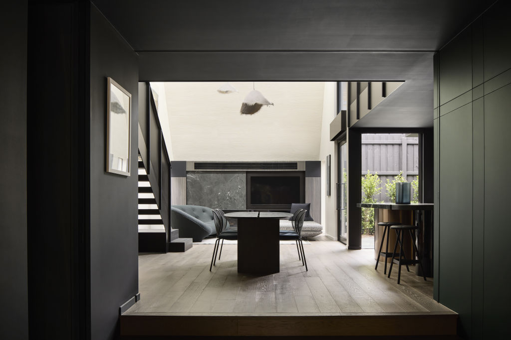
Speaking of theatre, darker tones take centre stage in Mim Design’s St Ninians project.
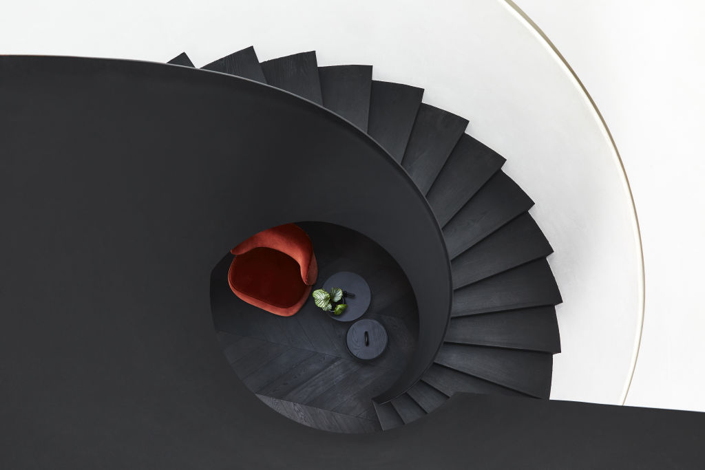
The colour was specified to “create an atmosphere that enhances a subliminal mood” and used to define key elements throughout the home including kitchen joinery, integrated cabinetry, circular staircase, black timber-lined ceiling, steel joinery and den retreat.
The immersion of black results in an ultimately relaxed atmosphere and contributes to what Fanning describes as a “peaceful space for a moment of respite”.

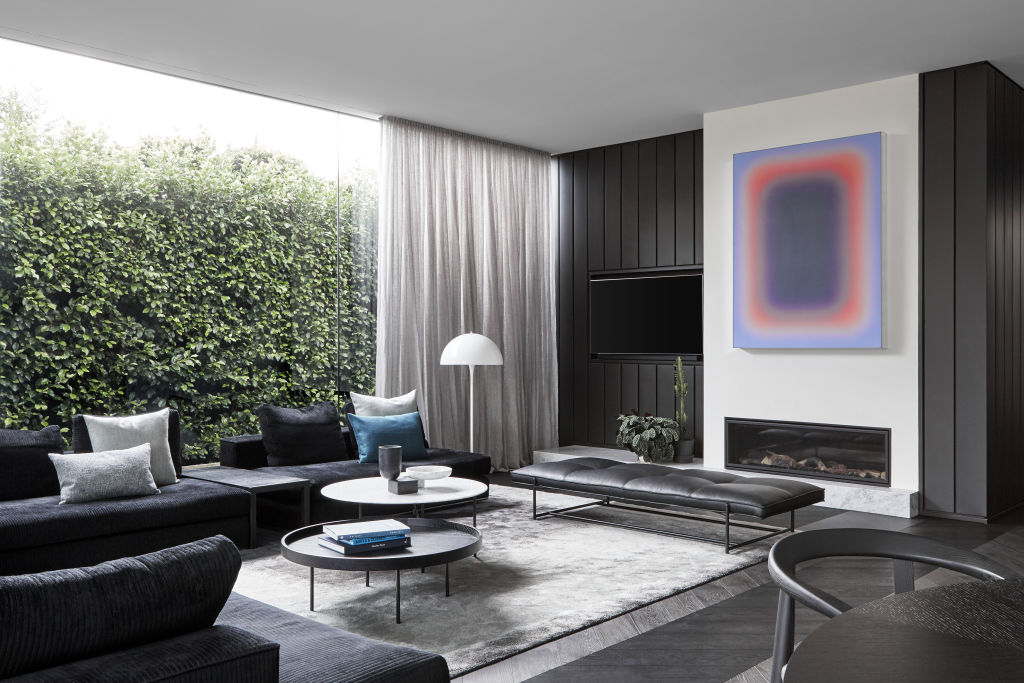
Black and darker tones were also used to create an ambient environment in Hotel House by Splinter Society Architecture, where the client brief was to capture the feeling of a boutique hotel at home.
While the project embraces moodier tones, there’s a lightness within. Stanley attributes this to “a balance of light and shade” and the use of darker tones that extend beyond pure black to create depth to the space.
“Using layers of black textures allows us to create a moody feel,” Stanley says. “We can then focus on light – both natural and artificial – and material highlights where we want attention to be focused.”
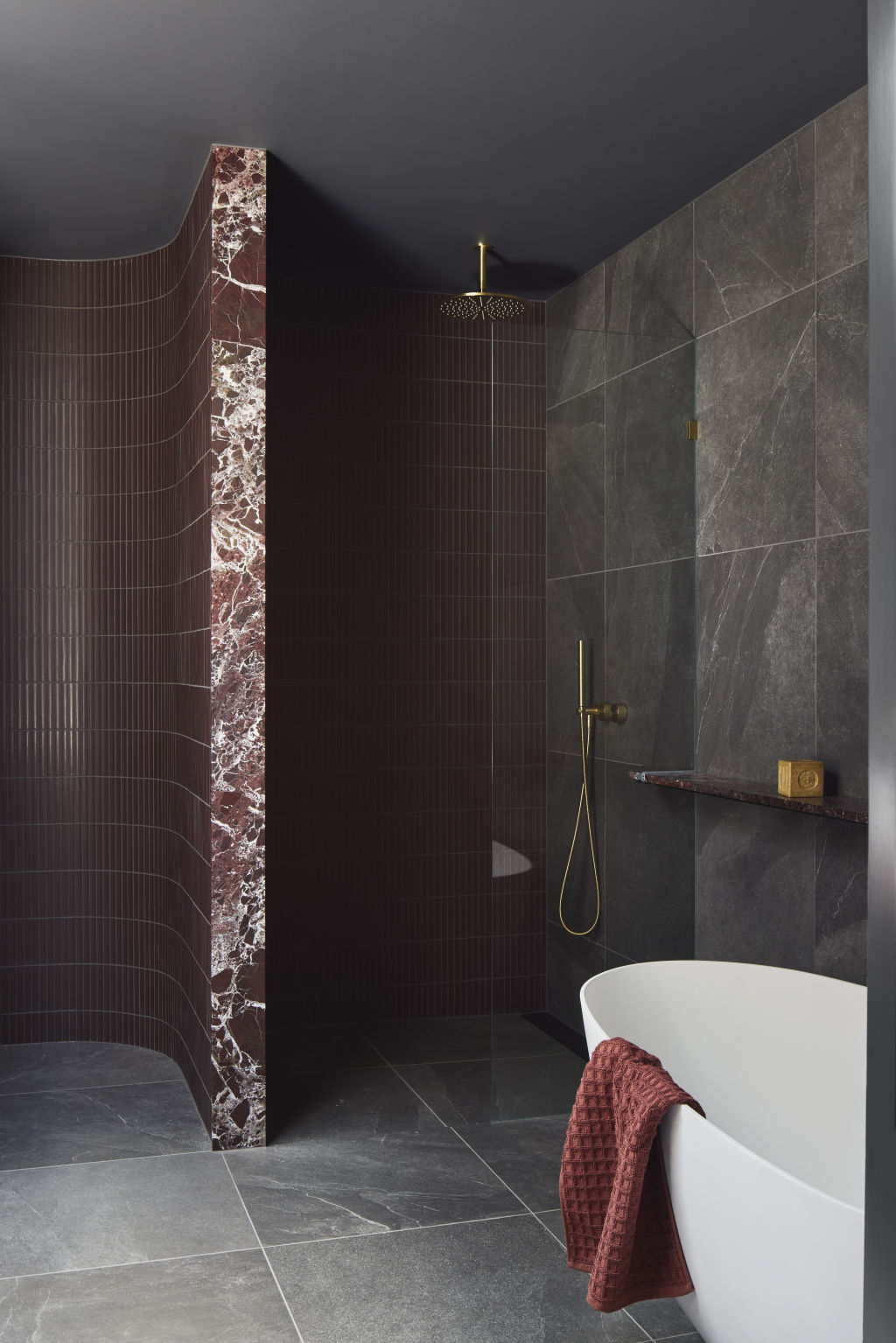
In Hotel House, dark shades, tones and textures work together across dark timber veneers, stones, perforated metals (which invite natural light to pour in) and a variety of steel detailing to ensure the moody palette feels equally decadent and uplifting.
“By combining multiple textures in dark colours you can create complexity and sophistication without an overbearing sense of dark,” Stanley says.
“Often our heavily dark projects feature a lot of light – this allows for a strong moody feel, while still being highly functional and liveable.”
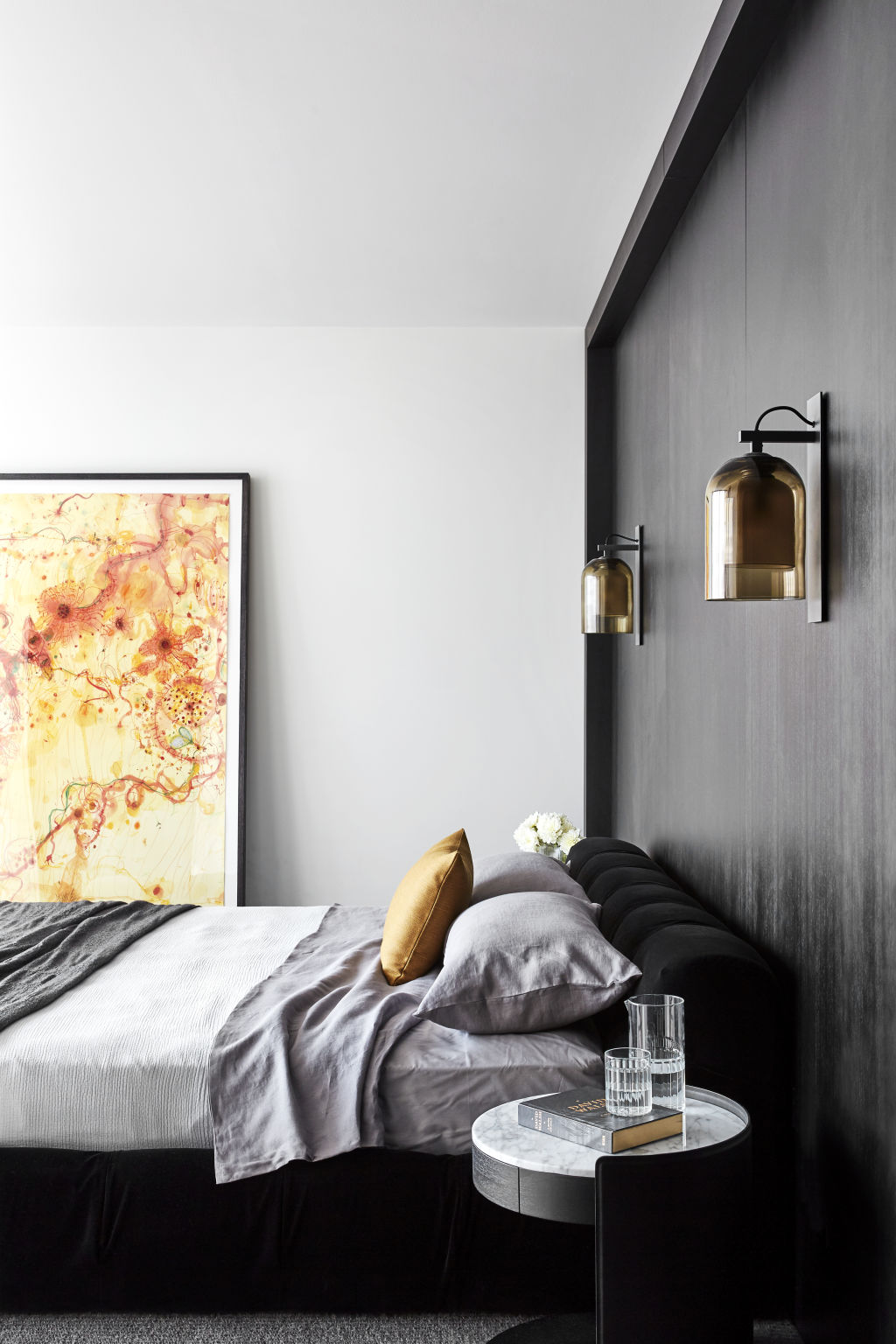
Both Stanley and Fanning agree balance is key when working with black and moodier tones.
“Gone are the days of black and white interiors,” Fanning says. “It’s necessary to understand how to soften shades to deliver the desired result.”
Similarly, Stanley also highlights the “benefit and richness you get from layering dark tones and textures rather than ‘just paint it’ black”.
As for what to avoid? “Black against clean white or any material or colour that is so heavily contrasted that the black would feel harsh alongside it,” Fanning says.
The 5 best ways to use black in the home
- Black, when used alone, can make a space feel dark and uninviting. To soften its usage, pair black with complementary darker tones to add depth and warmth within a space.
- Play with light and shade. Use black in spaces where there’s lots of natural light – the kitchen and living room are good places to start.
- Avoid using black against stark whites or high-contrast colours that will make it appear harsh and flat.
- Use black to define key elements in the home, such as kitchen joinery, cabinetry and steel joinery.
- Layer black (and darker tones) with mixed materials like timber, steel and marble to embrace the richness of the colour without overpowering a space.


We recommend


We thought you might like


States
Capital Cities
Capital Cities - Rentals
Popular Areas
Allhomes
More
