An apartment to call home: Transforming a small space through simple design decisions
Author: Vanessa Walker on Houzz
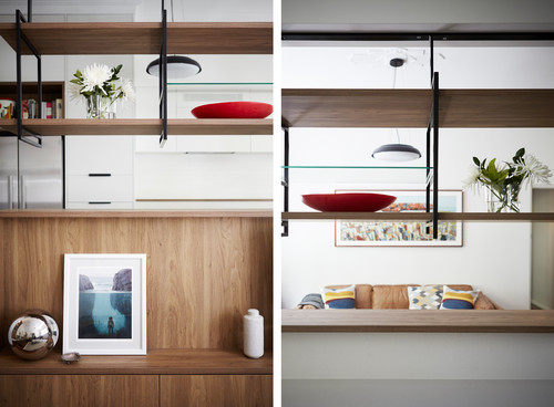
Attractive joinery inclusions and a slight floor plan change have a fantastic flow-on effect in this modestly-sized flat in Sydney.
Who lives here: Ben and Sally Johnson and their four-year-old son
Location: Ashfield, NSW
Brief
Our aim was to provide a greater sense of family living in our small space, and to create something akin to a home rather than an apartment. We wanted to rethink the planning of the existing separate entry hallway, kitchen and living room in a way that would enable conversation and interaction to carry on between the spaces.
Lightening the room while enhancing its mid-century character by reinstating features removed in a previous renovation was important, as was improving functionality and storage while maximising floor space.
Starting point
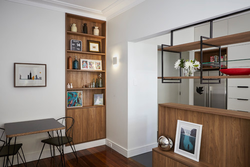
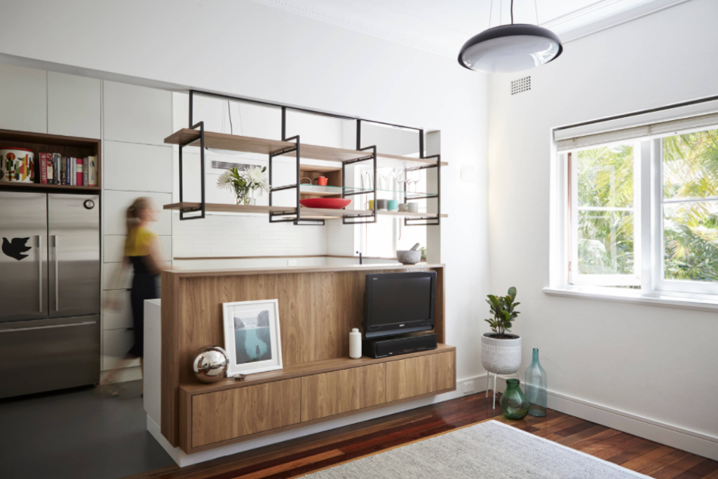
The idea central to all of the changes was to create a more open-plan living and kitchen area that would benefit both spaces. We didn’t want to do this and lose the charm of the old unit, so we limited our colour palette and designed simple joinery that would complement the existing features.
Key aspects
Colour palette: The walls and joinery are in Dulux “Whisper White”. The original hardwood floor in the living area was retained. The kitchen floor was painted with a Dulux epoxy in “Lead Grey”. Joinery hardware, tapware and other steelwork are all finished in matt black.
Budget is a challenge in any renovation, but we were fortunate to be able to draw upon our experience and contacts to control costs. We also did a lot of the work ourselves, which was both challenging and rewarding. Working with a family friend to build and install the joinery was an eye opener and taught us how important a straight and square room is (which none of ours were).
Why do you think this room works?
The renovation has made a huge improvement to the space and the way we use it. Being able to work in the kitchen and see through to the living and dining areas is probably the biggest benefit. However, one of our favourite changes has been the closing off and rearranging of the entry hall. Not only do we get a (small) laundry, we also get an entry space. And we lost the gun-barrel view through to our bedroom, and created a dining space with recessed wall shelving.
We recommend
We thought you might like
States
Capital Cities
Capital Cities - Rentals
Popular Areas
Allhomes
More

