Architecture experts explain why Australians are conservative with colour
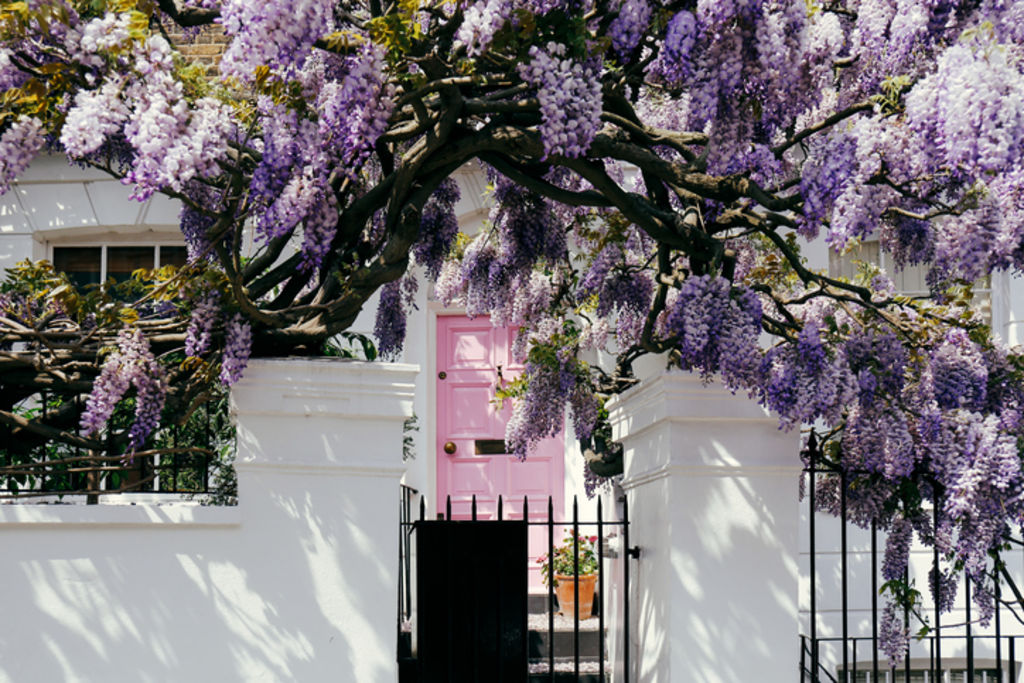
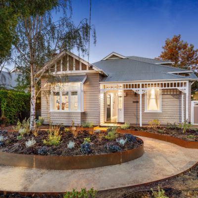
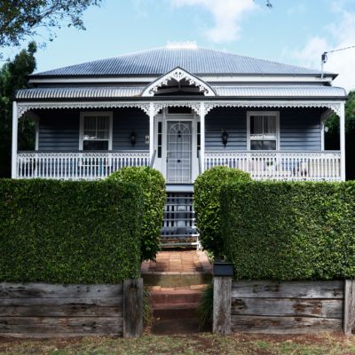
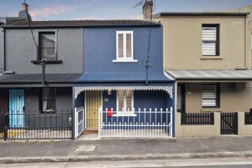
Australian homes are, by and large, conservative in nature. In many places around the world you can find entire neighbourhoods full of buildings painted in bold colours, but Australian homes tend to stick to a predominately neutral palette.
Architecture experts say the reasons for this conservatism is due to Australia’s residential architectural heritage, which is largely derived from Britain. The construction methods and materials used to build the country’s oldest homes in particular weren’t conducive to using colour.
“Some of the really brightly covered architecture that we see in parts of the Middle East and into Spain are often connected with Islamic traditions, where they’re using ceramic tiles on buildings and you’ll get colour in the tiles,” says Dr Stuart King, senior lecturer in architectural design and history at the University of Melbourne. “You get certain construction techniques there that have embedded opportunities for colour.”
Hear from the Australians taking grown-up gap years on Somewhere Else:
Another potential reason for Australia’s limited use of colour is because of the sheer value of property here, which experts say can stifle design creativity.
“I think people are perhaps a bit self-conscious about using colour and they’re trying to keep a kind of broad appeal to their architecture,” King says.
This sentiment is echoed by professor Andrew Leach, associate dean research in the School of Architecture, Design and Planning at the University of Sydney who noted, “The same can be said almost anywhere where the house is a major investment, and when its value is determined, in part, by the value of a neighbourhood.”
King says Australian architecture does feature some colour, albeit in more muted forms.
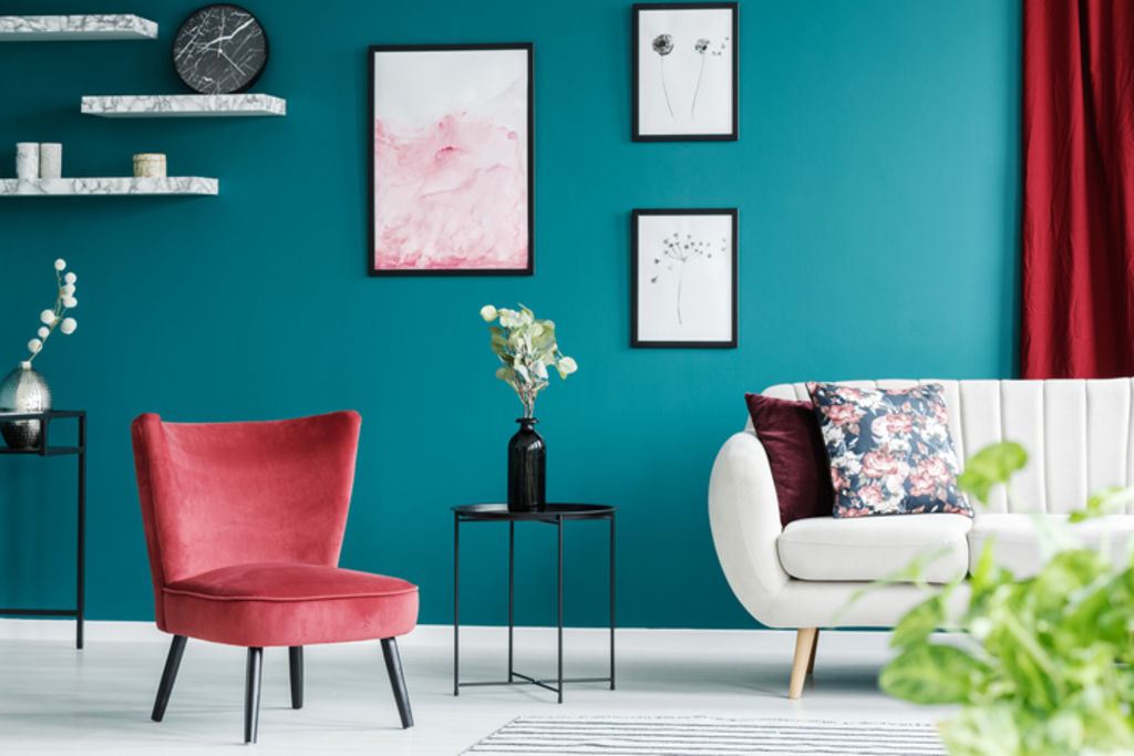
“In the mid-19th century, when we started to develop machine-made bricks and better firing processes, we had architects who were producing multicoloured brick buildings. It’s not those bright exotic colours, but you’d have some reds and browns and greens being used,” King says. “I think that’s part of our colour tradition, and that’s some of the local uses of colour that we perhaps don’t see today.”
Federation homes from 1890 to 1915 with their red brickwork, terracotta roofs, white trims and coloured glass also showcase this more subtle use of colour.
“I think we do actually have quite colourful architecture that perhaps we overlook if we only think about colour in terms of exotic colours, and that use of colour is actually embedded in the materials of the building,” says King.
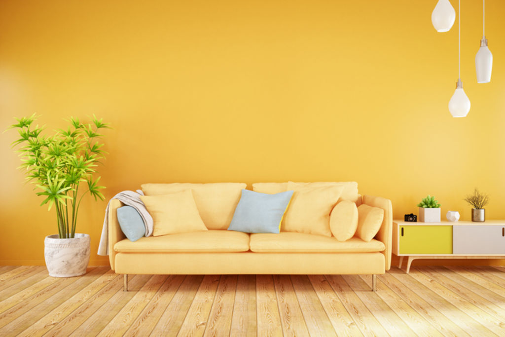
A similarly understated yet distinct use of colour can be seen in many Australian homes built from the 1960s to 1980s featuring dark coloured bricks and timber.
“Although we don’t think of them as colourful buildings, there are perhaps attempts here to connect houses to their environments and to the Australian bush,” says King.
When looking at places around the world known for their distinctly colourful homes (such as Cinque Terre in Italy, Santorini, Havana, Chefchaouen in Morocco, La Boca in Buenos Aires, Guanajuato in Mexico, Bo-Kaap in Cape Town, and high-rise buildings in Hong Kong), these are dense environments or made up of terraces constructed from the same materiality – not standalone houses.
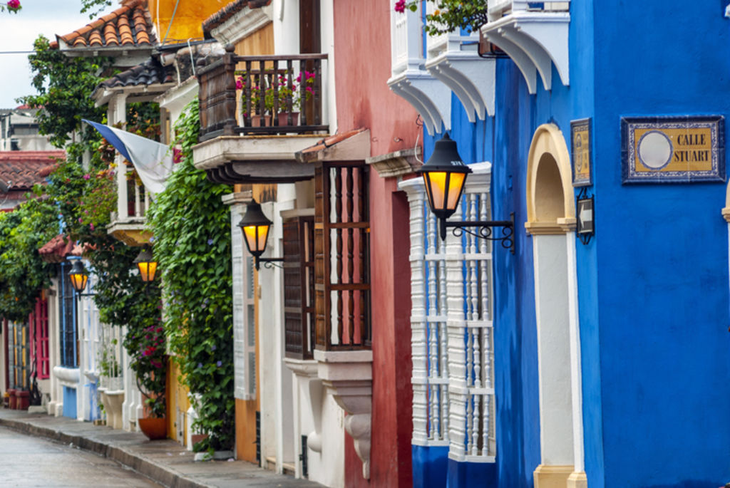
“In the Mediterranean, houses tend to be finished in the same materiality, and so colour is a way to differentiate one house from another,” says Leach. “Some towns still mandate the colour range an owner can paint their house, it’s just that this derives from an idea of ‘tradition’ that is just as conservative in expression as our houses.”
The lack of uniform housing style in Australia enables home owners to express themselves in ways beyond colour. “Much of our housing is recent, and our predominant model of housing is the standalone house. That immediately provides opportunity for people to have some individual expression of architecture, as opposed to say more dense urban environments, which are mostly apartment buildings and high-density housing,” says King.
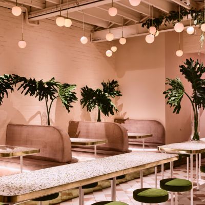
As Australia’s capital cities move to feature more high-rise buildings, it is likely that an increasing number of colourful buildings will be developed as a means of differentiation.
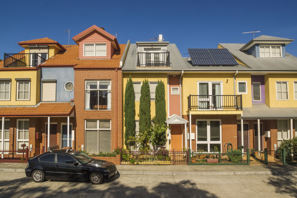
“Over recent years we’re seeing some quite bright colours – purples and greens and pinks in high-rise towers if you have a look in inner-city Melbourne at the moment,” King says.
This change has been occurring in buildings such as The Icon (aka the Lego building) designed by Jackson Clements Burrows, Light House by Elenberg Fraser, and the Bouverie Street Apartments on the former Carlton & United brewery site.
We recommend
We thought you might like
States
Capital Cities
Capital Cities - Rentals
Popular Areas
Allhomes
More
- © 2025, CoStar Group Inc.
