'Architecture doesn't need to be boring': Are we taking home design too seriously?

There’s enough serious stuff going on in the world to make us see our homes as a sanctuary, a place where we can retreat and chill out.
But why do we have to take architecture and home interiors so seriously? Many of us seem more intent on designing to please potential buyers rather than ourselves, resulting in predictable, conservative architecture and interiors.
That could be changing, however.
The Supreme Award winner in this year’s ADNZ | Resene Architectural Designer Awards, announced last weekend, was a family bach by architect Cymon Allfrey, which won precisely because it didn’t take itself too seriously.
Judge and award-winning architect, Mitchell Coll of Coll Architecture says Allfrey’s family bach in Hanmer Springs is a fun design, not just in its aesthetic but also the way it encourages play.
“The architecture deliberately challenges our understanding of a dwelling,” he says. “Three hovering buildings drawn together around a recessed patio and timber decks establish a familiar sense of a ‘campsite’. Two larger spaces project the idea that these could be tents; one for kids and one for parents. The smaller tower structure contains a store and sleep out joined to the patio.
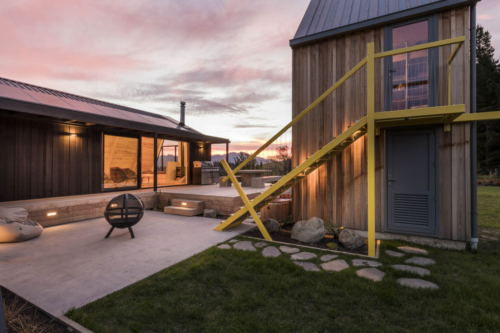
“Cymon has incorporated many playful design elements that make this bach special, whether it is the campsite feeling the bach inspires or the fun details, like the handrail that extends out to become a swing. Architecture doesn’t need to be boring; it should be art.”
Coll has some clear ideas about how to achieve a sense of playfulness, and they start with “leave your preconceived ideas at the door”. He also says timber and bold colour are fun elements – in the family bach there are strong pops of bright yellow.
It’s also important to forget about “resale value”. Rather, design your home for yourselves.
“Good design done well is going to appeal to people. Be yourself, don’t worry about the next person. Not everyone has to love it. I always say to my clients that you are better to have just 10 per cent of people who absolutely fall head over heels for your home, than 100 per cent who think it’s just nice. You want to really love your home. That is important.”
The benefits of a playful approach also apply to interiors and designers have been doing this for decades. Think Arne Jacobsen’s “Egg” chair and Salvador Dali’s Mae West-inspired “Lips” sofa. Even Philippe Starck’s Louis Ghost chair for Kartell is an exercise in fun.
“The Family Bach” has been furnished less expensively, using objects that have been found and loved – this is a retreat that has been crafted for memory making.
“Cymon Allfrey has spent many hours carefully selecting his interior details,” says Coll. “Hunting out individual items that add character and individuality to the interiors can really elevate a design. Cymon has mastered this in his bach project.”
Another couple who have mastered the art is Kim Rutter and David Roche. Aficionados of the mid-century modern stye, their house is testament to their creativity.
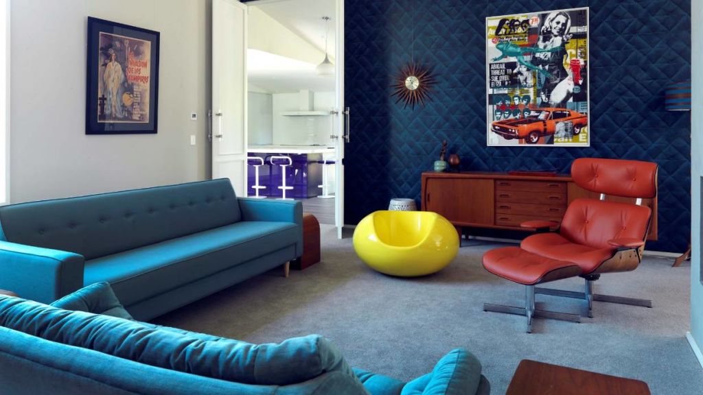
The living room is a medley of mid-century and 1970s memorabilia with its turquoise velvet sofa, yellow bubble chair, orange knock-off Eames recliner and gold sunburst clock. And there’s a giant-sized wallpaper mural of Tretchikoff’s Lady from Orient in the hallway.
“The builder walked in and said, ‘This looks like my gran’s house, and I don’t mean that in a good way,'” says Rutter.
Put that down to the family design philosophy: “It’s no good if it doesn’t make you smile.”
Evie Kemp is another fan of bold colour and quirky interiors. The designer has painted her hallway pink, and created a very eclectic interior.
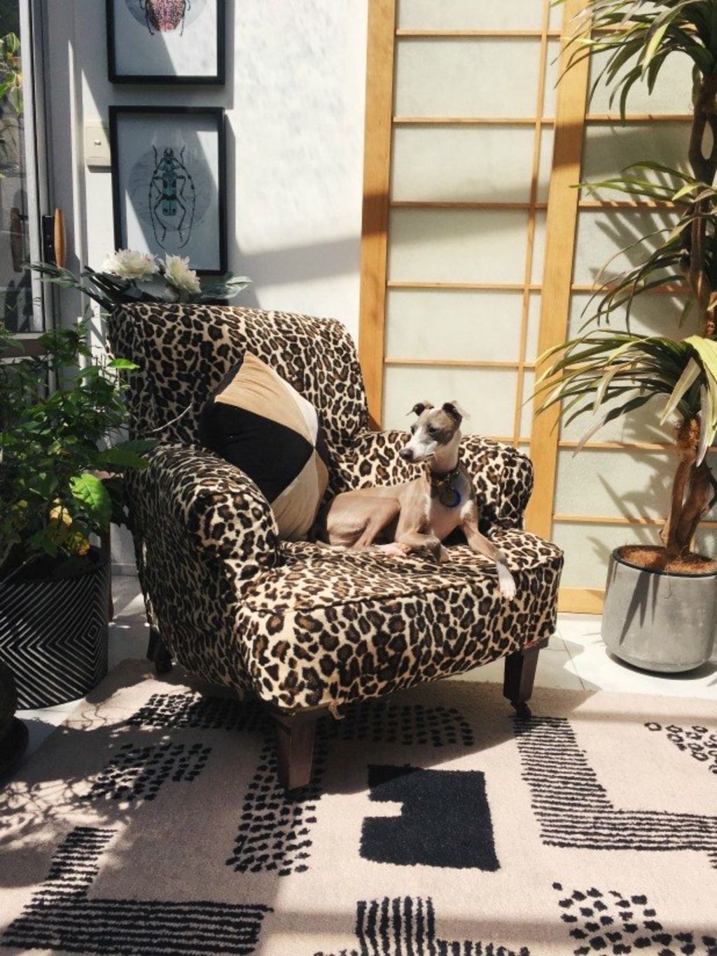
“Furniture is my Achilles heel,” Kemp says. “I’m incredibly passionate about it, but if I had to choose just one piece, it would probably be my leopard-print chair – my grandma recovered it for my mum and it was always in our house, until I finally convinced her to part with it. It’s really symbolic of my family and these talented and unique women I was brought up by.”
All these homes are different – there’s an underlying sense of fun that makes them truly memorable.
And let’s face it. This approach beats a house filled with “neutrals” and wall-to-wall carpet any day.
– This originally appeared on Stuff
We recommend
We thought you might like
States
Capital Cities
Capital Cities - Rentals
Popular Areas
Allhomes
More
