Bay Builds: Kyal and Kara reveal bedrooms, bathrooms and home offices
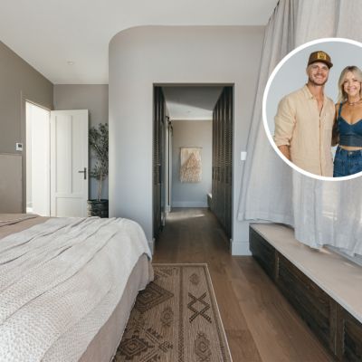
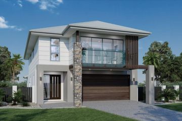
Episode one of Block stars Kyal and Kara Demmrich’s latest property adventure, Bay Builds, saw the couple tackle the spacious main bedrooms, walk-in wardrobes and en suite bathrooms in two mirror-image new builds on the NSW Central Coast.
This week, the additional bedrooms, main bathrooms and home offices are in the spotlight.
The French-inspired aesthetic is continued in House One, where grand-scale 1200-millimetre by 1200-millimetre rock salt tiles span the walls and floor in the main bathroom and are paired with elegant travertine feature tiles.
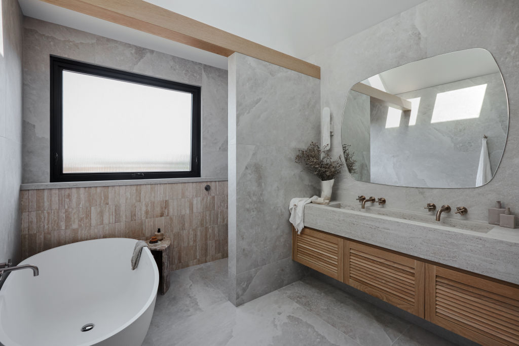
Twin sets of champagne-hued tapware service the wide, integrated basin made from a single slab of Dekton in a travertine-look finish. A large, white stone bath anchors the room and a fluted glass window casts plenty of natural light.
The main bathroom in House Two goes bold, with a black stone bathtub and toilet – something Kyal and Kara have never done before.
“I was a bit nervous about the black bath going in but now I can’t imagine anything else there,” says Kara. “We have a black toilet in the downstairs powder room, so I was like, ‘Okay if I’m going to do a black toilet down there, I have to run with that through the rest of the house.’”
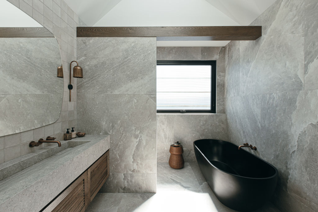
House Two’s main bathroom also boasts large-scale tiles and travertine detail in a darker hue and a custom-built Dekton basin with twin copper-toned tapware. The integrated basins in each bathroom come with custom American oak cabinet doors – a splurge that was well worth it, says Kara.
“The Dekton is such a beautiful material, when you run your hand along it, it’s got texture as if it were a natural stone, but you don’t have the maintenance of a natural stone.”
Opting for custom-made pieces doesn’t always mean blowing the budget, though; the made-to-order mirrors proved to be a smart saving.
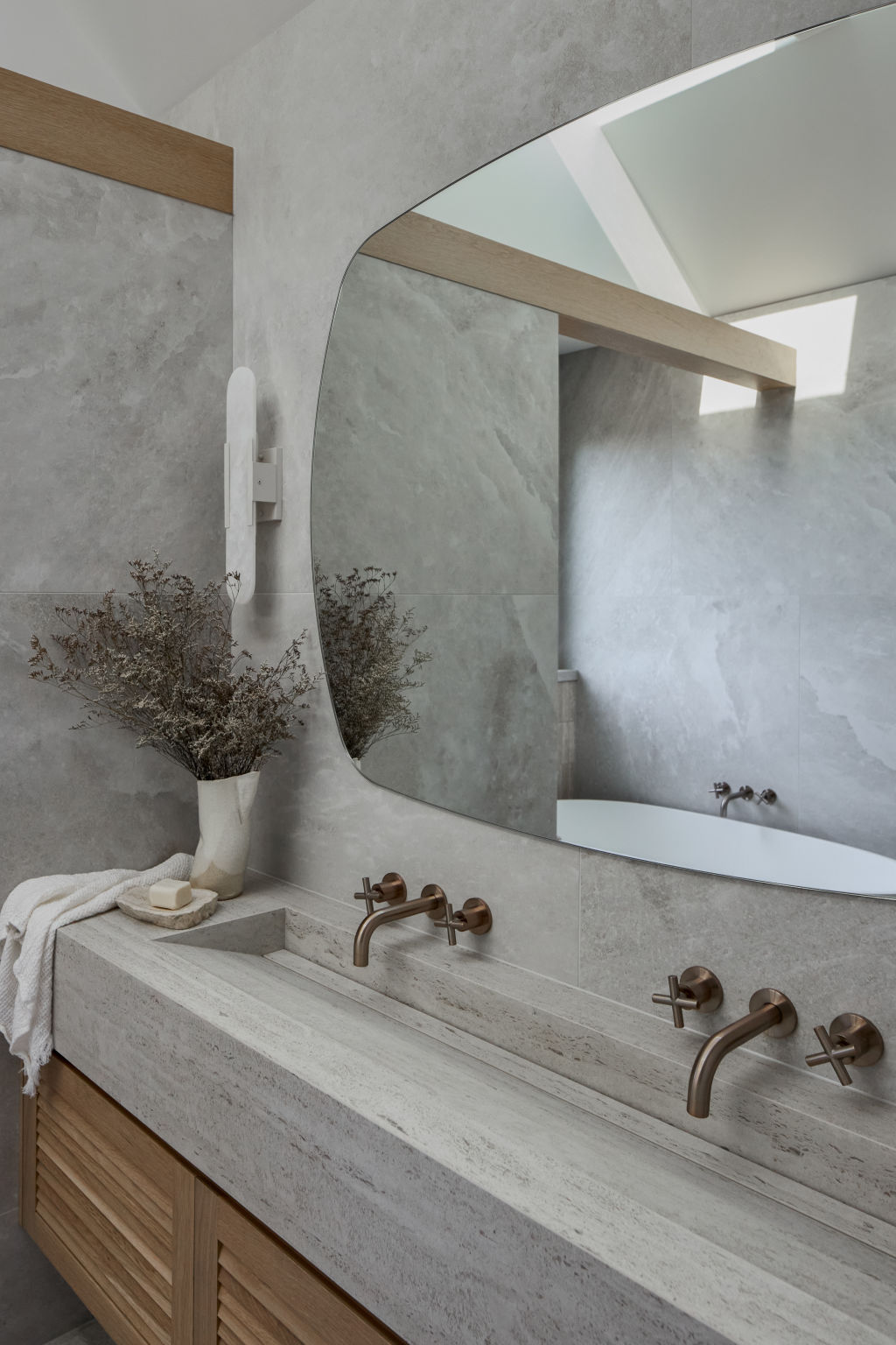
Kara says: “I knew a frameless mirror would be timeless and not take away from the vanity but I couldn’t find a shape I liked. I mocked up what I wanted on a sketch for our glass supplier to make and it ended up being a cheaper option than any other off-the-shelf mirrors of that size.”
In the bedrooms, bold colour is on display thanks to the clever use of paint and accessories.
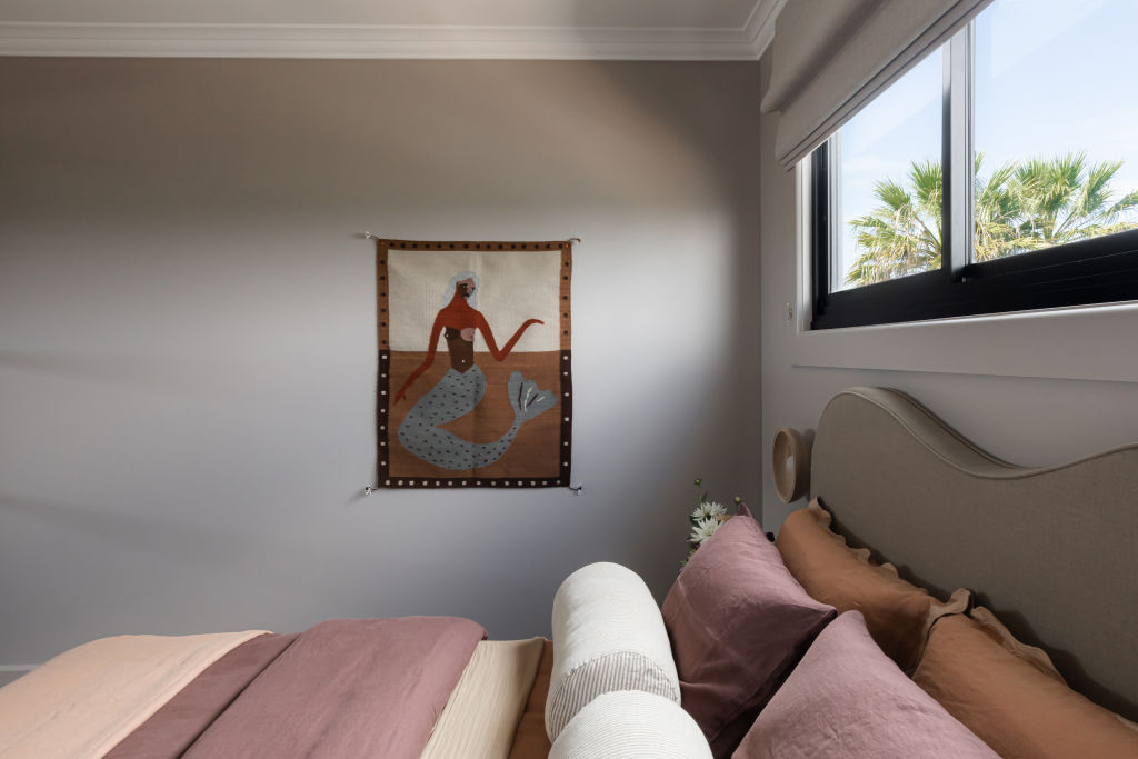
“Sometimes, I worry that they’re too bold but then I think, ‘Go bold or go home,’” says Kara. “You have to own your decisions and create a room that you love and that is going to leave a lasting impression.”
Paint is the most risk-averse way to make a statement, according to Kara. “It’s the most cost-effective change you can make, so if [a buyer] walks through that whole house and the only thing they say is, ‘Oh that middle bedroom’s a bit dark for me’, then that’s easy [to change].
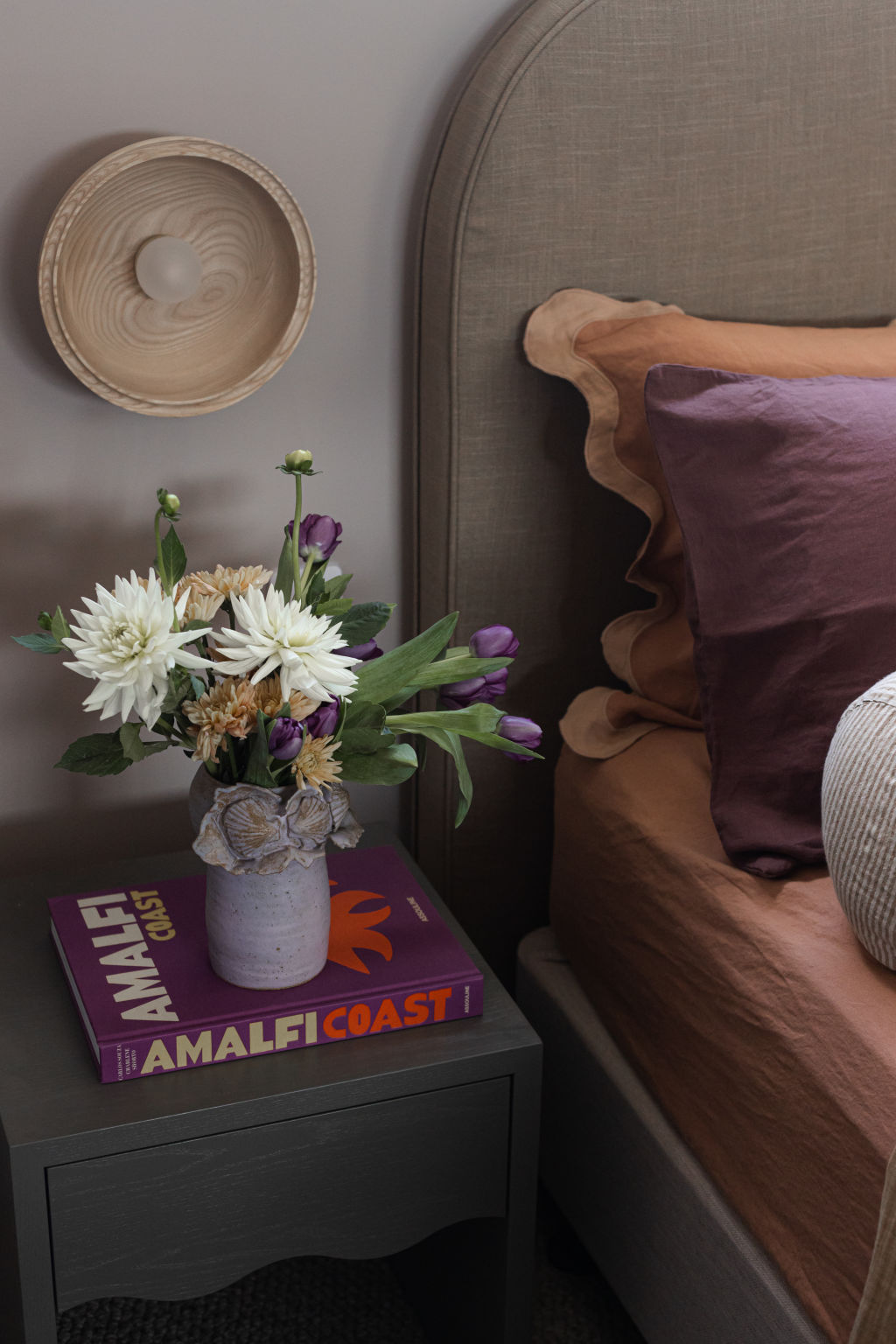
If you’re having trouble landing on a certain feel for a room makeover, Kara suggests taking inspiration from something that resonates with your personal style. “It’s a really nice way to create a house that’s truly you.”
In House One’s bedroom, this inspiration came from a lilac-hued vase, but Kara says you don’t have to be restricted to homewares, “it could be a t-shirt or anything. Just pick something you love and base your room on that and you will create something unique”.
Maroon and peach tones play off the lilac vase, and organic textures are tied in through linen bedding and timber accessories.
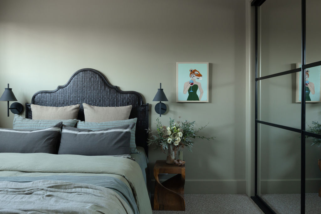
House Two’s bedroom is more moody, with its olive tones, dark bedhead and wall sconces. The bold, black steel detailing on the wardrobe door is a cohesive element used to tie in with the upstairs spaces and home office.
“We’ve never done a built-in door like this before. We have the office doors at the end of the hallway which are a steel-look timber door and it just made sense to me [to mirror those details].”
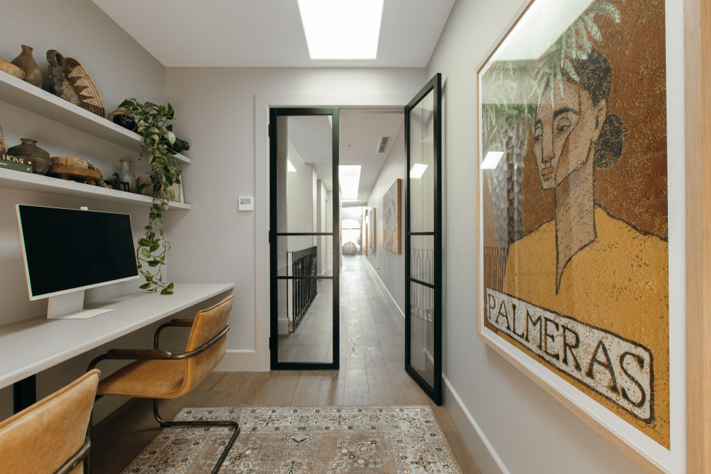
Doors weren’t always planned for the home offices, but once the rooms began to take shape, Kyal says they realised it was “important that we had doors on the office.
“When you’re on a Zoom call or an important meeting, you don’t want to be able to hear your kids yelling out that they want more Vegemite toast.”
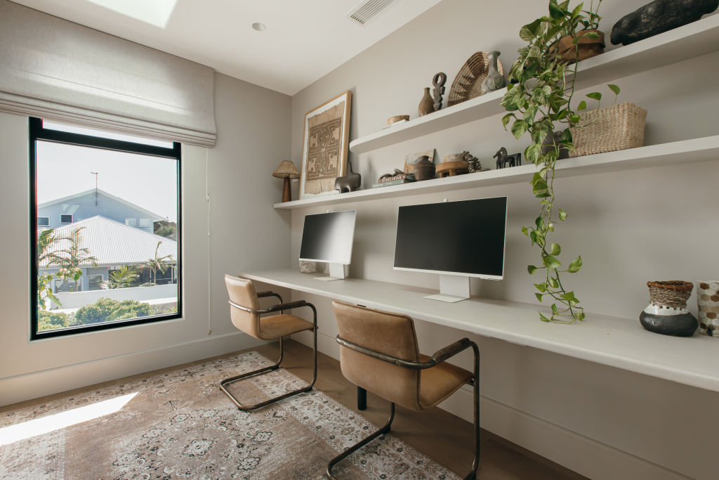
Kyal and Kara say the offices are a great example of embracing building variations or tweaking plans as you go. The spaces were originally designed as nooks but evolved into rooms in their own right as the build came together. Kara says that now, “they’re such a good size, you could even put an armchair in the corner.”
These spacious home offices are the perfect work-from-home spaces, featuring large skylights and windows that drench the rooms in natural light.
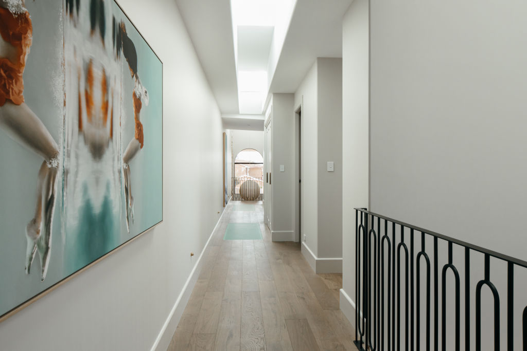
Skylights have been used cleverly throughout the homes. Consisting of three layers of reinforced glass sandwiched together, these innovative additions were laid into the floor along the hallways and ensure natural light is maximised throughout the houses.
Kara says, “The aqua colour of the glass wasn’t the anticipated outcome but I used the artwork in the hallway to help tie that in.”
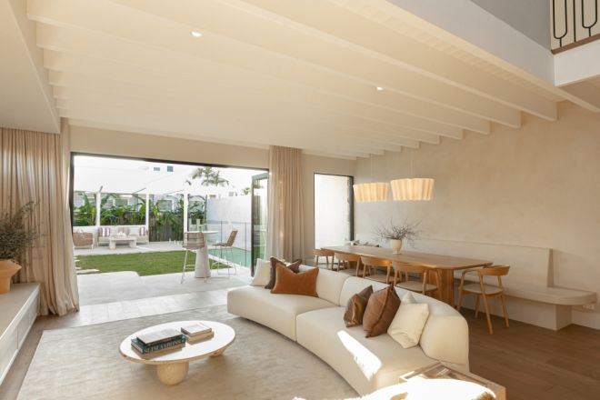
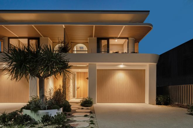
Bay Builds is Kyal and Kara’s latest property series, with new episodes and room reveals dropping weekly. We’ll be covering every room reveal and you can watch the episodes here.
We recommend
We thought you might like
States
Capital Cities
Capital Cities - Rentals
Popular Areas
Allhomes
More
