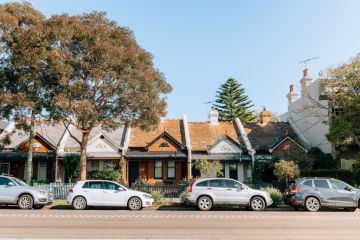
Before and after: The curious case of the recycled casa, a 1970s brick house redeemed
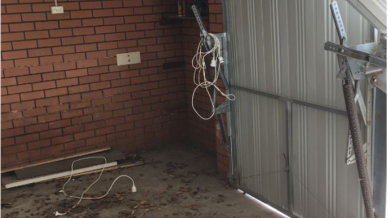
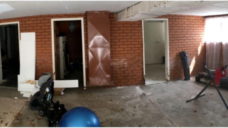
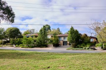
Ugly? … Let’s suggest that if you saw the before picture of the Elsternwick 1970s brick house you might have swiped left.
“Terrible place, badly planned,” says Melbourne architect George Yiontis, who nevertheless talked the owners out of completely deconstructing it.
While the three-bedder with a sunken garage “had a lot of things wrong with it”, he saw scope to redeem it as a thoroughly contemporary family home.
The owners, he says, “were open to demolishing and rebuilding but didn’t have a huge budget”.
What that meant, Yiontis says, “was that they’d get a nice house but it would be a lightweight house. It wouldn’t have the solidity of this build which was an ugly duckling but was double brick. It was solid.”
With some shrewd spatial rejuggling and two main moves – more deeply excavating the garage and reworking it as the living/dining/kitchen with direct access to sunlight and a grassy front yard, and bumping out a new steel-clad and “dramatic” entry and stairway foyer – Coy Yiontis Architects made an exponentially better residence while conserving, Yiontis estimates, “roughly 95 per cent of the original”.
Saving the structure was praiseworthy, first for environmental reasons with just under half of the nation’s waste stream coming from demolition and construction, and “because the clients got a lot more house for their money”.
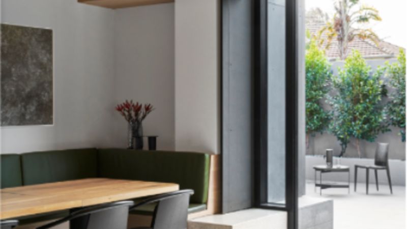
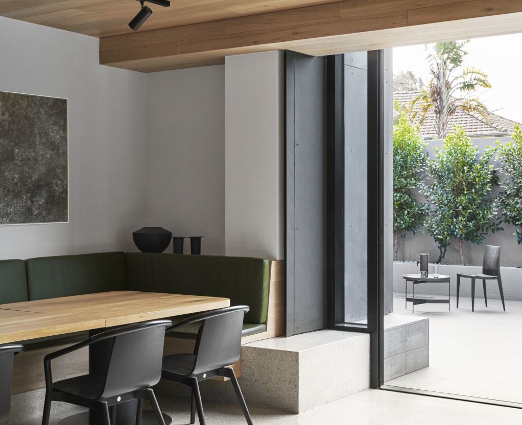
Keeping to a practice-characteristic style of spare, sophisticated classicism – “something that’s resolved and yet kind of simple” – the sunken garage was dug out an extra 500 millimetres to create a ceiling height of 2.7 metres “which was really perfect in a big room that opens to a beautiful north-facing front yard”.
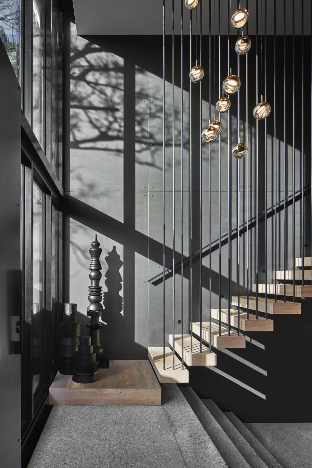
In the new “intermediate level” entry, which counterpoints charcoal and concrete colourations with the natural hue of the cantilevered oak stair, is a stratified cascade of steps going up and down to create the house’s “key circulation space”.
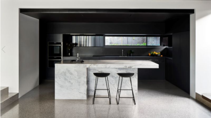
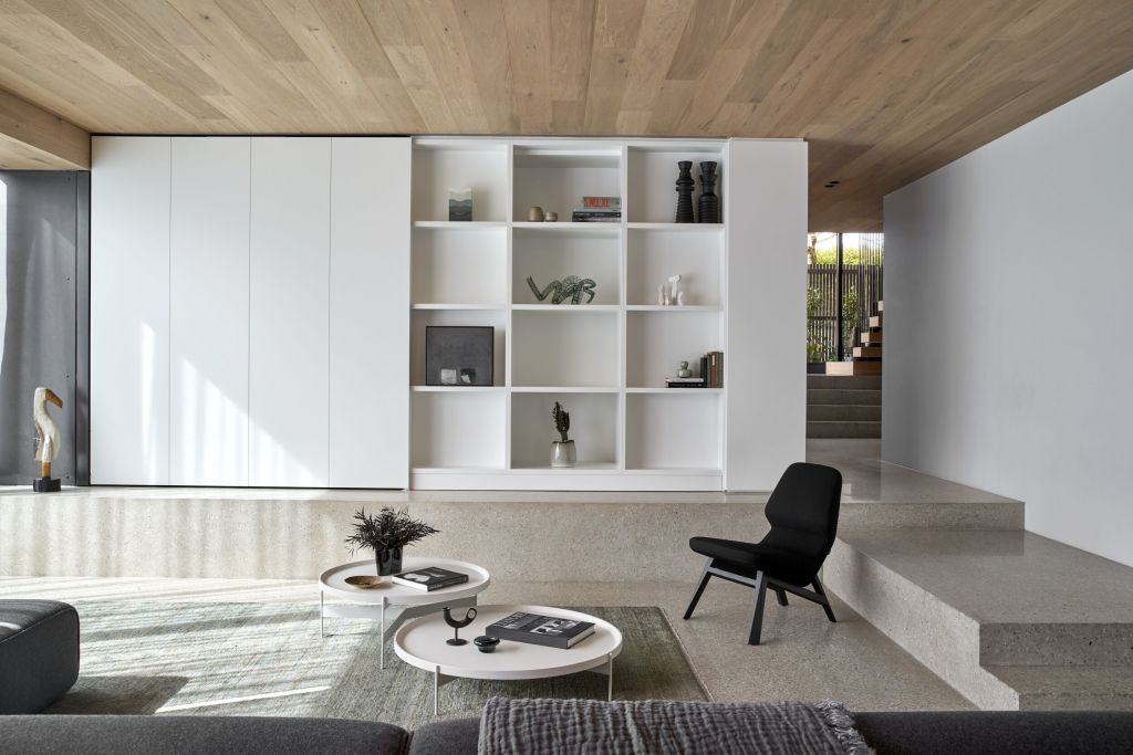
Some of the steps are small, some three metres wide and they keep descending to the polished concrete slab of the living area that is, in turn, surrounded by concrete plinths which the architects used as platforms for the entertainment and display cabinetry, and for the built-in banquette of the dining suite.
The plinths aren’t artifice but artefacts of the old house. “They’re the old footings that we just neatened up and clad in concrete,” he says.
Under the oak-clad ceiling which hides more of the “disgusting” horror of the 1960s suspended concrete slab, “and to help the room not look too stark”, the banquette “is space efficient”.
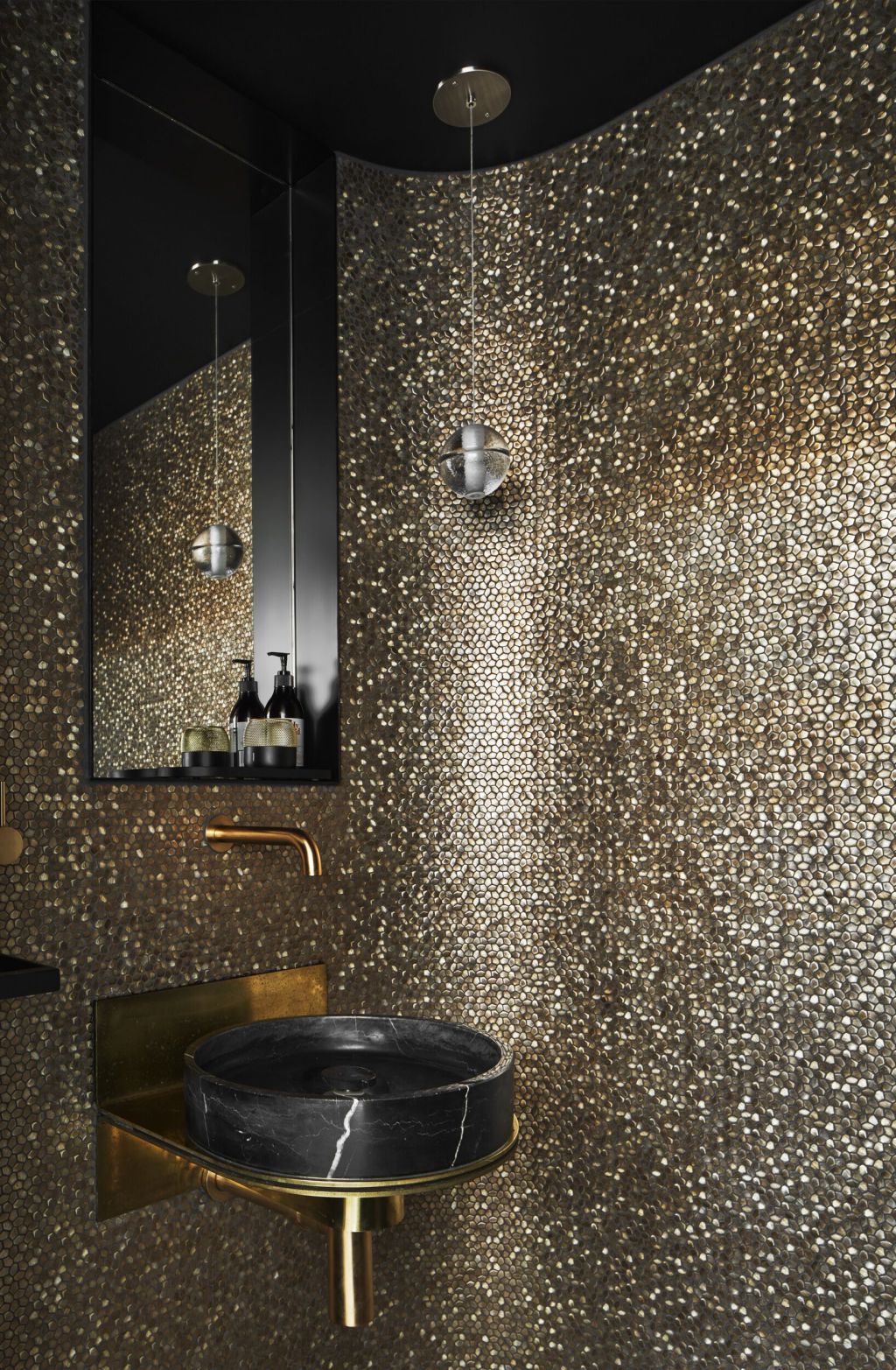
The guest powder room is all a-sparkle with diamond-shaped glass mosaics on the walls because, says Yiontis, “the clients wanted something special”.
Upstairs in the bedrooms, that restrained classic tone is reprised and again warmed with walls of engineered oak and bathrooms clad in figured marble.
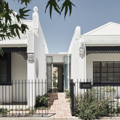
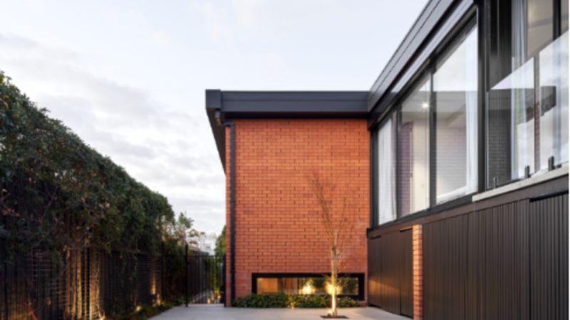
The re-presented exteriors of Solid House keep to two main materials: the brick that Yiontis talked the clients out of rendering “because there was something honest about it and because rendering it would make it banal”, and the dark steel.
“The steel signifies what is new and is such a fine material to contrast against the brick,” he said.
Requiring very little demolition “and just by changing the day-to-day purpose of the existing spaces”, says Yiontis, “it looks like we did a lot. But we didn’t. All the spaces are exactly where they were.”
We thought you might like
States
Capital Cities
Capital Cities - Rentals
Popular Areas
Allhomes
More
