Before and after: The modern renovation of a previously rundown space
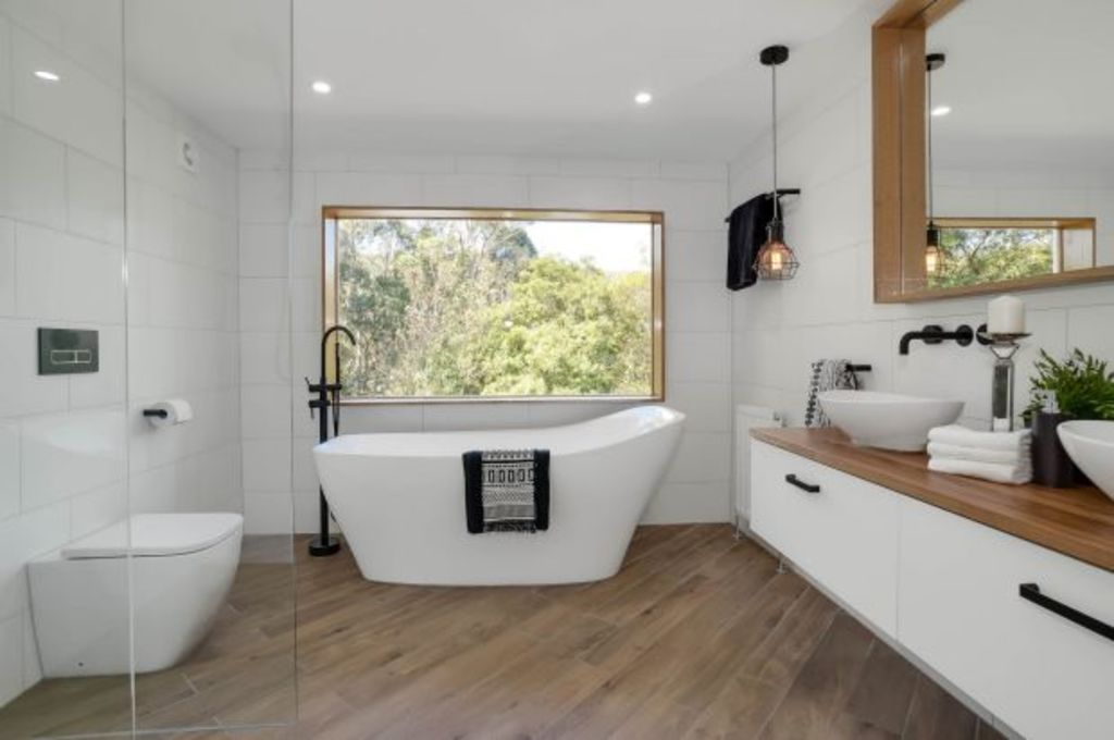
Inspired by the outdoors, this empty nook in a rundown 1960s weatherboard house has been beautifully transformed into a luxurious bathroom.
Located in the picturesque hills in Tecoma, Victoria, the house required a full renovation, including a new large family bathroom. An unused 3m x 3m throughway with glorious views of the hills proved the perfect space.
With a brief to create a modern and beautiful functional bathroom with a view, Alexandra Wright from Victorian Bathroom Group says every element of the home’s location needed to infuse its interior.
“We realised in this space we could harness the natural light and take advantage of the spectacular outlook,” she says. “It was the perfect location for combining nature-inspired materials and modern fixtures for a contemporary organic-style bathroom.”
Establishing layout
Replacing three small windows with a large central one was the renovation’s starting point. This window became the key focus of the room by providing the view and a copious amount of natural light.
“When entering the bathroom off the hallway there is real wow factor with a wonderful green nature-scape as the room’s backdrop,” she says. “For scale, space and to highlight the view, it made sense to position the bath beneath the window and furthest away from the door. We added a vanity on one side and on the other, a toilet and generously sized glassed-in shower.”
- Related: The couple who live where they work
- Related: Inside Darren Palmer’s creative process
- Related: A chat with floral stylist Holly Hipwell
Style and function
With luxury and modernity at the top of the client’s wish list, the bathroom needed to be highly functional and enjoy top-quality finishes and fixtures.
“Style is all in the detail, so once a functional layout is determined, style and design follow,” says Wright. “Quality matters and spending more on items like beautiful tapware ensures longevity, functionality and style.”
Statement pieces such as the timber window surround and framed mirror were custom-made, as was the bench top made from Victorian Ash Wood that sits atop a ready-made vanity. “Because it is a wet area we treated the timber accordingly to withstand water and regular use,” she says.
Storage
Creating large storage space was not required as there was already much available in adjacent rooms. “We limited it to the deep vanity drawers and towel rails,” says Wright. “The vanity is large enough for stashing everyday items, and there is the niche for the shower as well as the window surround for decorative and practical pieces.”
Lighting
With vast natural light available, additional lighting was kept to a minimum.
“We kept it simple with spotlights and a black pendant statement light,” says Wright. “They provide sufficient light at night and are in keeping with the overall style of the room.”
 A side-by-side before and after shot. Photos: Victorian Bathroom Company
Style and design
Material diversity is key to achieving interest, warmth and high style. Playing with light and dark aspects using a crisp contemporary palette and nature-inspired materials allowed a refined yet relaxed elegance in an otherwise high-use space.
“Timber, white and matt black looks fresh and timeless,” says Wright. “Timber was an obvious choice given the external environment, and we used it extensively from the window surround and mirror to the vanity top.”
The bathtub’s glossy surface plays against the timber-look flooring, providing even more of the contrast that characterises the space. “The timber-look floor tiles carry a wood-like grain, which is practical and consistent with our theme,” says Wright. “We placed them diagonally for aesthetic reasons, and along with the wall-mounted vanity, matt black fittings, mounted bath taps, and floor-to-ceiling tiling, it provides a real sense of luxury.”
Ensuring fixtures were simplistic in appearance allowed the view to remain the focus and to create a feeling of spaciousness.
“Mirrors create the illusion of more space so are both functional and stylish, and as natural light is extremely important we designed and created a bespoke, timber-framed mirror which mirrored the style of the window, reflected the light, and makes the most of that glorious view. It’s really very special.”
We recommend
We thought you might like
States
Capital Cities
Capital Cities - Rentals
Popular Areas
Allhomes
More
