Behind the listing: From 'the ugliest house on the street' to a bright coastal sanctuary
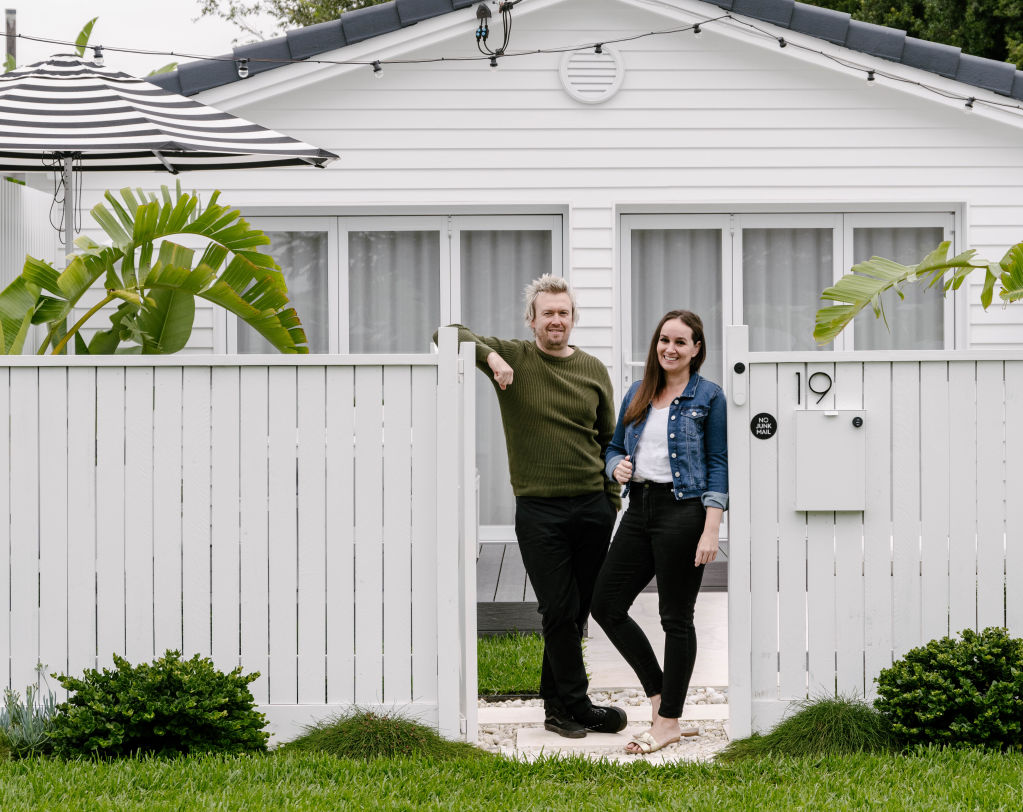
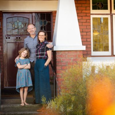
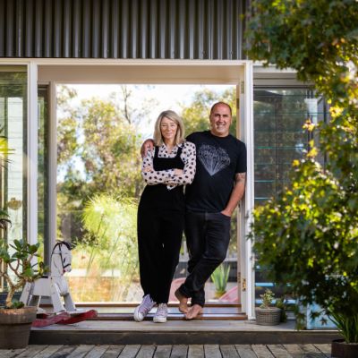
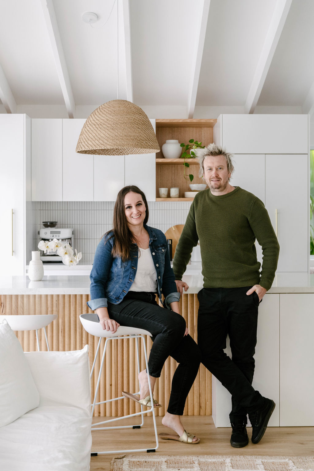
- Owners: Magazine editor Loni Parker and photographer and videographer Mark Zeidler
- Address: 19 Pearl Street, Scarborough, QLD
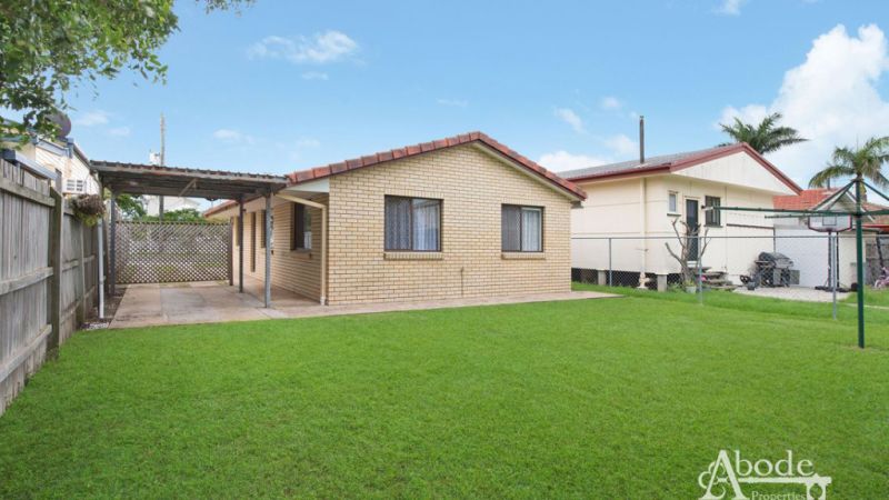
- Type of house: 1990s yellow brick house becomes a modern coastal cottage
- Price guide: Offers over $899,000
On the hunt for a “fixer-upper” in early 2019, Loni Parker and Mark Zeidler were strangely charmed by a straight-talking agent’s pitch that was delivered at one of the many open homes they attended.
“The real estate agent greeted us with, ‘It is what it is,’ which I loved,” Parker says with a laugh. “He was the first agent that was brutally honest about the actual condition of the house.”
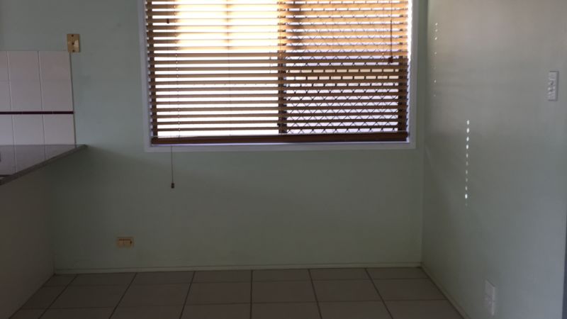
After years endured as a poorly maintained rental property, every surface inside the 1990s yellow brick house was covered in dirt and grime.
“My sister almost cried when I showed her the house prior to us moving in,” Parker says. “I had to laugh because I had such a strong vision from the start, I didn’t mind what it looked like in the beginning.
“The one redeeming feature it had was a pitched ceiling with exposed beams in the front area of the house. That had me sold immediately.”
The couple relocated from their new, one-bedroom unit in Brisbane’s CBD to the tired old house in Scarborough, buoyed by the prospect of tackling their first renovation.
As the tradies descended on No. 19, things got off to a rocky start when the plasterer reversed into a neighbour’s car, and Parker was blamed.
“I can laugh about it now,” she says. “But at the time, I was mortified that this was our first impression on our neighbours.”
It was only ever upwards from there as the “ugliest house in the street” began its transformation.
As editor and owner of interiors magazine Adore, Parker was, naturally, head of design.
“I designed the house myself, although obviously, I took inspiration from the pages of my magazine,” she says. “As I work in the industry, I am heavily inspired by the latest trends.”
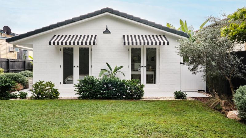
Now living a five-minute walk from Queens Beach, Parker leaned into a modern coastal theme, opening up the house by replacing the pokey windows at the front with bifold doors. The old yellow brick walls were clad in white weatherboards and the original red-tiled roof was painted in a trendier charcoal.
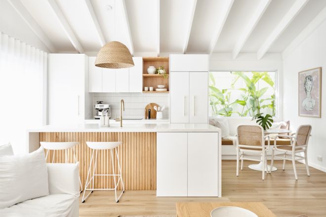
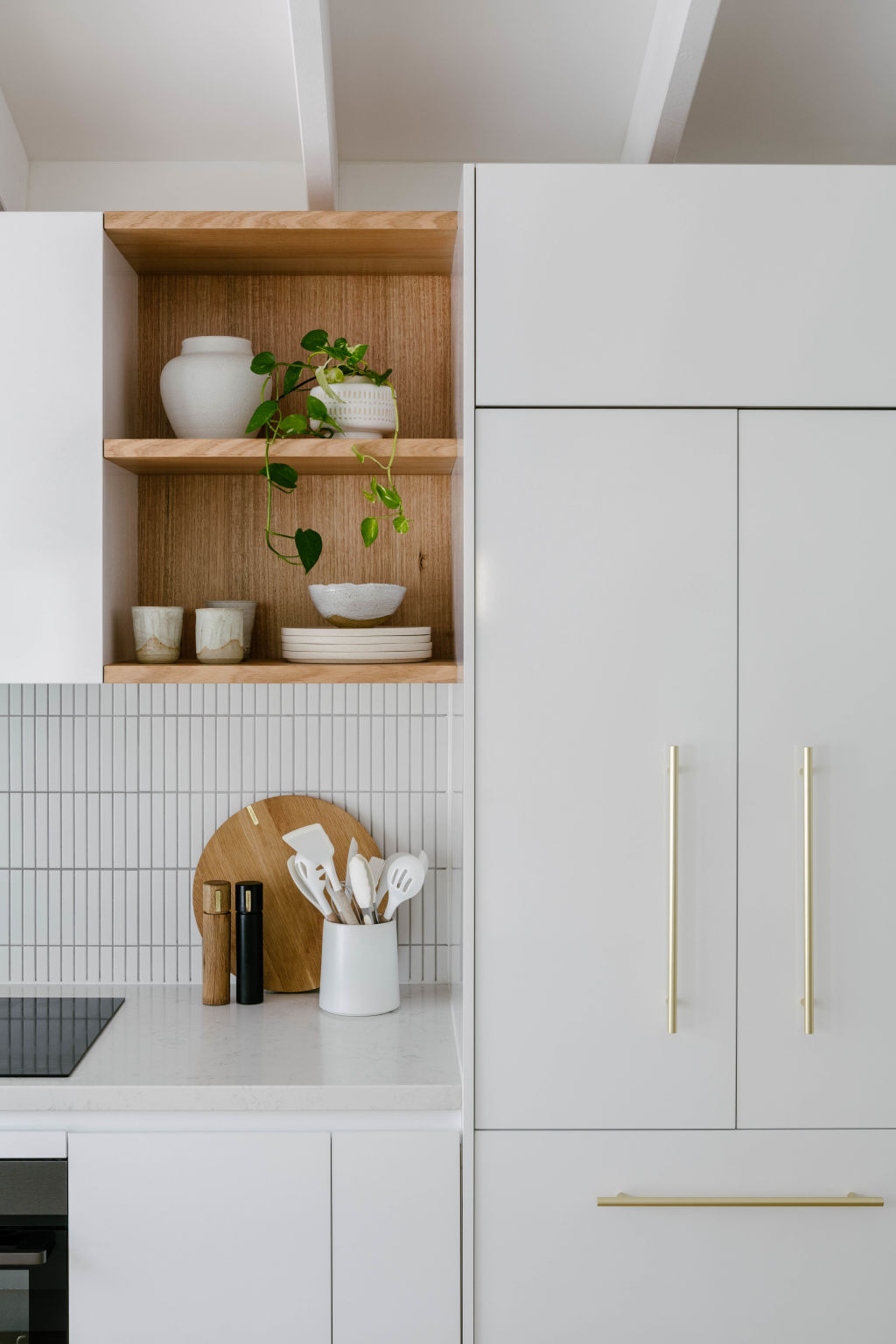
Inside, just as Parker had envisioned, the high, raked ceilings look beautiful above the now open-plan kitchen, dining and living zone.
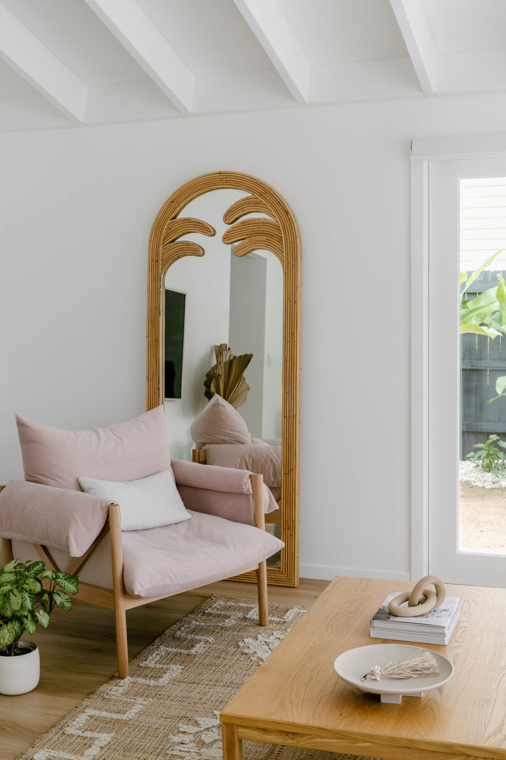
“I knew that space would look amazing once the brown beams and green walls were painted white,” Parker says of her safe and considered colour palette, chosen with resale in mind.
Gone, too, are the basic floor tiles, replaced with Tasmanian oak. Exposed timber shelving, a custom stone island bench and vertical timber panelling combine to render the original space unrecognisable.
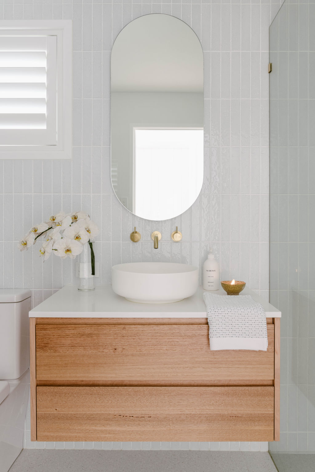
In the bathroom, which features handmade “kit-kat” tiles, a custom vanity and brushed-brass tapware, Parker says she drew inspiration from a similar design by interior styling business The Stables.
Two of the three bedrooms open via glass doors to the garden, where the transformation is even more dramatic.
“The outside had no gardens apart from an overgrown Golden Cane tree at the front,” Parker says. “The rest was just weedy grass. In a way, it was a good thing, because we could start with a blank canvas and design the gardens how we wanted.”
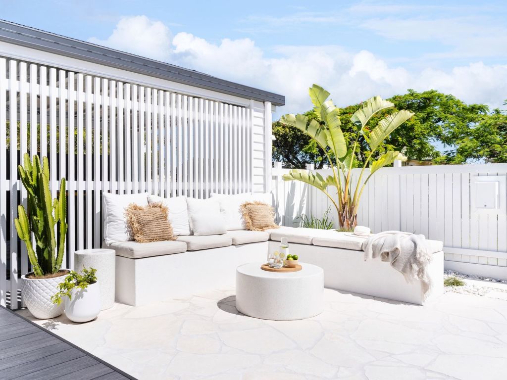
Now, landscaping has carved out zones in which to dine, sit and relax, work and play. Built-in concrete seating, styled with cushions and framed by white fencing and large white planter pots is where Parker likes to relax with a cocktail at the end of the day.
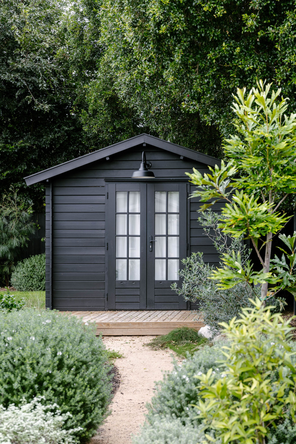
The garden belies its mere three years of growth, feeling lush and private. Nestled into the greenery is Zeidler’s studio space, a kit from SheShedz assembled by a carpenter, who also added a deck to the front.
“Mark loves his black shed,” Parker says. “He painted it all black, including inside, so it has some man-cave vibes going on in there.
“He uses it as a home office [and] a music room to play his record collection. He is very sad to be parting with it. He always jokes he wants to get a crane and take it with him when we move.”
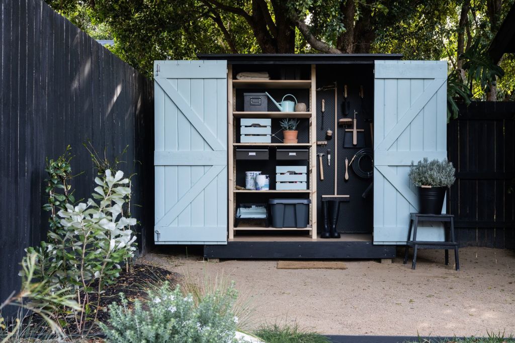
The small cedar tool shed at the bottom of the garden is another kit success story, this time by Stilla Sheds. Parker customised theirs by painting the internal doors blue, the exterior black, and adding a pegboard wall.
As is often the case, if a renovation doesn’t break a couple, it seems to galvanise a taste for it, and the pair plan to do it all again. Surrounded, as she is, by an endless supply of design inspiration, Parker is enthusiastic.
“The thing I like most about renovating is seeing something ugly transformed into something beautiful. Having a vision and then executing that vision is addictive, and probably the main reason we want to do it all again …
“It’s all about finding the right house with the right bones.”
We recommend
States
Capital Cities
Capital Cities - Rentals
Popular Areas
Allhomes
More
