Behind this home's mid-century facade lies a house designed with accessibility in mind
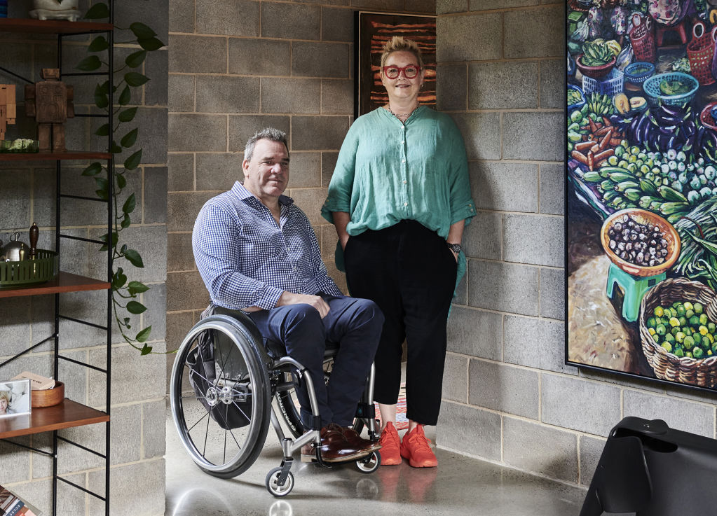
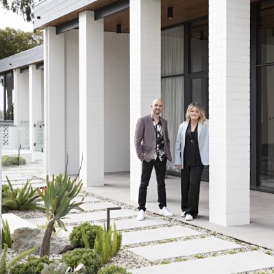
Who: Chef Tobi Dikstein and access consultant Nick Morris
What: A modernist-inspired and fully accessible Melbourne home
Where: Elsternwick, Melbourne
The Elsternwick, Melbourne home of chef Tobi Dikstein and access consultant Nick Morris is remarkable.
What looks like an authentic mid-century build is actually a modern family home, built in 2017, that’s “discreetly fully-accessible” for Nick, who uses a wheelchair. “There is no way anyone could tell that the house was built specifically for a paraplegic,” says Tobi.
Nick and Tobi bought the Elsternwick site in 2016. The original home on the block was completely unfit for purpose, so they worked with Fasham to design and build its successor.
“We knew we wanted to build a cohesive, accessible home, so we gave the [original] house away on Gumtree in exchange for a clear block ready to build on,” says Tobi. “I believe the house is now happily ensconced in Daylesford somewhere!”
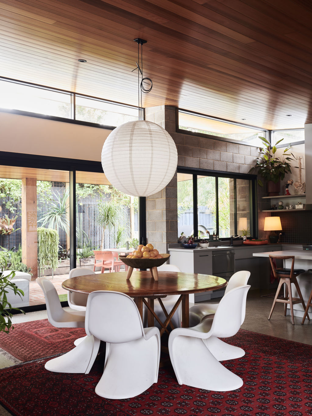
The vision for the design was clear from the outset. “We wanted to utilise the long block and build the house lengthways to receive the north sun all day and have views of the garden from every room,” says Tobi.
“We wanted single level, step-less, wide doorways, and passageways as part of the design – regardless of Nick!”
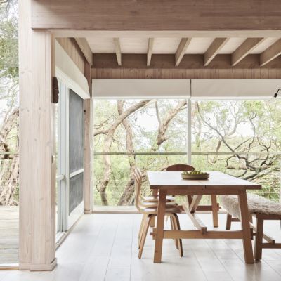
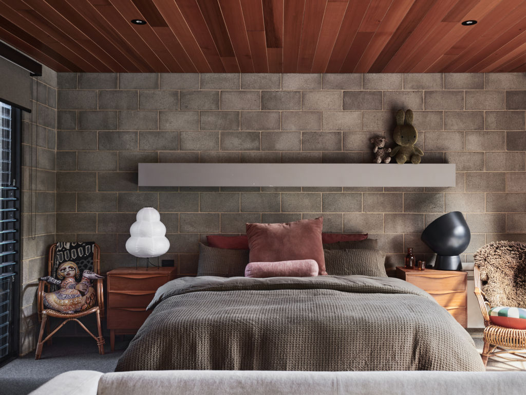
Inspired by mid-century modernist architecture, the resulting house is made from solid concrete block contrasted with warm timber ceilings. The property has two street frontages, each with their own entrances.
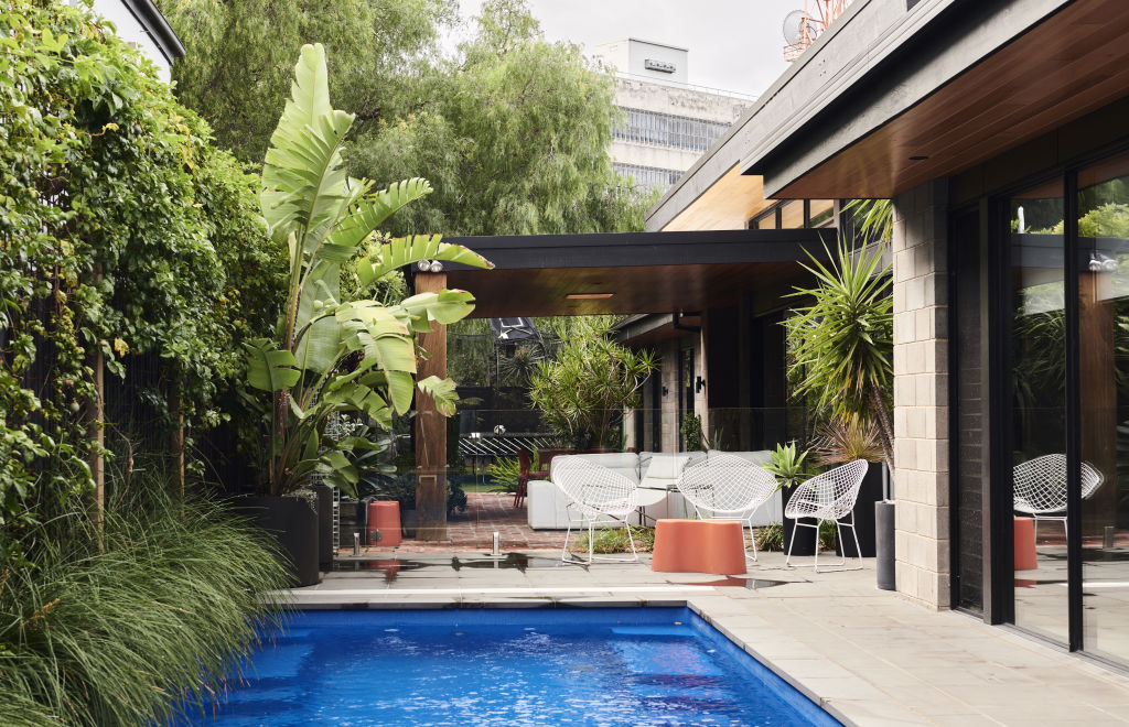
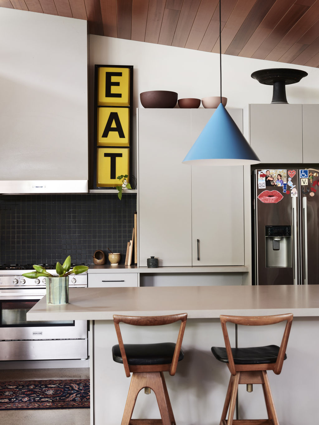
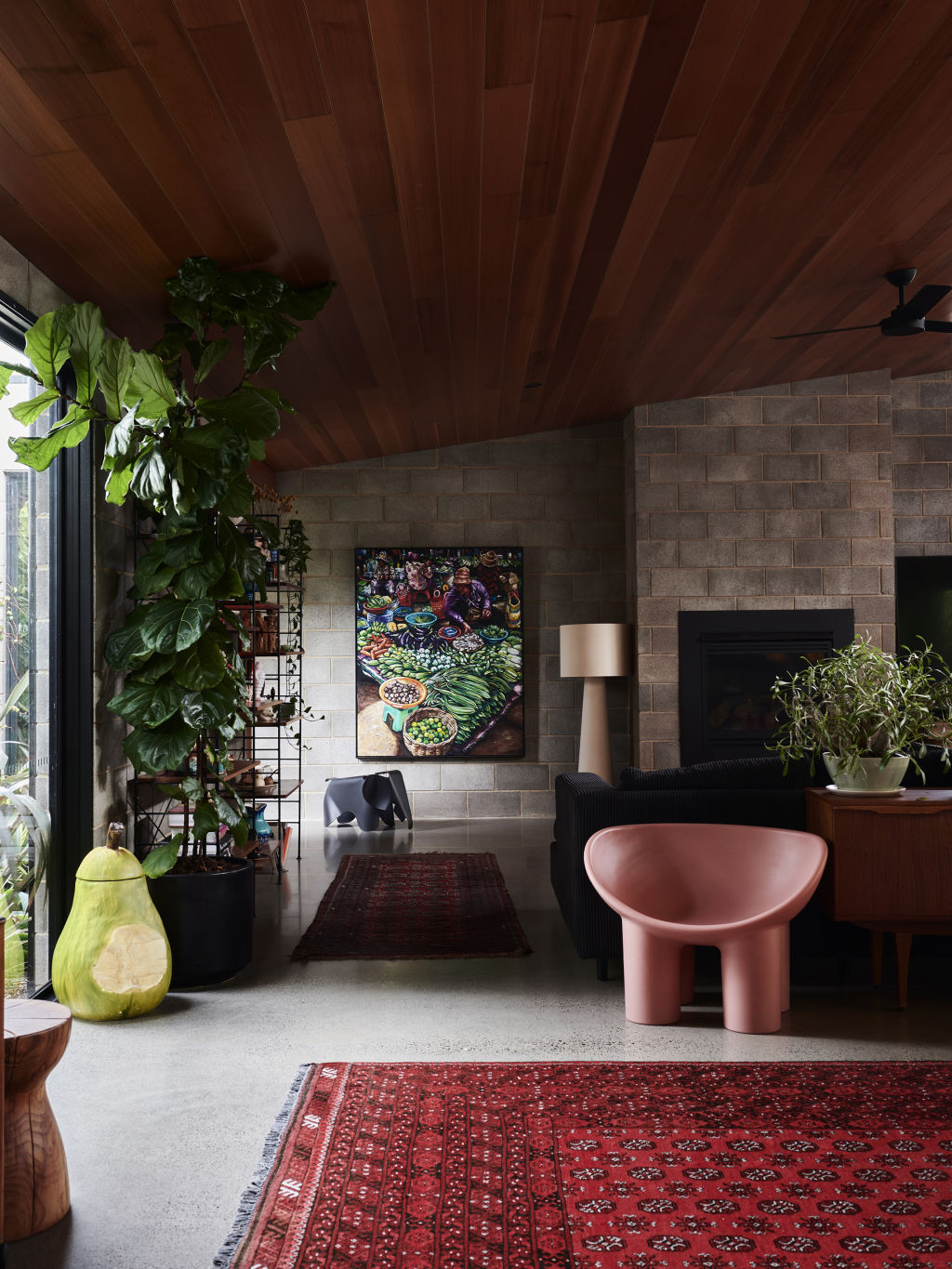
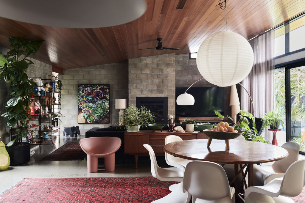
Tobi and Nick have introduced their style to the interiors mostly through the styling, which is playful and sculptural. “We chose a very simple colour scheme as we wanted our colourful belongings to do the talking,” Tobi says.
Persian rugs and art in every room add warmth and colour.
The home was designed within eight months and built over the following year. “We moved in at Christmas time 2017 on budget, on time and luckily with no major issues!” says Tobi.
“Our accessible home has a huge impact on our day-to-day life. Nick requires no help and is completely independent therefore we are all relaxed and free.’
In Tobi’s words, the house is a ski lodge in winter, and a pool party in summer.
“My favourite part of living in our house is arriving home in winter and feeling like the house gives you a warm hug.”
How to style with colour
Even in the most minimalist home, it’s always possible to inject some colour. Through simple styling choices, you can create a bold and cheerful home, whether you own or rent.
Artwork and prints
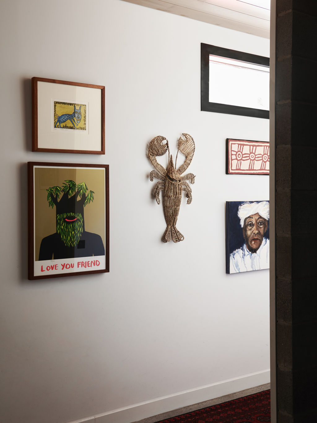
The obvious choice to enliven any space is to add art. Seek out work by local artists, or if original art isn’t within your budget, consider a framed print, or even a playful patterned fabric stretched over a frame.
Rugs
Rugs are especially useful if you rent your home, because they make a huge impact on a space, even when you can’t make any permanent changes. Always go for the biggest size that will fit in your space. Ideally a rug should tuck under sofas and furniture, rather than floating in the middle of the room.
Cushions
There is no easier way to refresh a living room than by adding different cushions. Sounds obvious, but it actually works. Try an original printed design by Melbourne brand Bonnie and Neil.
Bedlinen
Update your bedroom instantly with a bright, colourful bedlinen scheme that you can refresh each season.
More is more
Decorating is all about confidence. Combining bold and even clashing colours creates a uniquely fun and cheerful space. Own it!
We recommend
States
Capital Cities
Capital Cities - Rentals
Popular Areas
Allhomes
More
