Interior designer Carlene Duffy's six fundamentals of home styling
The most interesting and dynamic interiors are the ones that appear to be ever-evolving. They feel like a true reflection of the people who live there and feature a careful curation of collected pieces.
Beautiful interiors are not necessarily a result of a big budget or even of a design professional. Often the spaces that draw you in are simply the most thoughtful, considered and creative.
Here are a few simple fundamentals to help you along.
1. Cull fast
I’m no minimalist. On the contrary, in fact. Yet, I’ve walked into so many homes where I’ve thought, “I could simply take away that, that, and that, and this space would feel instantly better”.
In Marie Kondo style, if it doesn’t serve a function, spark joy, or hold sentimental value, it’s probably time to say goodbye. It costs nothing and makes room for the pieces that will do all of those things.
2. Collect, don’t shop
Don’t buy to fill a spot. When we go shopping to fill a spot in our home, we tend to buy cheaply, settle, and tire of the item quickly.
Be open to falling upon a vase at a market or a beautiful daybed at an antique store. If you love it, you’ll have no trouble finding a spot for it, and you’ll likely find the piece has much more versatility to play different roles in your home.
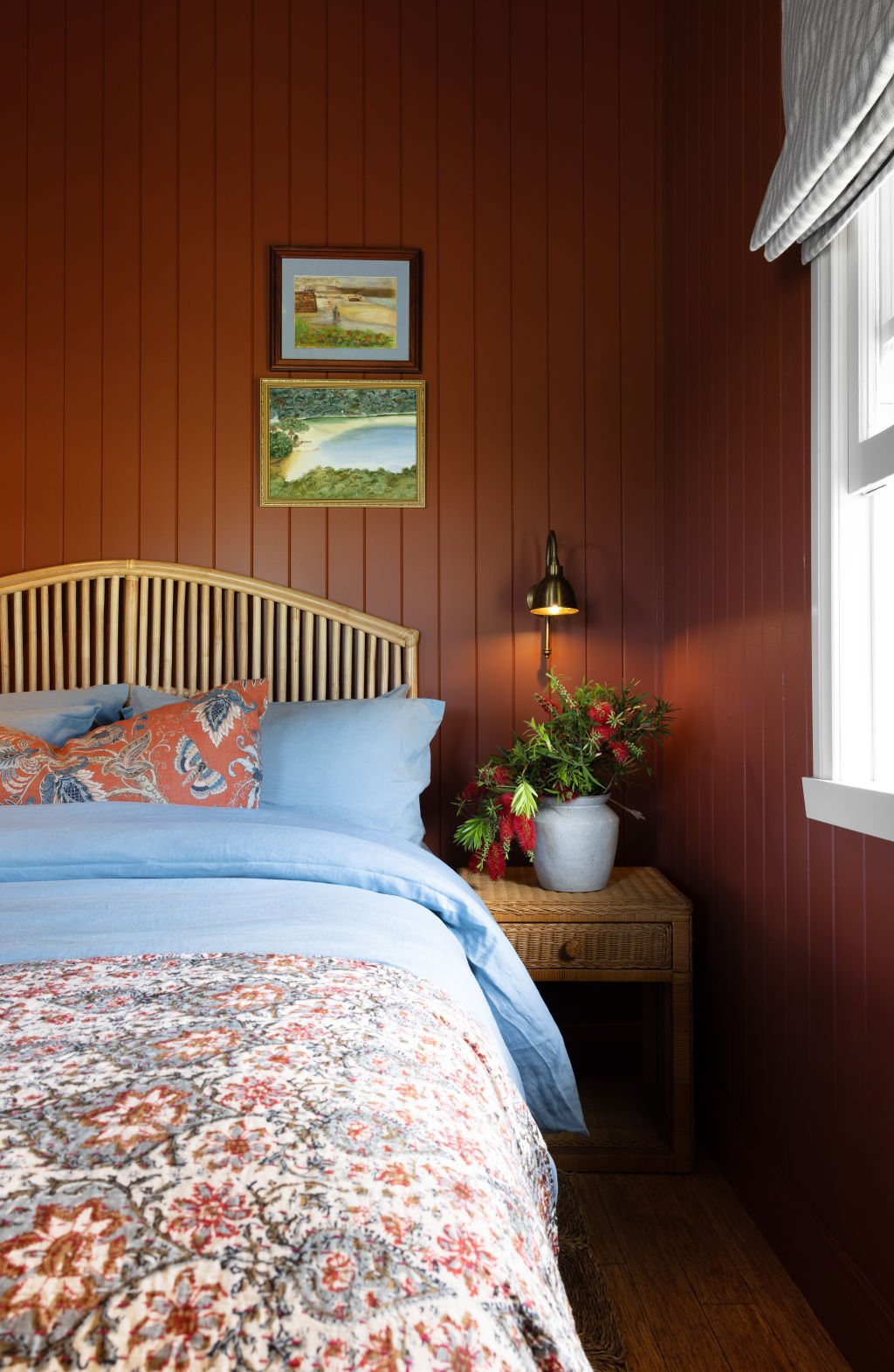
3. Upsize your rugs
There is an epidemic of island rugs – rugs that are so small that the only piece of furniture sitting on them is a coffee table.
Done right, rugs are highly effective at zoning and anchoring a space, providing softness underfoot, and are an opportunity to provide colour and pattern in the home.
At a minimum, you should have the front feet of all of your living room furniture sitting on your rug. That’s when you know you have the right size.
In the bedroom, your rug should protrude from the bed edges by at least 700 millimetres. Otherwise, it tends to be dwarfed by the size of the bed. Under a dining table, the rug should be large enough that when you pull out your chair, the feet don’t slide off the back.
And don’t forget your runners, whether for the hallway or kitchen. There are very few opportunities to add interest in your hallway – I love a vintage Persian rug for this purpose. It’s low-pile with high colour and pattern variance, making it ideal for high-traffic areas.
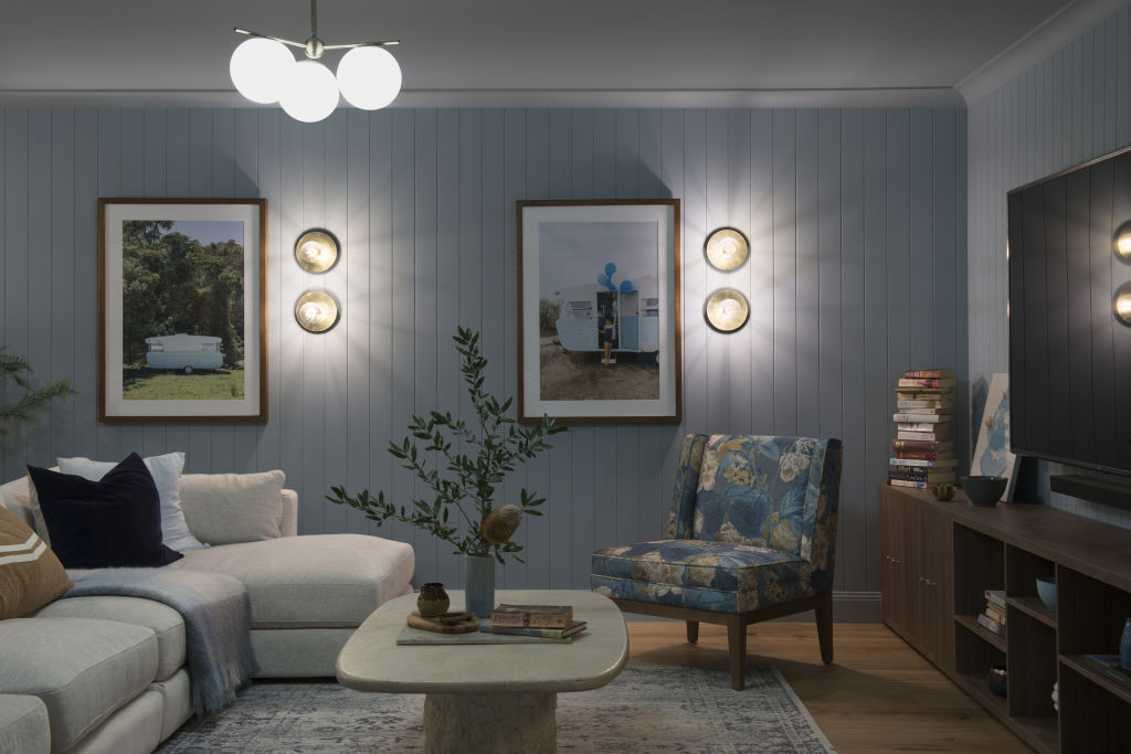
4. Treat all walls of the same kind equally
Let me explain. Often, when people are tempted to dabble with colour or pattern, they commit to treating only one wall and the other walls in the space are left in their original white plasterboard. The outcome is jarring.
The effect this creates can make you think that you don’t like colour and pattern, but it’s actually the high contrast that you don’t like. If you’re going to paint one wall in a space, paint all the walls. If you’re going to wallpaper one wall in a space, wallpaper all the walls.
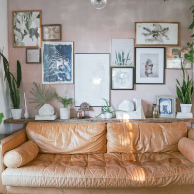
5. Display your treasures
I often feel overwhelmed by stark, bare walls in homes. Art can feel intimidating to purchase, but it should truly be whatever you want it to be.
I’ve been known to frame and hang printed tea towels, beautiful pieces of fabric, and Kimonos. For my nephew’s bedroom, I purchased a collection of vintage fishing lures from eBay and had them framed.
In my niece’s bedroom, we framed a sweet top made from embroidered tea towels from Austria, given to her by her aunt in Canada. It would otherwise have sat in her cupboard and probably deteriorated over time. Now, it’s something she can keep forever and potentially pass down the family line.
In our own home, I’ve hung African baskets, vintage op shop finds, fine bone china plates and cherished rice paper art that I bought on our honeymoon. Think outside the box.
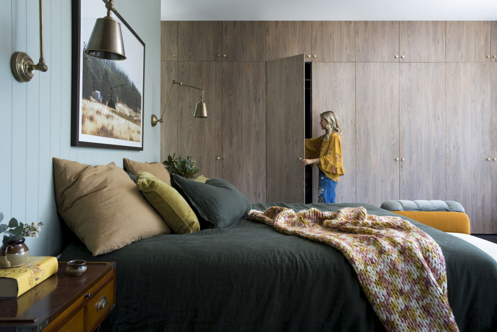
6. Reconsider your living room’s focal point
I very often see living rooms set up like cinemas, with all the furniture facing towards the TV. This makes the TV the focal point in the room, and I’m yet to see one that’s good-looking enough to warrant all that attention.
By facing a corner armchair towards the room, you immediately create a loose conversation zone. The coffee table becomes the focal point, taking the focus off the TV. This also makes your space considerably more versatile.
The space will be transformed from an exclusive TV-watching space to a space where you can comfortably commune with family or friends.
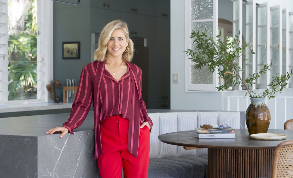
Passionate about interior design, Carlene runs Cedar and Suede, a full-service interior design studio on the Gold Coast.
We recommend
We thought you might like
States
Capital Cities
Capital Cities - Rentals
Popular Areas
Allhomes
More
- © 2025, CoStar Group Inc.
