Cluttercore: Is this eclectic style the next big trend?
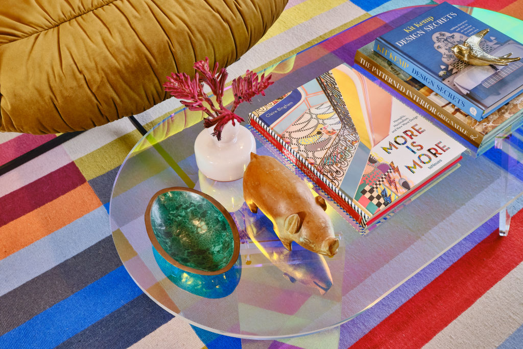
In a rebellion against minimalism, the newest maximalist design trend, cluttercore, is a more is more dream come true – a celebration of personality and character, where lots of stuff is in and simplicity is out.
Interior designer Alison Leeder of Leeder Interiors says the trend could be described as the opposite to minimalist style, and a bohemian version of maximalism.
“It’s a style that encompasses lots of colour and patterns while showing off an eclectic display of items that represent you and the story of your life. Cluttercore style makes for a cosy, lived-in feel the opposite to the minimalist aesthetic.”
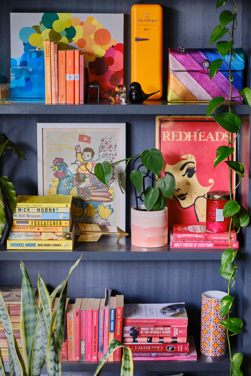
So, whether it is a collection of snow globes from your travels or a photo gallery wall of memories, it is “about embracing all the things you love and showing them off in your home through curated collections or fun displays,” explains interior designer Jessica Viscarde from Eclectic Creative.
“Harking back to Victorian interior style, with lots of layering … unlike other styles, where the overriding vibe is serious, cluttercore is anything but,” says Leeder.
“The walls are brightly painted or wallpapered and then covered in keepsakes that are deeply personal. It might be a combination of artwork, postcards, photos, and trinkets collected from travels. Surfaces are covered in collections of items that represent the owner, books, homewares – but the caveat being anything goes.
The trend’s key functions are to stimulate the senses and create a feeling of cosiness and security.
“The very essence of our homes or spaces became more than just four walls; it ultimately became a cocoon or safe space that we spent a lot of time in and wanted to feel nurtured, protected and ultimately at ease. And with all these feelings come things that can please or soothe us,” says Viscarde.
Cluttercore has been embraced by the younger generations, who have pushed back against minimalism and given a nod to nostalgia and sentimental value with their uptake of this design style.
“Gen Z has really embraced this style as it feels new and fresh to them, and a counter to the white, white and more white they’ve likely grown up with in their homes as kids and teens … Objects from family or travel can have special meaning,” says Viscarde.
Top tips for incorporating cluttercore into your home
Try to mix old and new to create a cosy home
Leeder suggests using modern furniture teamed with vintage or antique pieces and to embrace colour.
“Don’t be afraid of bold colours and combining patterns for walls and furniture. Think combining a striped chair with a floral cushion. Also consider different textures to create the layered look. Pair a velvet sofa with chunky tweed-look and silk cushions,” she says.
Show off your collections
“We all have those special, sentimental items that sit for decades in drawers. Consider getting them out and showing them off. You can also think about framing these special items so you could hang them on your wall too,” says Viscarde.
Don’t cover every wall space and surface
Leeder suggests trying groupings over and on the mantel, or above a hall table.
“Bookshelves are great to display a mixture of objects and books but don’t cram something in every space. Leave some breathing room otherwise it will become visually overwhelming.”
Don’t treat your interior as something that is finished and complete
“It’s a lifelong process where you can add things you discover along the way that make you happy. It’s a fun way to decorate where the look evolves over time,” Leeder says.
Add lots of plants
Use plants to soften interiors and create freshness in what could be visually busy spaces.
We recommend
We thought you might like
States
Capital Cities
Capital Cities - Rentals
Popular Areas
Allhomes
More
- © 2025, CoStar Group Inc.
