Colour forecast: The paint trends we'll see in 2016
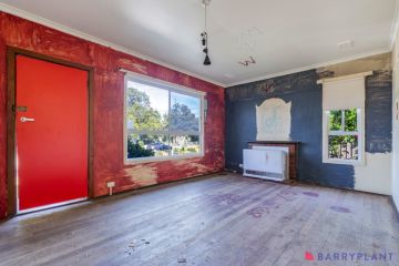
“I see a red door and I want it painted black … No colours any more, I want them to turn black.”
There’s an earworm from the Rolling Stones back catalogue. They sang it in 1966. But they must have known something, for dark-as greys and near-as blacks (with various undertones of brown, blue, even a touch of green), are proving to be surprisingly persistent fashion colours in house paint.
Initially popular in commercial settings, they began to appear on house exteriors (with white trim) about 2010. Two of Australia’s leading paint companies, Haymes and Dulux, are now betting they’ve got an even longer than expected shelf life by featuring the deep shades on their 2016 colour trend predictions.

Sage and Clare. Photo: Haymes
But this time they are for interiors.
For Dulux, which markets the all-time best seller “Antique White USA” as the-safe-as-houses choice of the domestic DIY painting mob, a stormy, near black/grey called “Domino” is now among their 50 top sellers – with a bullet.
“Not the perfect black, black,” says Dulux Colour communications director Andrea Lucena-Orr, “but pretty strong.”

Future Past. Photo: Dulux
Haymes colour concept manager Wendy Rennie reckons the moody darks, “which have evolved from latte”, are keeping on keeping on because “they have become the new alternative neutral – there is not one colour they don’t work with.”
They have come inside, she says, “because people have become more confident with colour”, and because there is a greater tendency to define spaces within houses. “They break space up. They’ll give a different feel to a room like a study, library or an adult space.”
Lucena-Orr says the darks have escaped from the media or theatre room. “And because we’ve been getting used to the darker colours, people are now using them for bedrooms.”

FLT Room. Photo: Haymes
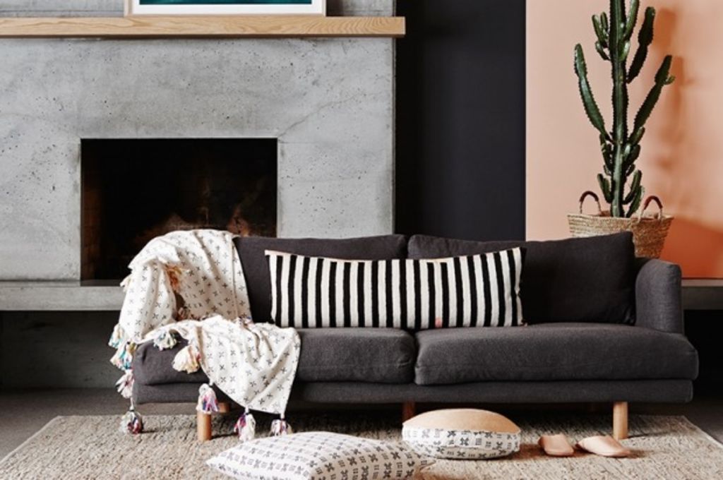
Rennie cautions that near blacks “are not suitable for every space”, but she says “they do sit really well with most materials: concrete, marble, timber and brick.”
She loves how they work with a wide range of other hues and tones: “yellows, greens, teals, reds and oranges”.
“They look amazing with salmon, melon and coral colours – the reds and the pinks.”

Retro Remix. Photo: Dulux
Orr explains how variations in the dark darks are also coming through with slightly differering undertones. “A dark grey/blue is really moody. There are other coloured greys with greenish and brownish undertones.”
Used well, and with what Rennie terms a new decor “counter trend” that has all the soft furniture being uphostered in fabric that is on the pale or pastel side, the gloaming greys are a residential paint story that is about “all or nothing”.
It’s a brave thing to do, “but if you’ve got the confidence, it can look pared-back and classy”.
And the commitment isn’t lifelong. As Lucena-Orr reminds us: “Paint is about making big changes in a cost-effective way. You can always change it.”

Future Past. Photo: Dulux
If your home could use a colour change, ask an expert to turn a painting project from ‘to-do’ to ‘done’.
We recommend
We thought you might like
States
Capital Cities
Capital Cities - Rentals
Popular Areas
Allhomes
More


