A colourful life: Inside the world of colour consultant Sonia Simpfendorfer

Author: Georgia Madden on Houzz
Have you ever wondered who thinks up the colours and combinations you find yourself lusting after for your home? Very often they’re the creation of a colour consultant – a design visionary with the ability to predict the colours and finishes we’re going to love, long before they’re even on our radar.
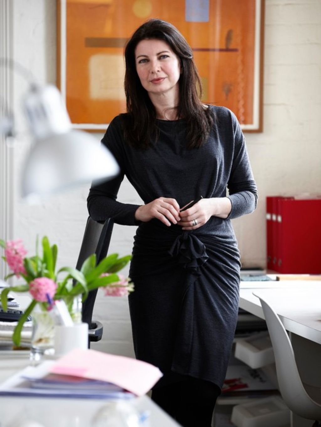
Sonia Simpfendorfer is the creative director at design firm Nexus Designs, where she has helped produce colour ranges for brands such as Colorbond Steel, PGH Bricks & Pavers and Viridian Glass. We go behind the scenes with Simpfendorfer to see how colour trends are brought to life.

How did you become a colour consultant?
I studied interior design and, while my studies didn’t include colour consultancy as a component, they certainly taught me the importance of responding to each project’s location and unique characteristics, and the psychology of colour.
Working with Harley Anstee (founder of Nexus Designs) for 20 years has been like receiving an ongoing masterclass from the master himself. Assisting Anstee and being involved in a wide range of consultancy projects, from bricks and Colorbond Steel to rubber flooring, has been the best education in colour I could have wished for.

What’s the one surprising thing you’ve learnt about colour?
That it has real power.

What’s the one colour that really divides people?
Green. But like all colours, there are so many different kinds of green. There is a whole range of gum-leafy soft grey-greens that are very liveable.
And people are terrified of purple, but purple can be fantastic. Think of jacaranda trees signalling that Christmas is around the corner. Our NYC loft (above) uses purple to evoke the Blue Mountains, but it is used carefully, not in great swathes on walls.
Have any recent colour trends surprised you?
The enormous popularity of grey. People have discovered that there is great complexity and versatility in grey – it can be cool, warm, dark, light or mid-tone. Grey has moved out of the realm of just being a favourite of architects and designers and is now being offered to the market in new and sophisticated ways.
Which colours do you have in your own home?
Natural timbers, warm white, neutral linen and terracotta, with additional colour from artwork and lots of books.

What are one or two classic colours or combos you love?
Timber and white is THE classic combination, but I love the way the earthy terracotta family and greens work together. One of my favourite country houses has sheds and verandahs painted in a dusty pink set in fantastic gardens and trees, and it is delightful. Colour should deliver happiness.

What does a typical day look like for you?
Very full! I split my time between interior design and building product colour consultancy projects. Typical days include project team meetings, site visits to check on interior projects under construction, meeting with clients and suppliers, plus a lot of information gathering and research.
How do you identify the next big colours?
Our colour and surface design work is primarily in the building product industry, so we look at everything through the dual lenses of longevity and currency.
Choosing a brick or roof colour is not a throwaway decision. It is so different to the fashion sphere where “of the moment” is the guide.
Where do you look for inspiration?
We carry out detailed research, collect and analyse information from international and local sources, and we are interested observers of what is going on in interiors, architecture, building design and urban design. We also carry out comprehensive surveys with end users and specifiers. This is the solid foundation that underpins the inspiration.
It is not just a dry research process though – we have also honed our instincts and intuition for great colour outcomes with a lot of real-life experience. Every year we send one, two and sometimes three of our team to Milan Design Week and other international events.
Shows such as Milan are great for widening our view of the world as there are many events and exhibitions that are purely experiential, which allow for a fresh perspective alongside the more prosaic “here is a chair or finish in a new colour”.

How long does the process take?
This depends on the product. In addition to forecasting, editing and refreshing ranges, most new products and colours need to be prototyped, trialled and tested before they make it to the market.
BlueScope is a great example. For a colour or finish to even be seriously considered for Colorbond Steel, it first needs to go through their legendary remote location, extreme-conditions testing process for a few years. Only when it passes that test does it become a contender. This is clearly different to choosing a colour for a t-shirt!
How do you make your trends a reality?
One of my favourite things about our studio is our multi-disciplinary collaborations. We all have specialised primary skills, such as interior design or graphic design, but we also work together on the colour and product projects.
Interiors might provide the words about colour inspiration, which graphics then represents visually. For the launch of the Colorbond Steel Matt range, for example, our graphics team created steel sculptures from each of the steel colours, which was a powerful representation of its beauty and creative potential. I always talk about “us” or “we” as that is the truth of how we work – together.
We recommend
States
Capital Cities
Capital Cities - Rentals
Popular Areas
Allhomes
More


