Daggy or designer: What some homes get right that others get so wrong
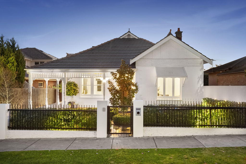
Most people would love a designer home – a home that stands out for the right reasons. But how can two houses have similar facades yet one looks fantastic, and the other is largely forgettable?
The answer is simple: houses that stand out for the right reasons have adhered to the Design Principles – a set of design rules that architects and exterior designers have been using for centuries. So what are these principles, and how can you apply them to your property?
Balance
Getting a balanced look for the front of your home is essential to a visually appealing effect, but can be tricky to recover from if you get it wrong. This doesn’t mean that everything has to be symmetrical or equally spaced apart, but there has to be some sense of proportion and spatial balance.
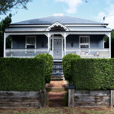
Take a look at a workers’ cottage versus a more contemporary house with a skillion roof. Both achieve visual balance, but in entirely different ways.
House materials and textures
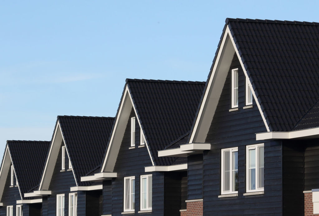
Whether the structure of your facade changes or not with your renovation, the materials and texture choices are a critical component of a designer-looking home. Textures can be used to add or subtract visual weight and can assist in creating a more balanced look if the structure is not symmetrical.
We use different materials and textures to accentuate some areas and downplay others.
Personal preference definitely comes into play, of course, and should always be the primary driver when selecting your colours, finishes and textures. An exterior designer will be able to advise you on the best way to weave the look and materials you love into the upgrade of your older home’s facade.
The goal is to blend what you have with what you want in order to achieve a cohesive and appealing look that suits the original style of the house.
Exterior colour choices
Getting the colour combination right for your exterior can make or break a renovation.
Colours can be a clever way to provide depth, shorten, widen or lengthen spaces and can even work to camouflage or accentuate different elements. A common misconception is that a lick of paint will solve all, but a great looking home exterior goes much deeper than that.
Your focal point
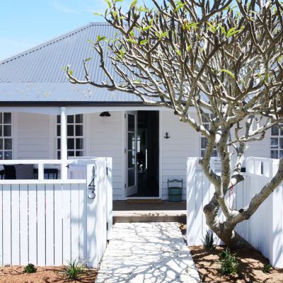
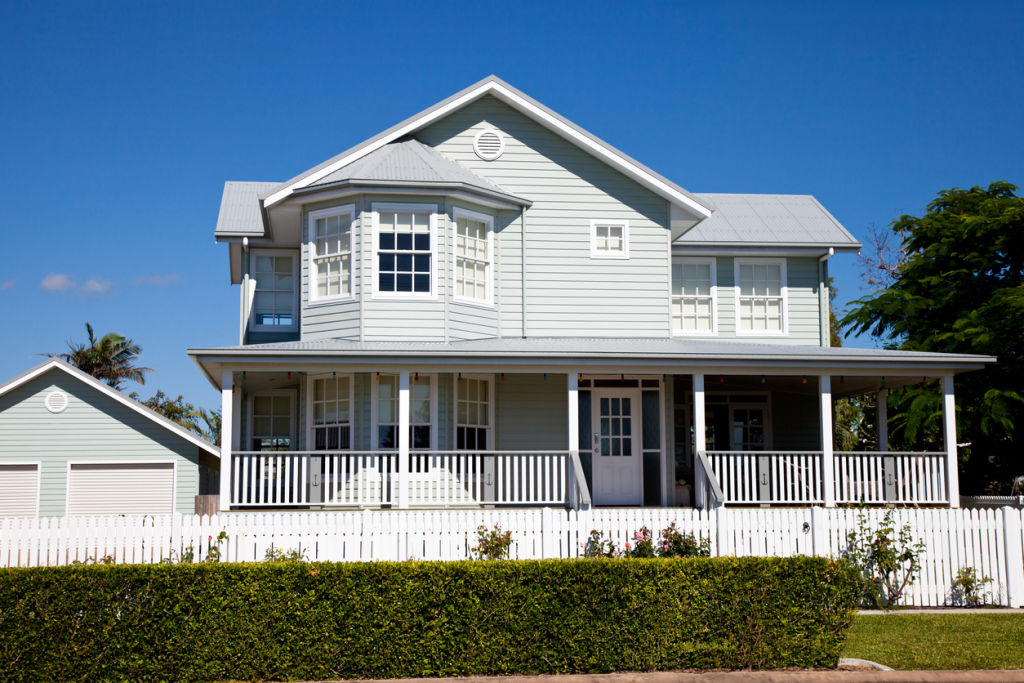
One of the areas that many renovators forget to take into account is the entryway. You want your entry to draw the eye in and extend a welcome to family and friends.
You could make a bold statement here or gently draw focus by using a colour that is a shade or two lighter or darker than the facade. Clever use of lighting and landscaping is also key to a designer-looking entry and facade.
Landscaping
There is more to landscaping than just filling up garden beds with a plethora of plants.
Take another look at the architectural features of your facade. Is your house top heavy? Is it brick or timber? Is it high-set or low-set? Your landscaping needs to work with and anchor the house, so choose plants that will achieve this.
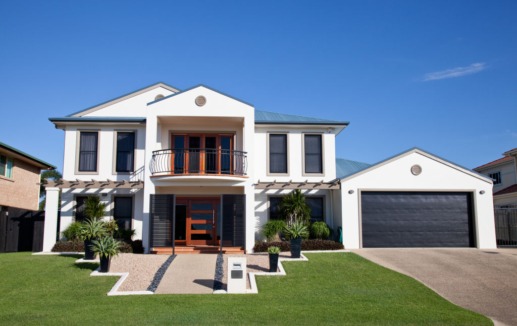
As a general rule of thumb, choose visually heavier looking plants if your home is made of a heavy material like brick. A house made of a lighter material like timber can get away with using daintier plants or going with plants that are less visually heavy.
Accomplishing a cohesive designer look for your facade is a complicated process, but it is achievable if you employ these design tips. If it all sounds a bit tricky, consider using an exterior designer. It will simplify and speed up the process and will usually save you a heap of money in the long run.
Jane Eyles-Bennett is one of Australia’s top interior-exterior designers and owner of design firm Hotspace Consultants. Join Jane in her Facebook group Home Renovators Network Australia for design and renovation inspiration and insider tips for your home improvement projects.
We recommend
We thought you might like
States
Capital Cities
Capital Cities - Rentals
Popular Areas
Allhomes
More
