Dear Darren: Darren Palmer answers your design questions
Q: How do we embrace, disguise or treat Besser block internal walls?
A: There are three equally good approaches to consider.
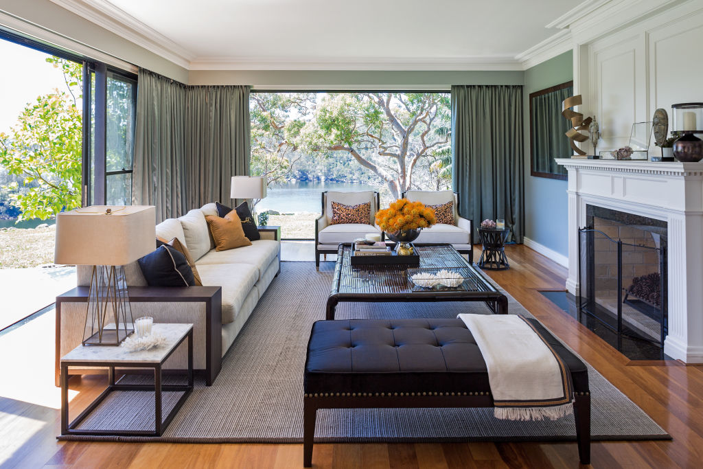
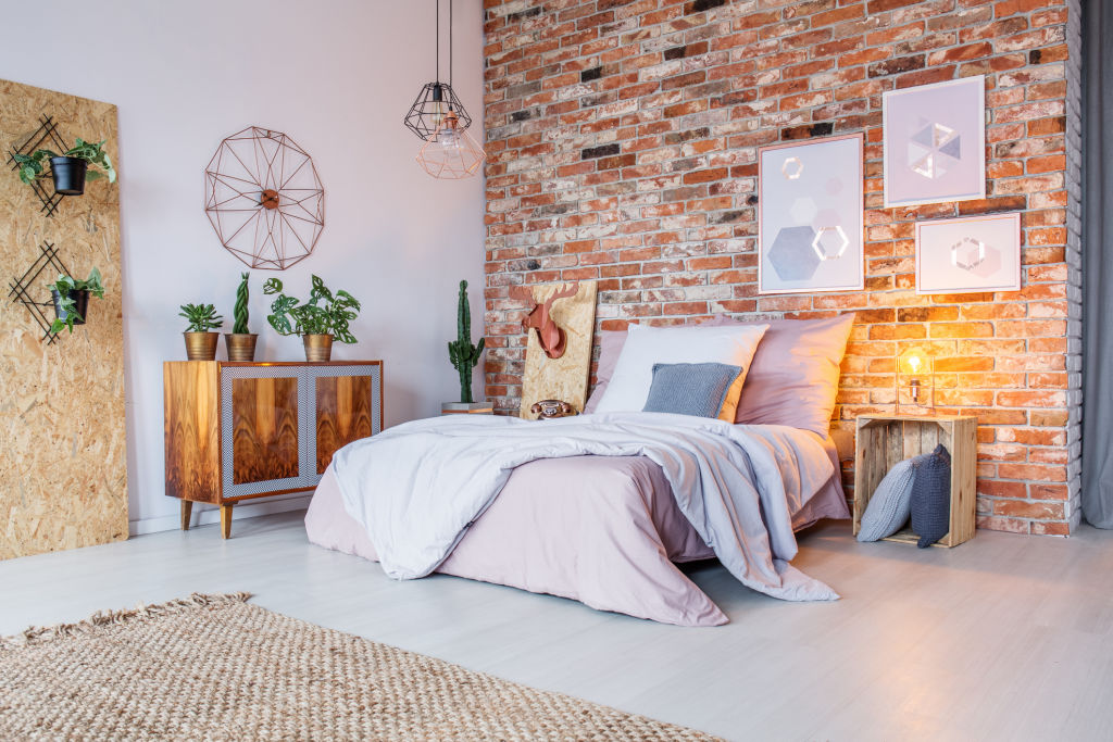
Embracing Besser brick is easier at the moment than ever before as you can go with the industrial look and layer in touches of black metal, concrete and metallics such as brass or anthracite.
You can also embrace Besser as part of a more bohemian look that can be made from elements such as terracotta tiles, terrazzo, coral, grey and white with additions of rattan and oak. This whole palette is on trend and would be a good balance to the harder look of the concrete block.
Hear all about life on the water on Somewhere Else :
You should take the same approach to covering Besser brick as you do any other type of internal brick. You can either direct stick plasterboard if you want a quick and easy, but less professional approach, or use battens or framework in front of the wall to attach anything from plasterboard, laminate, veneered panels or VJ to give you visual interest.
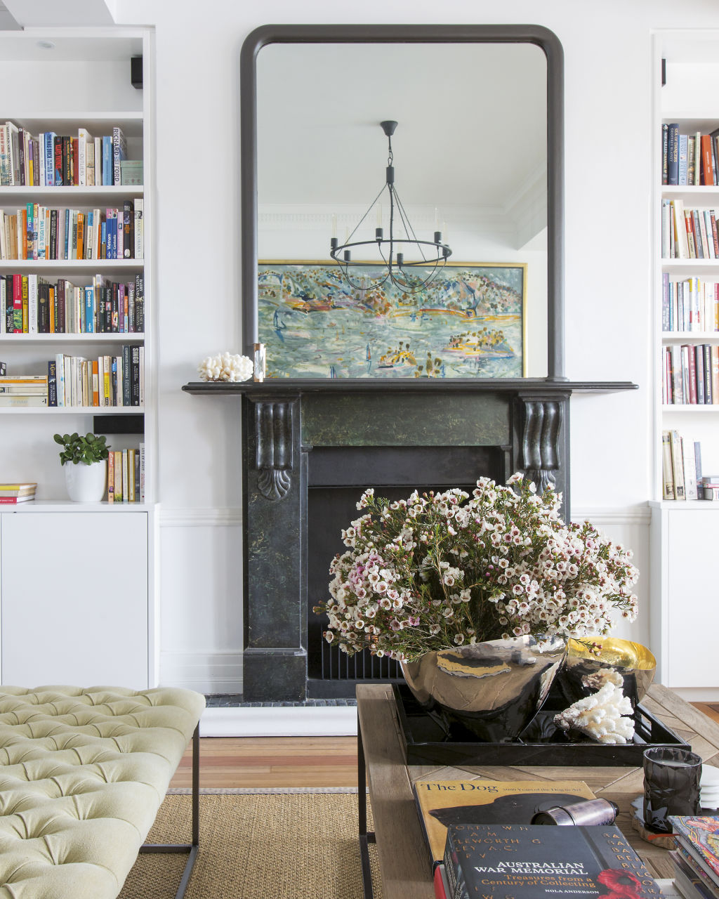
Lastly, treating Besser brick walls can be beautifully done by the application of specialty finishes such as venetian plaster – you’d be advised to hire a professional if you want the best results. Corlina from Luxury Wall Finishes advises that their process to apply over Besser brick is to prime and render the block, add another coat of prime and then apply the venetian plaster before applying the final sealing process. It’s a hugely luxurious finish but does come at a considerable labour cost.
Q: We’re having trouble with furniture layout in two rooms in a 1910 house where the fireplaces are in the corners of the rooms backing onto each other. The rooms are also open to each other. Trying to work out what type of furniture to use and where to place each piece to make the rooms cosy and semi-formal is proving impossible. Any advice would be welcome.
A: That’s an interesting challenge, and one that I actually faced in my own last home renovation.
My solution was to have a television on an appropriate wall where I could face a sofa toward it, but only set up one of the rooms for TV viewing, the other was set up for conversation.
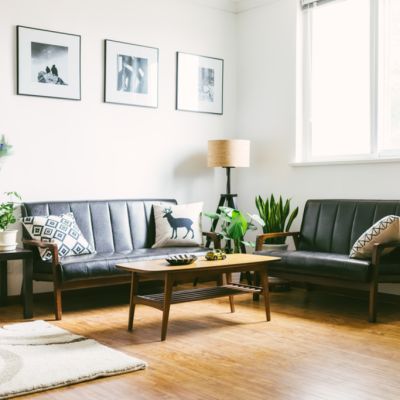
The room closest to the street had a sofa pushed back against each side wall, providing a walkway between the coffee table and the sofas on either side in a very symmetrical approach.
The middle and trickier room needed a more asymmetrical and unconventional approach to allow for TV viewing if desired, so I created a walkway behind the back of the chaise section of an L-shaped modular sofa. The modules allowed the sofa to be configured in several ways, not locked into a left or right L-shape.
Allowing 400 to 500 millimetres as a walkway is just enough space if you need to squeeze a lot in.
Remember, too, that sofas can have shallow/normal depths and extra/deep depths.
For narrow rooms, choose a normal depth and allow the right walkways – from 700 to 1100 millimetres.
If you have a design question to ask our interior guru Darren Palmer, email editorial@domain.com.au
We recommend
We thought you might like
States
Capital Cities
Capital Cities - Rentals
Popular Areas
Allhomes
More
