Darren Palmer's favourite colour choices and how to apply them in your home
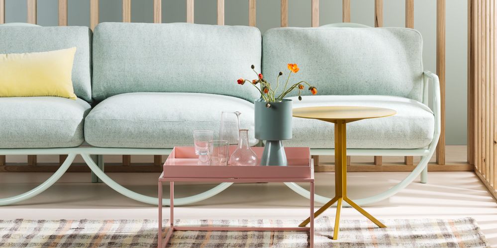
Giving your interiors a fresh lick of paint is one of the best ways to inject some personality into a space. Here are some of my favourite colour choices right now and how to apply them in your
own home.
Before you jump right in and slather your walls in a daring shade, it’s important to test how the colour will look in your home.
Paint A3 boards in your chosen colour and move them around your home throughout the day, testing in different light, and make sure you’re satisfied before applying. You need to ensure the colour works with the rest of your interior inclusions, such as furniture choices and decor, too.
For big statements, paint all of your walls and, if you’re feeling bold, you can get great results from painting ceilings, too.
If you’d rather play it safe, paint your doors for some drama. In very few instances would I recommend creating a painted feature wall – retro is back, but this application is so early-2000s and that era is thankfully not having its resurgence, just yet.
For an even more measured approach, look at furniture pieces and decor to embrace these colours, although bold decisions often yield the best results.
Whites
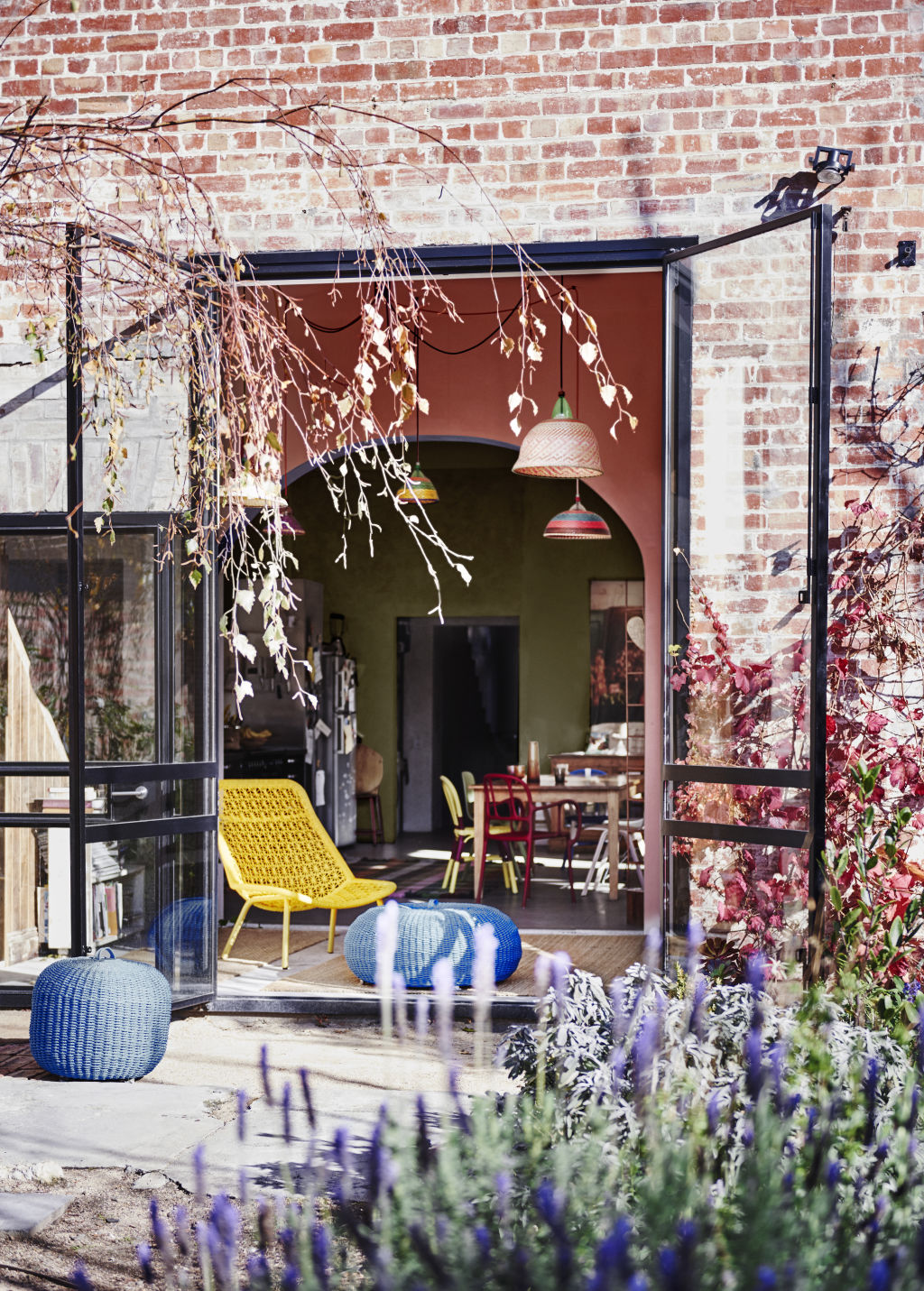
Haymes Greyology 3 is a lovely white with a neutral (not cold or warm) grey base, great for lightening and brightening interiors without casting a hue. Dulux Lexicon can be used for similar reasons, though it skews slightly toward the bluer tones of grey. Dulux Whitsunday Island is a slightly darker, warmer light white, skewing ever so slightly green, which can be brilliant for oak, grey, black and white schemes or, for a slightly darker take on the same idea, Haymes Soft Feathers can warm up a white and bright space.
Orange
It is notoriously hard to get right, but this hue is definitely having a moment in interiors, particularly in upholstery. The colours on trend in 2019 are Haymes Pale Rust for a more coral based terracotta or Cherokee, for a browner take on a mid-orange. Dulux has corals like Gold Pheasant, and more clay-coloured oranges such as Terracotta Chip, Baked Clay and Italian Clay, which are all in line with Pantone’s colour of the year, Living Coral.
Purple
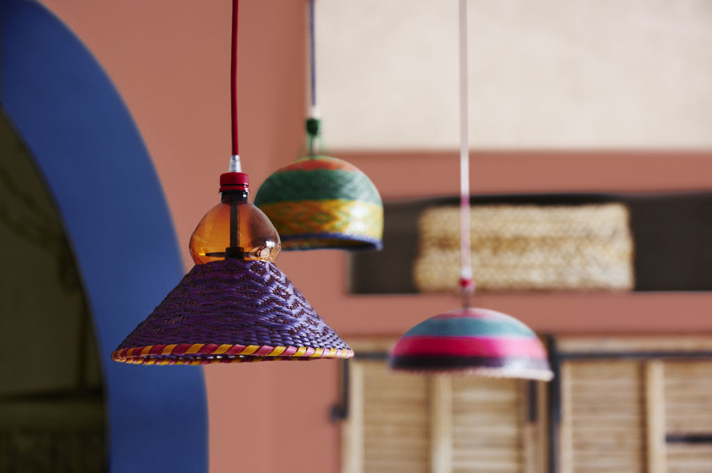
More fig and plum than purple, these colours are also being seen through interiors. Haymes Deep Plum is near black so will be better applied in measured ways, such as on furniture or doors, though it’s the right type of desaturated purple for the look of the moment. Haymes Berry Crush, Berry Juice and Burnt Sienna are all worth considering. Grey-based pastels are proving popular and are in contrast to the sultry mood of the deeper hues. Haymes Canada Violet and Sweet Pea, and Dulux Nantucket Mist and Antique Lace are all appropriate for a lighter pastel look.
Blues
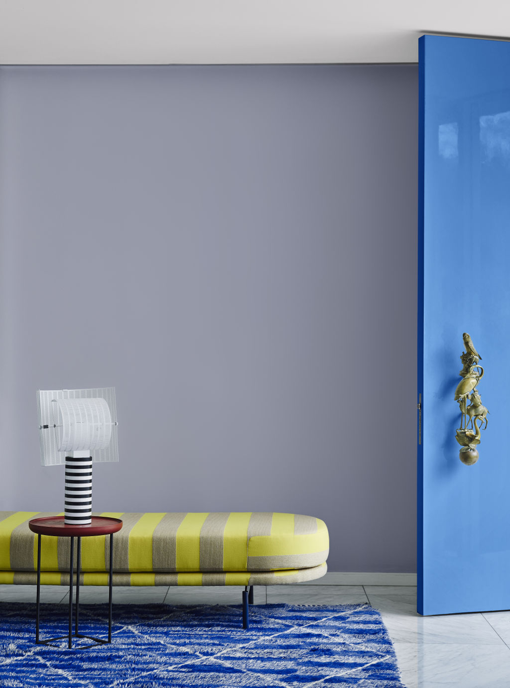
Blues are a perennial and can lead you in any number of directions. For pastels look at Haymes Windstream, Miranda and Hazy Shade, but to really make an impact you’ll want brightly saturated colours, like Haymes Royal Flair or Reef Oasis, or Dulux Blue Sail, Sinatra or Summer Waters.
Chasing that Memphis look? Go for the more teal blues like Dulux Aqualogic or Haymes Somerset – but with this look, conviction and colour co-ordination are key.
For a great (and safer) nautical blue, go for something greyish, like Haymes Twin Flower, Slumber or Silence. For a deeper statement Copen Blue, also by Haymes, is a deep navy, perfect for highlighting doors.
Greens
Greens are another long-lasting colour with broad appeal. I’ve used Haymes Chameleon to highlight doors in a beach house, within a white-and-oak palette, as the green always helps to defuse any yellowness in oak or pine flooring. For pastels, look at Haymes Capulet or Dulux Lamb’s Ear Half. For the more sultry palettes, go for forest greens and emeralds, like Dulux Wimbledon and High Tea Green. These colours really pop against white, and tie in nicely with the plum and fig colours as part of a scheme, or as accent colour references for decor and furniture.
Yellow
Chartreuse is having a moment as well, although stick with upholstery, art and decor if this colour appeals to you as it can be a little overwhelming. It’s not exactly yellow, but a grey-based, greenish colour. Mustards are a gold-like, dirty-based yellow that are also featuring in interiors again. Look at Dulux Goldie or Hay Wain for a more golden mustard, or Haymes Gold Dust for the more green-skewing version.
HomeSpace by Darren Palmer (Murdoch Books, RRP $39.99).
We recommend
We thought you might like
States
Capital Cities
Capital Cities - Rentals
Popular Areas
Allhomes
More


