Design brief: Inside the clever remodel of a charming 1960s weekender
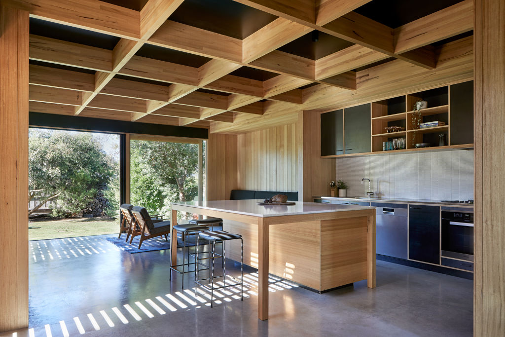
The clever remodel of a charming 1960s Mornington Peninsula home has transformed it from a modest weekender to a modern and spacious full-time family home.
The single-level building’s considered design, floor layout, and economic use of space characterise the traits of the Small Homes Service of its time. Maintained beautifully throughout the decades, its exterior and interior had changed very little, except for a new bathroom.
“The owners loved the original ’60s character of the house,” says Antony Martin from MRTN Architects. “Its original features had been preserved, including its painted timber window frames, custom-made window wall, and hardwood timber ceiling with its decades-old patina.”
Because the home lacked modern comforts and functional spaces, the new design revolved around adding a second living space and a contemporary kitchen upgrade. The addition of a new pavilion, inspired by the home’s original living room, needed to not only tick the functionality box but also provide a smooth and seamless transition between the old and new.
Martin says the pavilion was intended to complement the original living space, rather than replicate it.
“We wanted to provide a contrast in a way that was not simply doing the opposite,” he says. “The original home has white painted finishes and a clear-finished timber lining board ceiling, which is the main feature of the original house. The new addition references both the timber ceiling of the original and its custom-made window wall.”
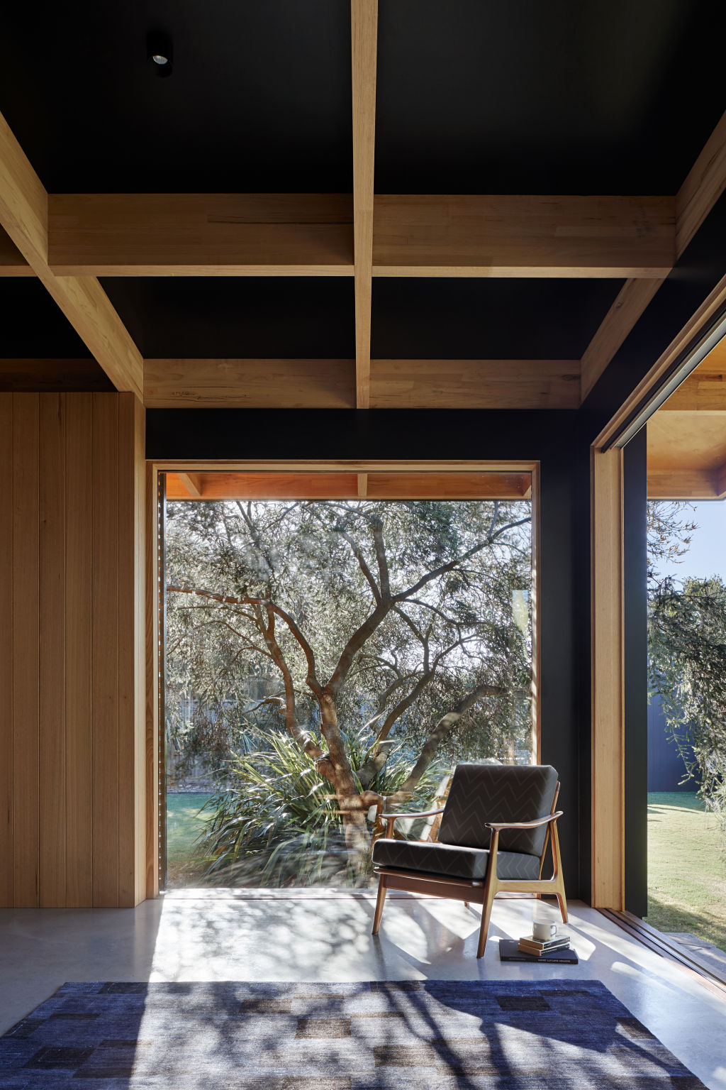
The ceiling’s exposed glulam timber structure is inspired by the austere construction methods of Japanese architecture, and the exposed structure is fabricated from Australian hardwoods and complemented by silvertop ash lining boards and Tasmanian oak veneers.
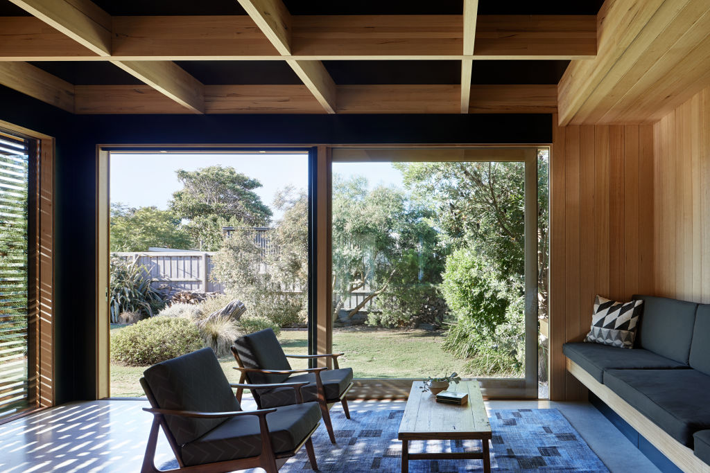
Offsetting the timber finishes is a stark dark palette, which is beautifully illuminated thanks to vast sheets of glass.
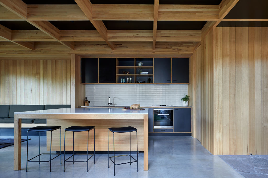
Inside, the open-plan kitchen’s new cohesive material palette integrates, rather than delineates, the space.
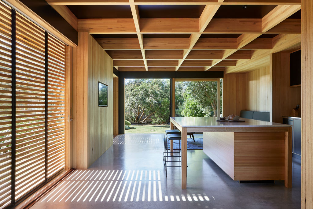
“The clear-finished timber veneer ties the kitchen to the timber finishes found elsewhere,” says Martin of the remodel that centres on a vast kitchen island designed to operate as an oversized table.
Stylish sliding timber battened screens shield the indoors from the harsh western sun and open up the home to a garden of native trees.
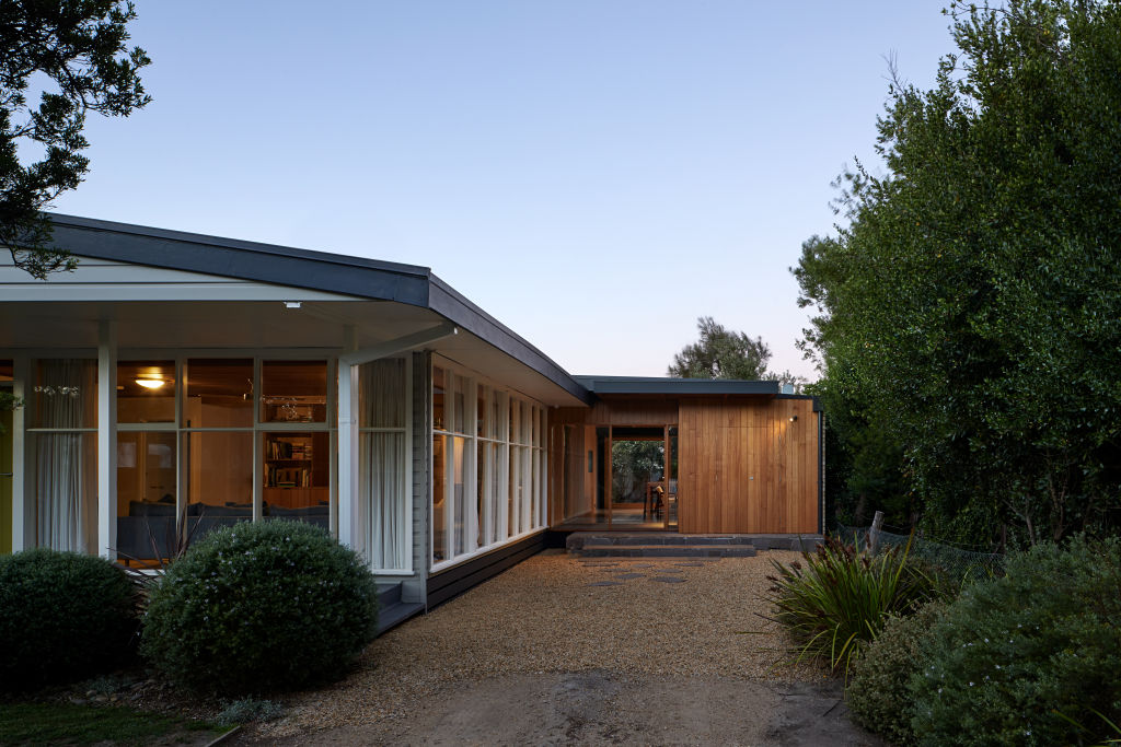
The result is a seamless and respectful transition between the old and new, and a contemporary, functional and stylish family home.
“The character of the materials and quiet contemplation of garden through the large windows creates a space of calm,” says Martin. “The tenuous connection through a corner of the existing house means the new pavilion exists in quiet conversation with the lovely original house.”
Get the look
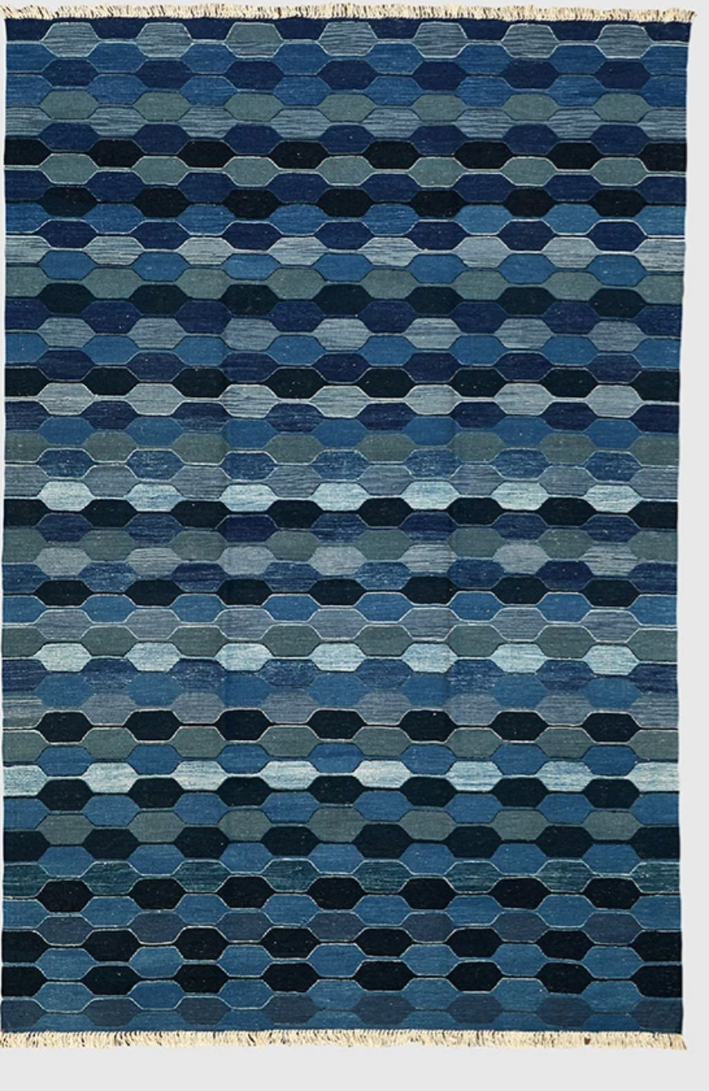
Rug – Loom
The Contemporary Kilim rug from Loom in a cool blue hue ties in with the burnished concrete floors.
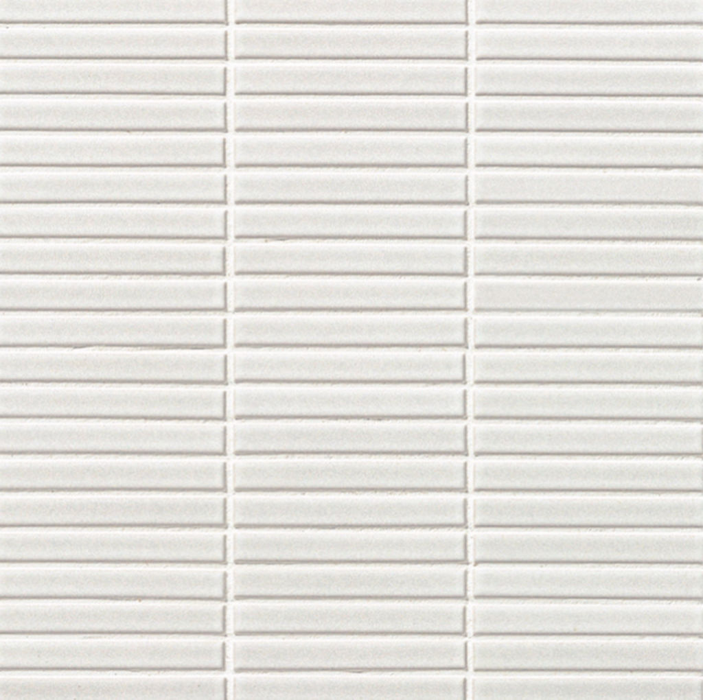
Tiles – Artedomus ‘Yohan Border’
The Yohen Border tiles from Artedomus, used on the kitchen splashback, are inspired by the tones of traditional Japanese pottery.
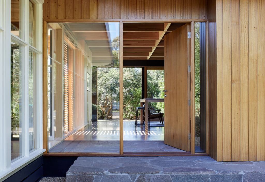
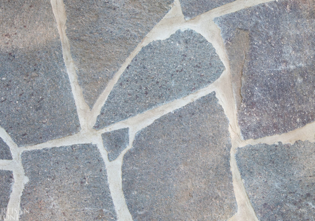
Pavers – Porphyry Stone Crazy Pavers
Porphyry Crazy Pavers, a low maintenance stone sourced from Italy, were used both inside and out.
We recommend
We thought you might like
States
Capital Cities
Capital Cities - Rentals
Popular Areas
Allhomes
More
