Don't try this at home: the five worst design trends of 2016

It’s hard to believe it’s November again. We’ve survived almost the entire year. As we look back over 2016 there are undoubtedly things we can all find to be thankful for. But it would be remiss of us to deny or forget that this year carried with it many heinous burdens that we’d all be glad to never lay eyes on again.
I’m speaking not just of politics and crushing world events, but things closer to home, as well. Like, literally in our homes. And if we don’t at least reflect on some of the worst interior trends of the past 11 months, we may find ourselves repeating them. So let’s pause, inhale deeply and remember, for no other reason than to release such domestic faux pas to the universe (and maybe ask for a store credit).
1. Fabric wall art

Photo: apartment therapy
Blame the growing craft movements and the recent fetishisation of the alleged exotic. Hell, blame crappy paint jobs that need cover-ups. The fact is fabric wall art exploded in 2016 and not all of it was pretty. Where once people were content to hang up a twee tapestry of their dog’s face, or mount that vibrant Mandala print on their flatmate’s adjoining wall, the two trends converged this year and we saw DIY weaves, (also known as wall hangings) flood every design blog, Pinterest and Instagram account.
Some of them look good. Some of them look like a dog had a fight with a half-knitted jumper and to prevent further altercations, it’s been hung on a wall so Fido can’t reach it. It’s this year’s version of the Balinese dream catcher and the only thing worse than a loose wall hanging is an overpriced Juju hat. These spectacular, African-inspired headdresses are supposed to represent prosperity and freedom and you’d want to have both in large amounts because a small one goes for $300 and a large around $700. For feathers. And raffia.
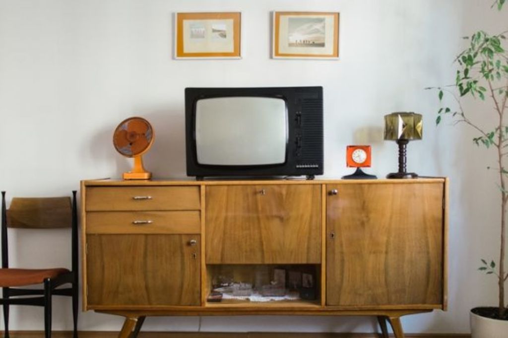
2. Going too Retro

Photo: Hooked on houses
Boogie Nights and adjust accordingly.
3. Wallpaper

Photo: design-milk
Every year interior designers and home stylists tell us: wallpaper is making a comeback. 2016 was no different. This proclamation is usually accompanied by “a peek” inside some fabulous creative type’s abode and, serving as the ultimate backdrop to the “eclectic pieces” from Marrakesh and Freedom Furniture, is a beautiful wall of flowers. Or perhaps it’s an entire room that’s been papered in silver leaves.
There’s nothing inherently wrong with this – it almost always looks striking and beautiful. The problem is the conceit, like a model advertising a transparent mini dress, this is a very specific look. Hey, I wish we could all cover our kitchen walls in golden filigree, but just like those mini dresses, unfortunately, it’s just not going to look the same for the average person.
4. Minimalist bedrooms

Photo: Arch Daily
There’s really nothing like coming home to an all-white bedroom, consisting of just your oversized, low lying bed and soft-as-t-shirt sheets, rice-coloured side table with a lamp the colour and texture of paper – and absolutely nothing else. There’s nothing like it because it can not exist in the real world. What about your clothes? Your non-matching blanket for when it is cold? Your iPad or laptop? Oh, you just grab a pale basket and pile it all in. But, then one basket quickly becomes two and before you know it you’ve added those ridiculous paper bag storage things and what do you know? It’s no longer minimalist.
5. Too many words

Photo: Deseret Book
So, you like a quote from Mark Twain, or Coco Chanel or Deepak Chopra. By all means, write it down but please refrain from framing it. Worse is when you only want “Good Vibes” or your children to “Feel Good”, so much so that you had it printed on a cushion.
Here’s the thing: we all want happiness. We all love our kids to the moon and back and we all wish each other Namaste, (in my day we called it shalom, but that’s by the by.) But staring at those same words every single day? Not inspirational.
We recommend
We thought you might like
States
Capital Cities
Capital Cities - Rentals
Popular Areas
Allhomes
More


