The Block 2018: How to dramatically change the look of your home in 48 hours
A re-do renovation executed in just 48 hours sounds like the ultimate challenge, and for the contestants on The Block this week, it proved to be just that. As part of re-do week, the couples had to transform one room deemed by the judges to be the least effective.
So how did they fare? We asked the experts.
Masculine master bedroom
With a master bedroom described by Shaynna as “heavily masculine”, all-female team Bianca and Carla were faced with re-styling a space dubbed more “man cave” than boudoir.
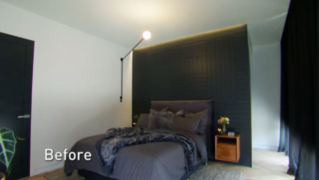
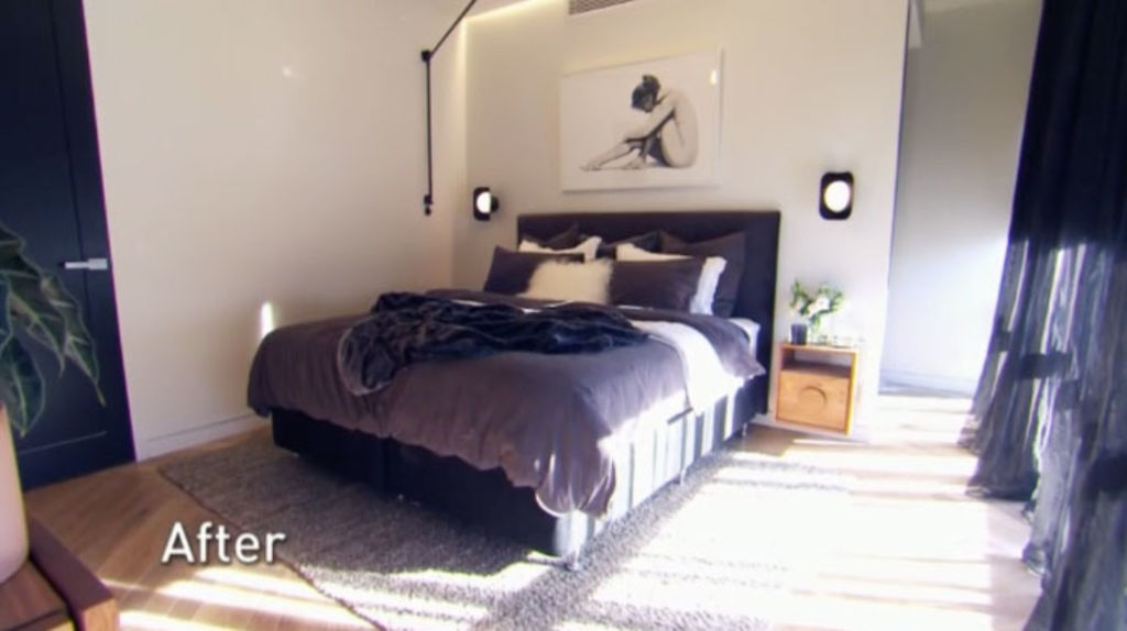
Solution: “Different lighting, perhaps a gold fitting with multiple bulbs, would instantly inject femininity into the space,” suggested Sara Chamberlain, director at The Real Estate Stylist.
“The rustic timber bedside tables are very masculine too. A more structured, black side table with a marble top would look much softer.”
While Bianca and Carla decided to repaint their dark feature wall, Chamberlain says an easier solution would have been to redress the bed.
“There is nothing overly masculine about a dark wall. The issue is the dark linen against the dark feature wall because there is nowhere for the eye to rest. White or neutral coloured bed linen immediately calms the space and looks fresher.”
Wrong place, right fireplace
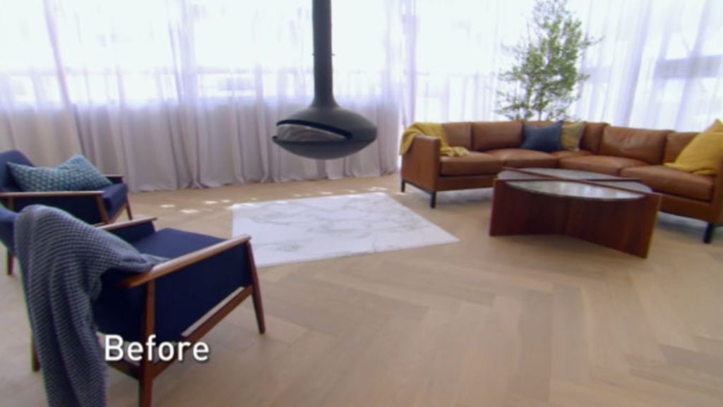
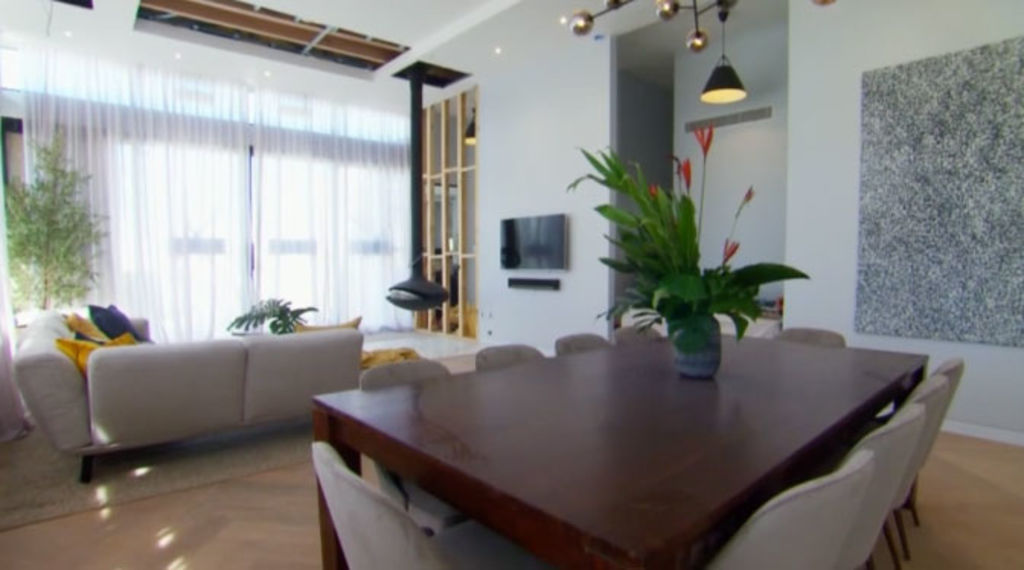
While furniture can be easily manoeuvred around a room, not so a fixed feature. Case in point – Jess and Norm’s super-expensive floating fireplace. Despite the judges’ admiration for their choice of heater, they were heavily criticised for its bad placement.
Related: View the five Gatwick apartments for sale
- Kerrie and Spence: 1/34 Fitzroy Street, St Kilda
- Hans and Courtney: 2/34 Fitzroy Street, St Kilda
- Sara and Hayden: 3/34 Fitzroy Street, St Kilda
- Norm and Jess: 4/34 Fitzroy Street, St Kilda
- Bianca and Carla: 5/34 Fitzroy Street, St Kilda
Solution: “The room itself is beautifully minimal and well-styled, except for that weirdly off-centre UFO,” says stylist Rebecca Johnson.
“It is an expensive and time-consuming operation to move it to the corner of the room, but in this case a worthwhile one. There is no point in leaving a permanent fixture in the wrong spot. It throws off the layout of the room, leaving it lacking function, purpose and style.“
Too beige
Beige is often considered boring, but for many it is an easy go-to hue. Or so Courtney and Hans thought.
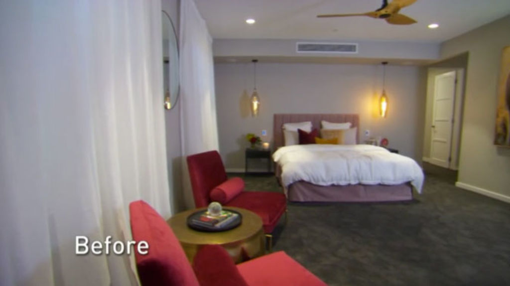
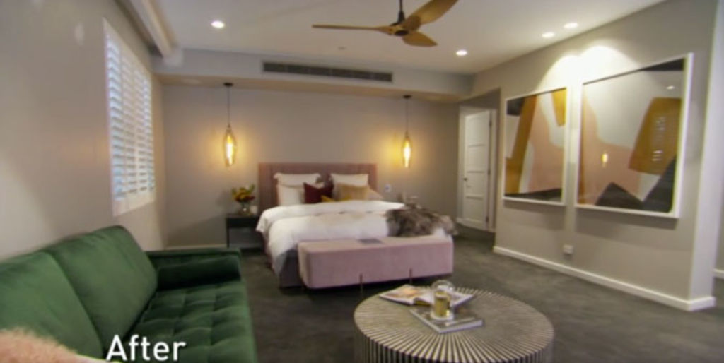
Solution: “Beige isn’t necessarily safe or boring, it just requires careful styling consideration,” says Chamberlain. “Working with an all-beige palette, especially in a bedroom, can be perfection. But only if you execute it using various textures to create real luxury.”
When working monochromatically, aim for perfect tone-on-tone.
“Everything from wall paneling, rugs and greenery to mirrors and upholstered furniture should meld and harmonise. That’s real luxury,” she says.
Safe styling
From their choice of artwork to occasional furniture, Sara and Hayden’s bedroom styling is deemed too safe by the judges, leaving them with an entire room to restyle. And fast.
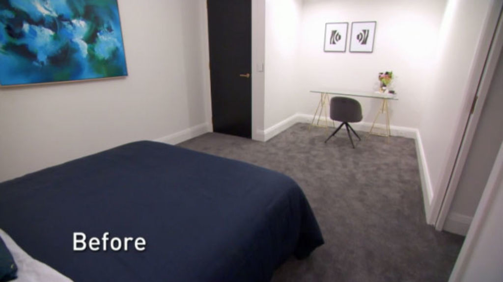
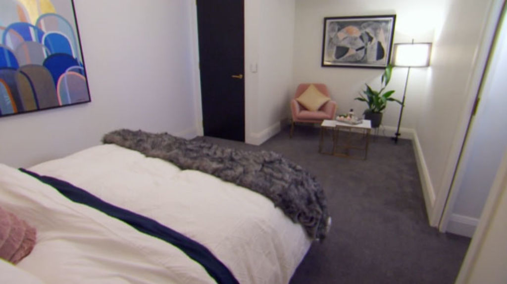
Solution: “If selling your house, don’t select artwork that is too personal,” says Chamberlain. “Look for clean lines and gentle subject matter. Steer clear of oversized artwork that imposes on the space, and select smaller scale pieces instead.”
When choosing occasional furniture, consider scale, proportion and purpose.
“If the ceiling is high and the space is large look for sizeable pieces, and in a smaller space opt for lesser elements,” she says. “Really think about proportion. Ensure your bed and bedside tables are the right height for each other, and choose an occasional chair that doesn’t look too low near a large-scale king bed.”
Empty and emotionless
With the judges comparing their living room to that of a “1990s boardroom”, Kerrie and Spence faced a task that even the most seasoned stylists find challenging.
“[An] under-styled room is the number one challenge because larger rooms tend to devour everything,” says Chamberlain. “You can throw the works at it and still wonder if it’s enough.”
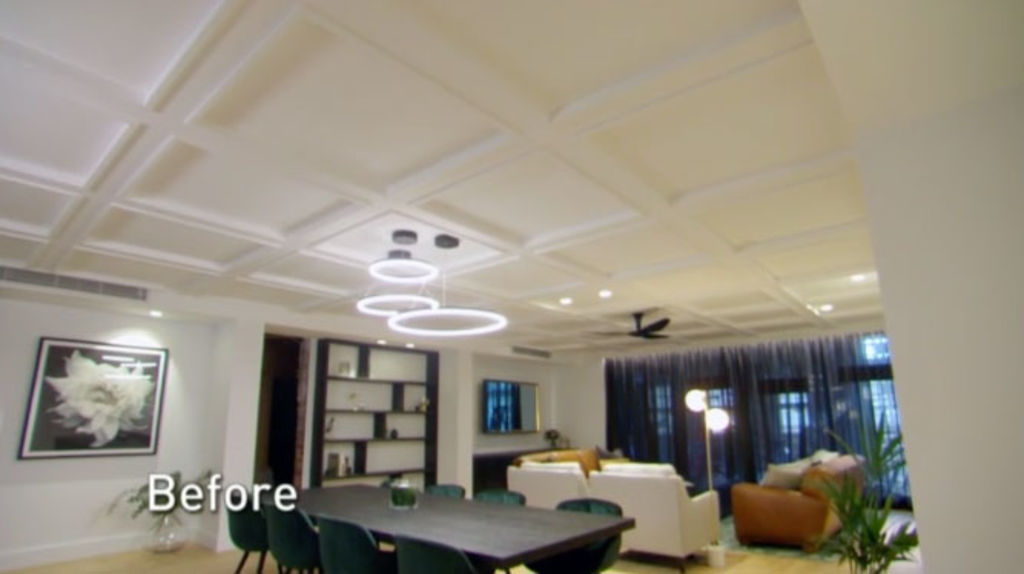
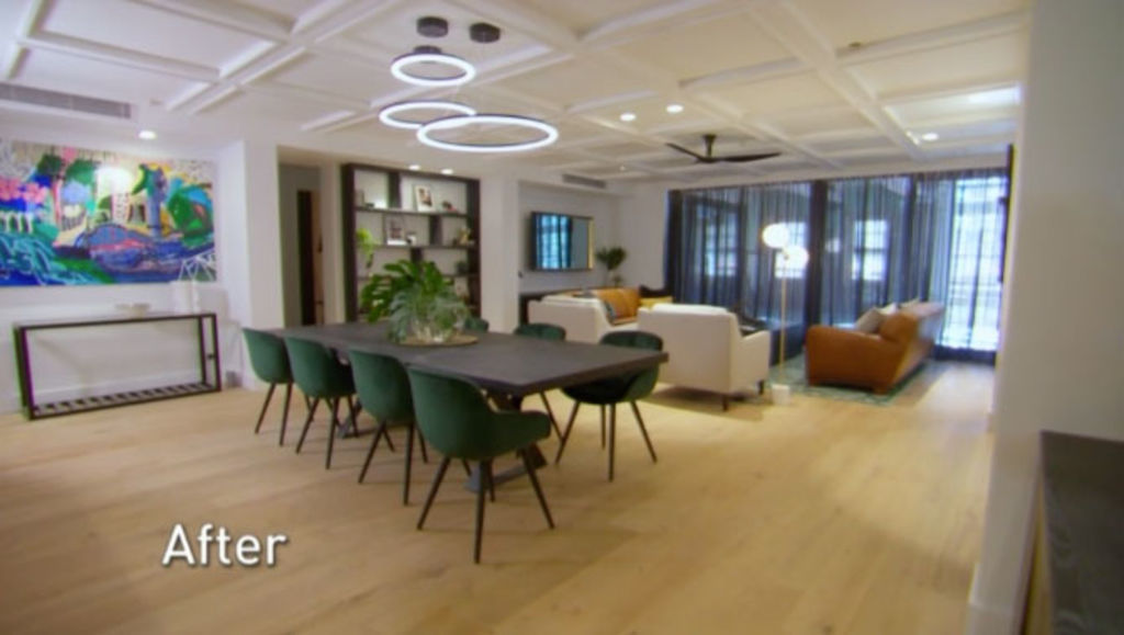
She also disliked their colour scheme. “Teal and orange-toned leather is too contrasting,” she says. “These colours can work, but it takes a lot of considered effort.”
Solution: “Key is to keep colours consistent so you have a solid colour scheme,” she says. “To avoid an under-styled space, work with the basic design principles of scale, balance, pattern and texture.
”Creating layers between the ceiling and the bookcase is a great idea, except theirs is only 10 per cent full. A fully stocked bookcase and den is a great look and is impossible to under-style. It creates a sense of home and less a boardroom vibe.”
We recommend
States
Capital Cities
Capital Cities - Rentals
Popular Areas
Allhomes
More
- © 2025, CoStar Group Inc.


