Ease unified in split-level design: Inside the home of architect Nina Still

Even in the images of architect Nina Still’s Putney house you can sense the movement of plant-infused air and leaf-filtered, wavering sunlight. Hers is an abnormally vivified domestic atmosphere.
“Everywhere,” she says, “in every single room, you can look out and have access to views of the garden, the light, the pool and the sky.”
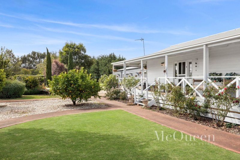
Charmed anyway by the old weatherboard cottage “that was like a vintage Queenslander with a massive verandah” that had been relocated at some point in its history “by being chopped in half and transported by barge from Balmain”, Still was equally attracted to the large site that drops off on one boundary by nine metres.
“That gave us good aspect into the tops of the trees.”
So, having tweaked some of the arrangements within the old three-bedroom cottage, adding louvres and insulation, while resisting making it more open plan to instead “keep it as a cottage with small rooms”, all was well. Almost.
The remaining problem was of “overbearing” – a three-storey neighbour who was too close on the western boundary.
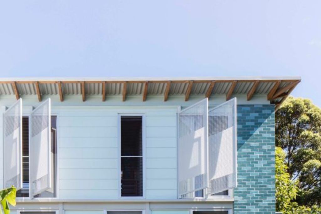
The architect’s solution was to design a three-level wing against this intrusion that would contain three bedrooms and create a courtyard of complete privacy.
The contrasting, contemporary and double-brick expansion is a completely separate building. And, Still says, “it freaked people out that we would have to cross a verandah to get to it.”
- Related: ‘It ticks boxes:’ Why this furniture is highly coveted
- Related: This terrace was once dark and impossibly narrow
- Related: This tiny home gives the term new meaning
With an open-sided undercroft that serves as a pool room, cool room and workshop – albeit one with a bathroom – the bedroom wing gives the children middle-level bedrooms and the parents a top-floor main suite that is an avian eyrie.
Still painted her bedroom walls “a beautiful purple” because, as is so apparent in her home’s extension, she loves colour.
“You have to have colour. I don’t function without colour. It brings so much joy.”
The schemes she has chosen are all responding to what is in the immediate environment.
The patterns of the three shades of glazed brickwork are about reflecting the “colours and shadows of the pool. It also blends with the garden”. So too do the vibrant turquoise walls of the undercroft.
The painted timbers on the stairwell balustrade screen are a shade of pink. “I love pink, but I used that colour to heighten the glow that reflects off the terracotta bricks of the house next door.”
She also loves the way the verandahs and decks serve to integrate the two buildings. But the even more pleasant discovery “is the idea of having two separate zones to the house”.
“Removing ourselves to the sleeping zone at night means we can leave all the day-to-day stuff, the phones and the telly, in the cottage. We enter very peaceful spaces that are just looking out at the trees.”
We recommend
We thought you might like
States
Capital Cities
Capital Cities - Rentals
Popular Areas
Allhomes
More


