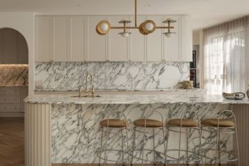
Eight interior design rules that have a positive effect on human emotions
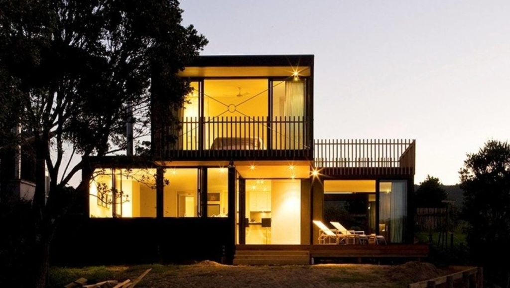
There is an undeniable connection between people’s feelings and architectural space: sometimes we don’t know it rationally, we just get it instinctively.
It’s a complex and little-researched relationship involving area, volume, light… And being human.
When designing a home, architects are really just manipulating space. Here are some rules that seem to have a positive effect on the spirit:
1. Adopt the Golden Mean
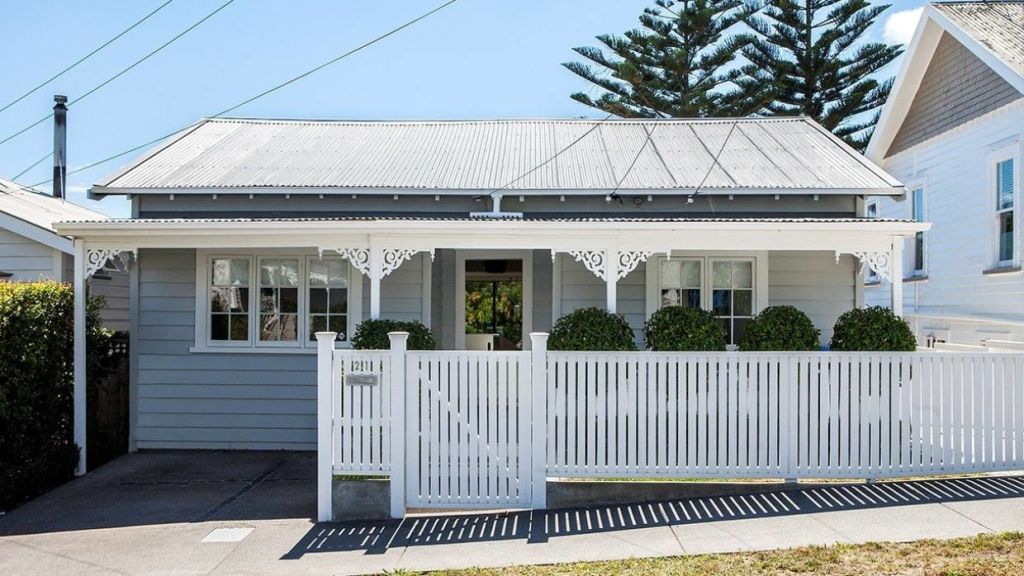
In spatial terms, this is about symmetry and proportion. A simple gable roof is a sublime example of this.
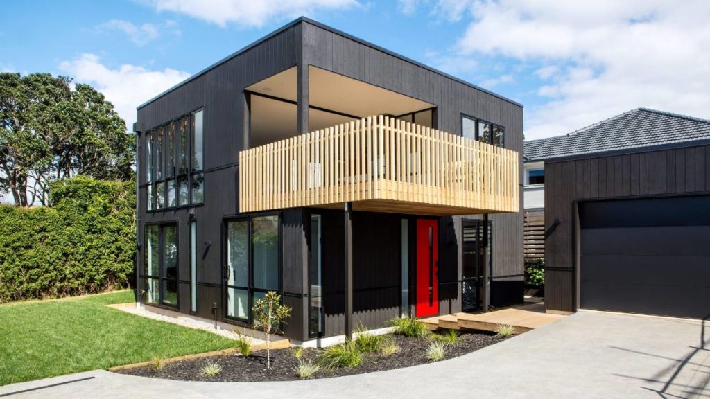
In more complex designs, such as a home comprised of cube-like volumes, the elements should all relate proportionally (eg. the bedroom pod might be half the size of the living zone). “Human” proportions are also important – not too little, not too much is a good credo to design by.
2. Use a higher stud for small spaces
It creates more volume and often lets in more light which makes the room feel bigger. Many tiny houses effectively use a vaulted ceiling and install a mezzanine bedroom beneath it.
3. Try to bring in natural light from two directions
Research has shown that humans are a bit like moths – they gravitate to light: having windows on two sides of a room just feels more welcoming.
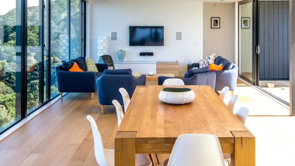
4. Floor-to-ceiling windows are another ace in the architectural toolbox
They make the space feel bigger than it is while clerestory windows give a sense of height and can bring light into a space that needs walls for functionality eg. above a bank of kitchen cabinetry.
5. A flush transition with a covered deck area expands the living space, blending the inside to the outside
Using the same material on the floor – eg. the same tile that can be used both indoors and out – and extending the ceiling beyond the threshold, makes it even more seamless.
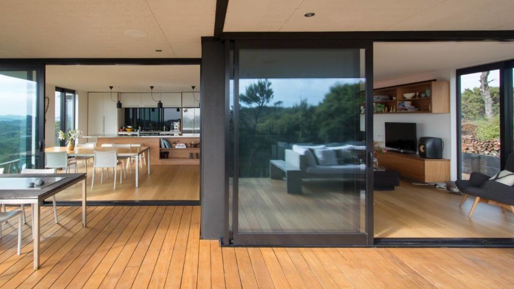
6. Avoid too many ceiling down lights (especially in the centre of the room) as it can become oppressive
Down lights create shadows below and bring the ceiling down. Pendants are a much kinder option while up-lights will “lift” a ceiling making a room feel more spacious.
7. Keep the overall size (in terms of square metres) as small as you can
Clever design can make the rooms feel bigger. More space equals more cost and usually a bigger mortgage. That isn’t beneficial to human wellbeing.
8. Consider skylights for internal rooms such as bathrooms
They bring light into the darker recesses and open up a space.
Caitlin Bartlett is a graduate architect at Box.
- This story originally appeared on stuff.co.nz
We recommend
We thought you might like
States
Capital Cities
Capital Cities - Rentals
Popular Areas
Allhomes
More

