Five common bathroom blunders and how to steer clear of them

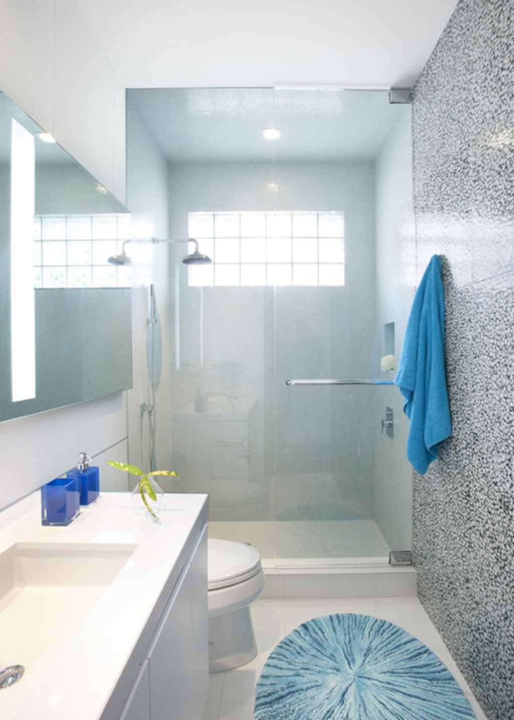
Contemporary Bathroom by DKOR Interiors Inc.- Interior Designers Miami
Author: Dylan Chappell
Adding to or renovating your house is one of the most exciting and creative processes you can go through. But with all that responsibility comes pressure to make informed decisions that will last for decades. How can you make sure to get the right design for your lifestyle, stay within your budget and maximise the return on your investment? Start with a great design for every room in your house – including (or especially) the bathroom.
Bathrooms, whether big or small, should always be well thought out and carefully located, and should function with multiple users in mind. We’re long past the era where there was one bathroom for every three bedrooms in the house, and everyone had all the time needed to use it. Today’s bathrooms need to be beautiful, use space efficiently and serve the users functionally. Avoiding the common design blunders below can help you be happier with your bathroom for the long haul.
Browse thousands of beautiful bathroom designs on Houzz

1. No view out
No-one likes a dark, damp bathroom with bad circulation – it’s no fun spending time in a space like that. If you’re building or relocating a bathroom, try to site it on an outside wall with windows. If windows are not an option, installing an operable skylight can allow for the fresh air and natural light needed to make the space feel comfortable.

2. A clear view in
I once worked on a large renovation for which the existing design had a bathroom in the dining room – seems like a conflict of interests, right?Whenever possible, avoid locating the bathroom directly off one of the home’s public rooms – like the kitchen, living room or dining room.
This doesn’t necessarily mean you have to put in a long hallway, but do try to create some sort of formal separation to break up the line of sight. The last thing you want is to be sitting in the living room with a glass of wine in hand and looking straight into the bathroom at the toilet.

3. Making it all about the toilet
That leads me to my next blunder: avoid making the toilet the first thing you see in the bathroom, and avoid any sight lines to it from adjacent rooms. I like to put the toilet and shower in their own room while keeping the sink separate. This allows someone to take a shower while someone else gets ready at the sink. In the bathroom floor plan here, the wall between the two rooms uses up only about 5cm of width in the overall size of the bathroom but doubles the room’s functionality.
Shop for sinks and bathroom vanities online

4. Curbed-shower enthusiasm
A curbless shower makes a bathroom feel bigger and look cleaner – plus, it’s very practical for ageing homeowners, since it adheres to universal design principles. This look is fairly easy to achieve in a new bathroom or a renovation – just make sure you mention it to your architect or contractor prior to construction.
5. Thinking bigger is better
That’s right: bigger isn’t better; better is better. Whether you’re designing a large master bathroom in your dream home or trying to figure out how to squeeze in an extra bathroom for your growing family, the most important aspect of your new bathroom is that it has a great design that functions efficiently for your specific lifestyle.
The truth is, great design is less about how a bathroom looks (although it’s always nice when it looks fantastic) and more about how it works. Great design translates to a house that functions better, costs less to build, is more efficient to maintain and gets you more for less.
Get professional advice from a bathroom renovator in your area
We recommend
We thought you might like
States
Capital Cities
Capital Cities - Rentals
Popular Areas
Allhomes
More


