Five popular home design decisions you should reconsider (this might surprise you)
There is one thing I know for sure and that is every home design should be treated uniquely and with respect to the specifics of the property, considering things like the home’s origins, the people who live there, and the spatial footprint with which you’re working.
That said, there are a few ideas we typically employ across design projects which are generally in conflict with common practice.
Kitchen sinks on the island bench
I can understand why the sink often ends up on our island bench. Typical kitchen designs include a wall of tall joinery that flanks the bench space housing a stovetop.
The obvious position for your sink is the island bench, but when designing a kitchen this is something we avoid.
It looks great in the magazine but, whether we like it or not, the kitchen sink is typically a hot mess. It’s generally loaded with dishes in and around it, ready to be washed, drying or waiting to be put away.
There’s no avoiding it and nor should we. That’s living!
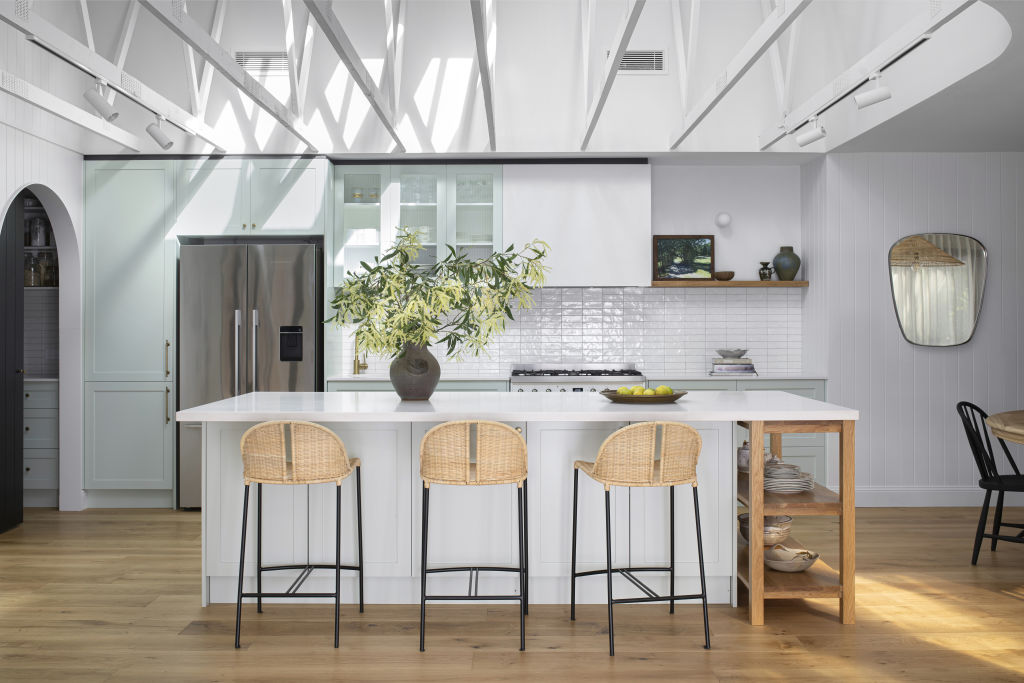
The problem comes into play with our open-plan floor plans, and the mess that gathers on a floating surface (a surface that does not sit against a wall) can create a feeling of visual chaos that then impacts the entire common area (kitchen/living/dining).
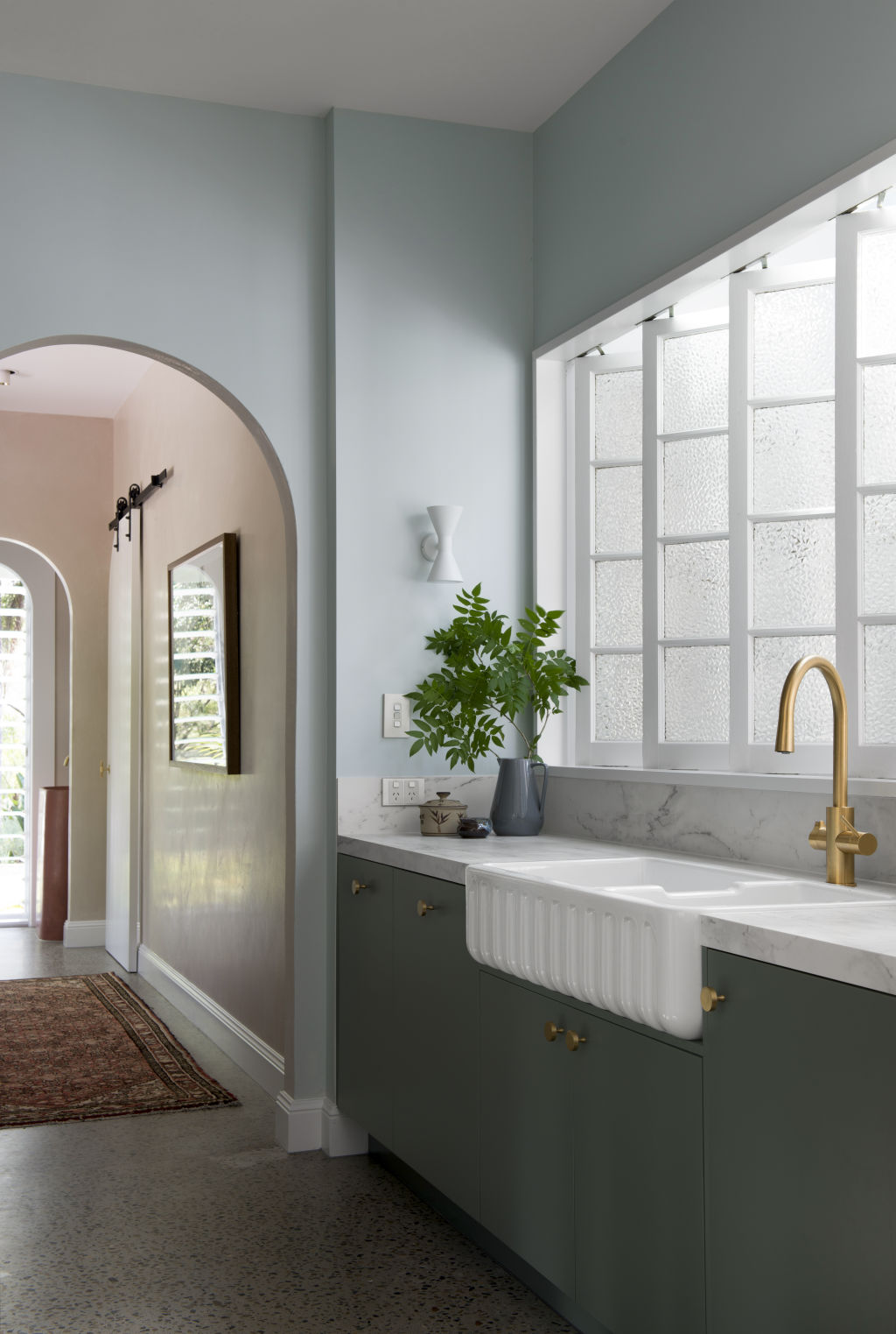
We get around this by positioning the sink on a back-wall bench or semi-concealed in what I call a “pseudo butler’s kitchen” (a space that is semi-concealed by a wall or internal windows but without a door).
Large butler’s pantries
Not unlike walk-in wardrobes, butler’s pantries also tend to take up precious floor space and sometimes with little benefit.
Once upon a time, butler’s pantries were a space to store your pantry items on narrow shelving in a way that allowed you to view your food and herbs and spices in one fell swoop. Bliss!
However, butler’s pantries have seemed to evolve into much more, with home owners opting to use them to house extra refrigerators, dishwashers and second sinks for the benefit of entertaining.
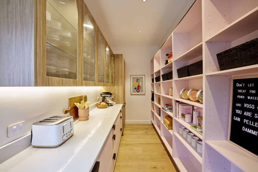
I’m not saying this is wrong, but creating a substantial butler’s pantry in an average-sized kitchen space can feel forced and can compromise the flow of the space.
Its inclusion and its scale should be with thought to how you actually use your house, and with less emphasis on your annual Christmas party.
Walk-in-wardrobes
I’m just going to say it, walk-in-wardrobes (or WIRs) are space-suckers. WIRs have become one of those things that have become a staple in floor plans in modern times and, to be frank, I don’t know why.
Sometimes when you’re building from scratch you have the luxury of space and a WIR feels warranted or simply just works with the floor plan, but very frequently, they feel forced into a space, sacrificing practicality.
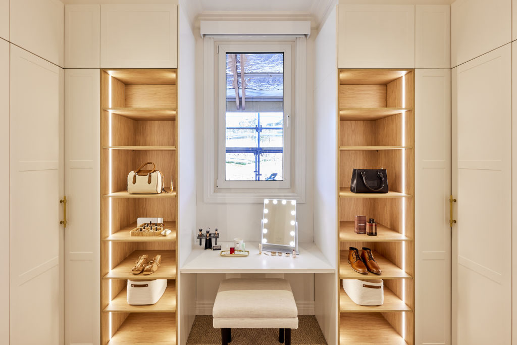
In our own home, I was resolute that we wouldn’t have WIRs because history has shown me that these spaces invite my family to dump their clothes in there with the deluded feeling that they’ve put them away.
Instead, we have a full wall of beautiful timber grain built-in cabinetry. Not only does it look and feel more sophisticated, but it means my family cannot dump their clothes on the floor and forget about them.
Horizontal surfaces
Let me explain. You obviously cannot have a home devoid of any flat surfaces but when you’re designing them into your space, they absolutely should have a function.
Horizontal surfaces in your kitchen and bathrooms are necessary. They are prep zones and they house things like sinks and stovetops, but often I see horizontal surfaces designed into homes where their function is ambiguous.
Some home owners are keen collectors of things like books, sculptures or ceramics, and these flat surfaces are a means of displaying their treasures. But, for most homes, these surfaces are junk collectors.
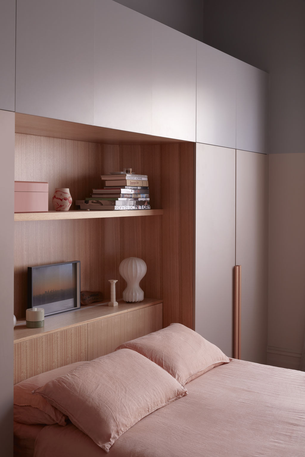
It’s where the busy-ness of daily life will accumulate in the form of hats, keys, sunglasses, bills, random lids and your kids’ kindy artwork.
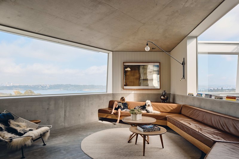
And the open-plan design of our homes means that these surfaces can cause a visual chaos that is typically not conducive to how we want our home to feel.
If you’re not a natural collector or curator, instead, consider closed built-in joinery or a free-standing tall cabinet where you can store your bits and bobs behind closed doors with a sense that they have a home.
Bedroom balconies
We all daydream about the idea of waking up at dawn and our morning espresso appearing in our hands, then sipping it leisurely on a balcony conveniently located off our main bedroom.
And who am I to tell you this is but a pipe dream? But, OK, it is a pipe dream!
Our coffee machine is probably located downstairs in our kitchen and the chances of us walking downstairs, making ourselves a drink, of any kind, and then walking back upstairs to our balcony is slim to none.
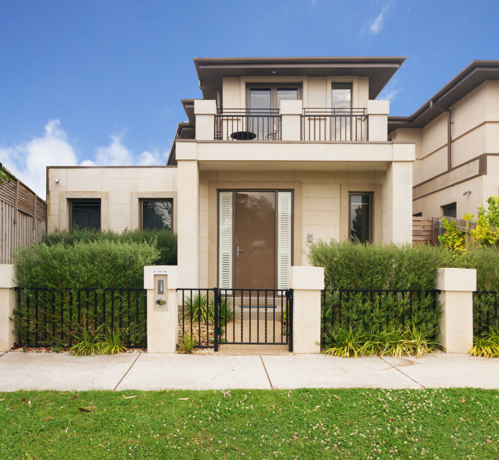
Especially given we most likely have given ourselves about 25 minutes to feed the kids breakfast, make their lunches and get them out the door in the morning.
A bedroom balcony is not an insignificant addition to your build or renovation so unless it’s something that will make your daily life easier or more enjoyable, skip it.


Interior design, styling and renovation expert Carlene Duffy first appeared on our TV screens in 2014 with husband Michael as part of Channel 9’s The Block Glasshouse and Reno Rumble.
Since then, she has been a constant on Australian screens as host of 9 Life’s Ready Set Reno, Open Homes Australia and Renovate or Rebuild.
Led by a passion for interior design, Carlene runs Cedar and Suede, a full-service interior design studio based on the Gold Coast.
We recommend
We thought you might like
States
Capital Cities
Capital Cities - Rentals
Popular Areas
Allhomes
More


