Forget minimalism, glamorous interiors are in

There’s a fresh wave of opulent interiors sweeping away the restrained and minimalist look, says Talib Choudhry, editor-at-large of Elle Decoration UK.
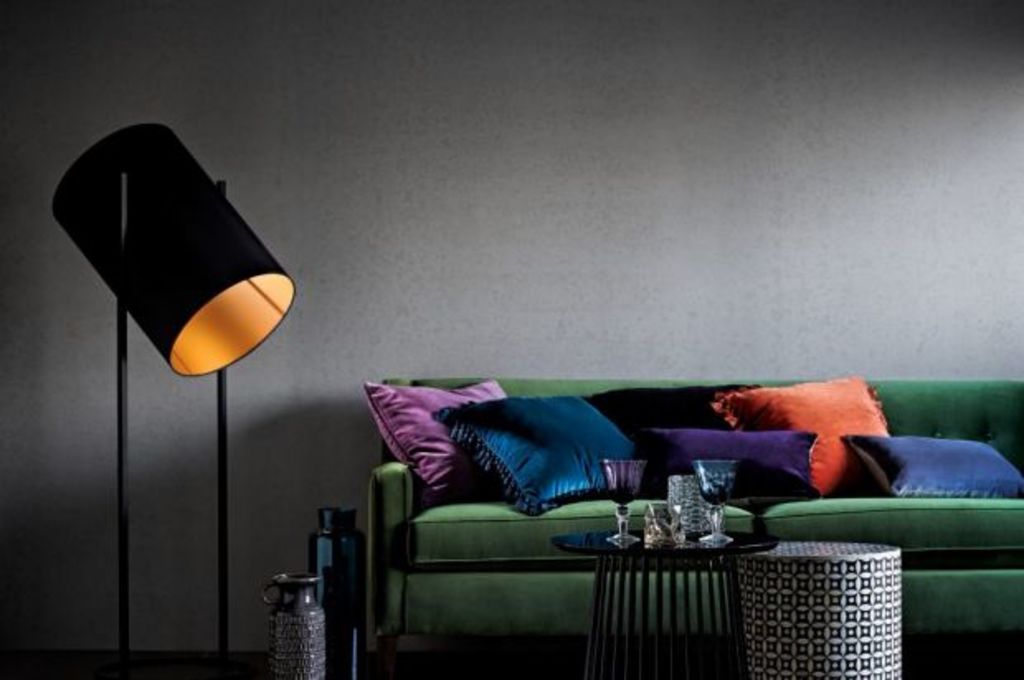
Think vibrant velvet sofas, murals, colourful kelims and patterned tiles.
It was perhaps inevitable that after decades of understated, minimalist design being in vogue the style pendulum would swing back to something more decadent and rich.
There’s a new maximalist mood in the design world that taps into the gilded glamour of decades past and it is redefining boundaries of good taste.
This new wave of opulent interior design has received the stamp of approval from unlikely quarters: Elle Decoration, the contemporary homes magazine, is celebrating ”Uber-Maximalist” design in its current issue.
The sleek Scandi homes it usually favours have been sidelined in favour of spaces that display more decorative flair.
There are vibrant velvet sofas, hand-painted wall murals, colourful kelims, patterned tiles and plenty of brass and marble accents.
West London-based interior designer Kat Trevor has noted a marked change in the briefs she is receiving from clients in recent months.
Whereas previously a neutral, luxury hotel-style look was the default request, wealthy homemakers are now requesting more individual interiors.
“Thankfully we’ve moved on from acres of taupe to more unique and exciting interiors,” she says.
“My clients are more willing to experiment and often ask that every piece in an interior is extraordinary. Some want their home to be a jewel box and when it’s done right it can look breathtaking rather that Oligarch flashy.”
Wallpaper gets exotic
For her current project, Trevor placed an order for several designs from Cole & Son’s new Curio wallpaper range, inspired by precious natural materials. The Strand design recalls the exotic aged timber made over in malachite green and gold.
The new generation of Scandinavian designers are tapping into this seductive mix themselves – albeit in a more restrained way – and proving that excess doesn’t have to be vulgar.
“There’s a warm opulence coming through in Scandi design,” says Sabine Zettler, a design consultant who promotes the annual Design Norway exhibition in London.
“Traditionally it has been very functional, but designers in the region are now being much more playful and making sculptural, decorative pieces that don’t necessarily have a strict purpose.”
The high glam home
However, as with fashion, the Italians are best at creating high-glam looks for the home.
Those wanting to kit out a maximalist interior will find inspiration at mosaic specialist Sicis’ showroom.
The company has patented a technique for creating mosaics from a variety of materials including marble, gold and glass, which are fashioned into floors, murals and mosaic-encrusted furniture.
The Giotto cabinet, for example, features iglass tiles that give its surface a subtle lustre.
Fellow Italian brand Visionaire is set to open a boutique at Harrods this spring and also offers a polished, luxe look, with high-gloss sideboards, Murano glass lighting and a collection dubbed ”Nature’s Jewel Box” that features marble and agate crystal slabs.
Visionaire is the latest in a series of high-profile signings for the home department at Harrods, which include fashion designer Matthew Williamson’s furniture collection for Duresta and Hollywood interior design queen Kelly Wearstler’s debut furniture collection, both of which launched this month.
Mix it up
The hard work and comprehensive roster of brands means that Harrods is perfectly poised to ride the neo-maximalist wave and finds itself in the novel position of being the most exciting furniture destination in London, if not the country.
“We have a broad customer base and our offering now fully reflects that,” adds Fard.
“Whether a shopper is looking for something exclusive and opulent or ultra-contemporary design from the likes of Fritz Hansen or Tom Dixon, we have it.
Often, they want a mix of both. What unites our customers is an expectation that they will find a considered edit of the world’s finest brands and our buyers travel the world to find the best, most exclusive pieces.”
Wearstler’s Californian style combines 1970s references with more contemporary silhouettes and flashes of the decadent. Think ruched leather armchairs, jewel-encrusted stools and clean-lined sofas.
Organised bohemia
As might be expected, Williamson’s upholstered furniture is bohemian and eclectic; shapes inspired by diverse eras (from Rococo to Mid-century) are covered in a rainbow of colours and prints including Williamson’s signature butterfly motifs.
He describes the look as “organised bohemia” and envisages people using the furnishings as he would – as bold statement pieces mixed with existing furnishings.
“I absolutely want people to be able to dip in and out of the collection,” he says,
“It’s laid-back, relaxed and louche. It’s ‘done’ but there’s a random, effortless quality to it. I don’t like to be prescriptive. I’ve learnt that the eclecticism of my style is a strength.”
Trevor, on the other hand, has no qualms about being prescriptive and counsels against taking a piecemeal approach to decorating.
“Individual pieces can look a bit tacky when viewed out of context, whereas when you’re surrounded by it all it’s very seductive,” she says.
“A strong look is not necessarily for the meek-mannered, but I say go bold or go home – or rather, go home and be bold.”
The Daily Telegraph
We recommend
States
Capital Cities
Capital Cities - Rentals
Popular Areas
Allhomes
More


