From drab to fab: The colourful features that make this classic home stand out from the crowd
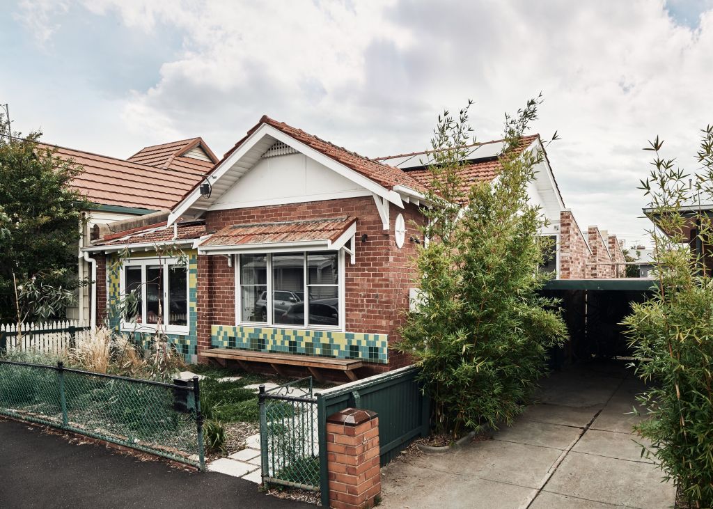
If this common-enough, late Federation brick semi isn’t announcing itself as having a fresh, fun, hello-there personality, what more would it need to signal that than colourful facade tiling, an inside window seat that fully opens to the street, and a garden bench affixed to its front wall?
Located in Melbourne’s Brunswick, what Phooey Architects has rebooted as Pod House started as a solidly built Australian residential type seen in a lot of the early 20th-century middle suburbs of Melbourne and Sydney.
Like many of them, before a major refurbishment and minor but effective sideways expansion, it was dark, its bedrooms were cramped and the rear kitchen lean-to was literally falling off.
“As we started working on it,” says architect Emma Young, “the cracks were getting wider.”
With a brief from colour-brave clients for more and bigger bedrooms, flow-through living areas that started with a sunny window-set daybed and resolved in a new kitchen and study, and crucially, better light and air flow in the elongated footprint, Phooey followed their core philosophy of “keeping what isn’t broken”.
While the kitchen came off, one sentimental fragment of its lino featuring a jaunty red-hatted chef in the repeated pattern was retained and became the inspiration for the colours that appear in the arty tiling of the bathroom and powder room. The red chef lino shard is now framed above a mirror.
But the reds, blues and whites of that “vestigial piece” kicked off a colour story that now distinguishes an engaging renovation and helps make every space in the place a revelation of unalloyed delight.
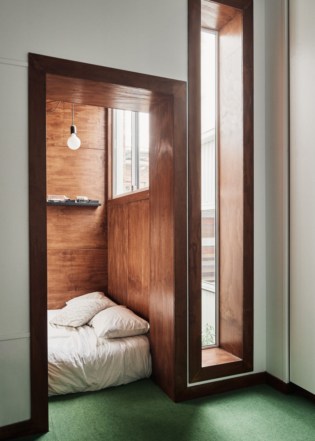
It became known as Pod House because along what was the side walkway, three boundary-touching bumpouts, measuring only 1×2 metres but big enough to accommodate a double bed and must-have bath, were built on as brick “pods”. Between each is a tiny garden that provides another source of light and fresh air.
“The pods were our idea,” Young says. “And because it seemed insane not to use the space on the west side of the house, the clients loved it. A full-sized bath was a necessity and we were able to create a really special space with a courtyard view for it.
“The children’s bedrooms were [previously] small.”
By making the side pods as ancillary cabins; “as little cocoons for beds”, the old bedrooms were freed up “as places to keep their stuff and to play in. We created special spaces for the children to hang out.”
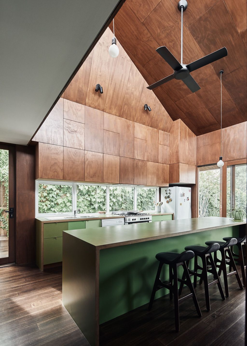
Now comprehensively remade, the whole house is full of comfortable hangouts: the kitchen under a high non-symmetrical apexed ceiling anchored by green Laminex benching is, Young says, “like entering a greenhouse”.
With the ceiling lining and upper cupboards stained ply, “it’s quite a simple geometry but when you’re inside it, it’s an even more impressive volume than I was expecting. All that ply makes it very warm.”
Through a run of stacking sliding doors in different hues of greens and blues, “the action hub” of the kitchen connects to the home office, which is painted “a very dark bluey green. The door [colours] are the transition to the study.”
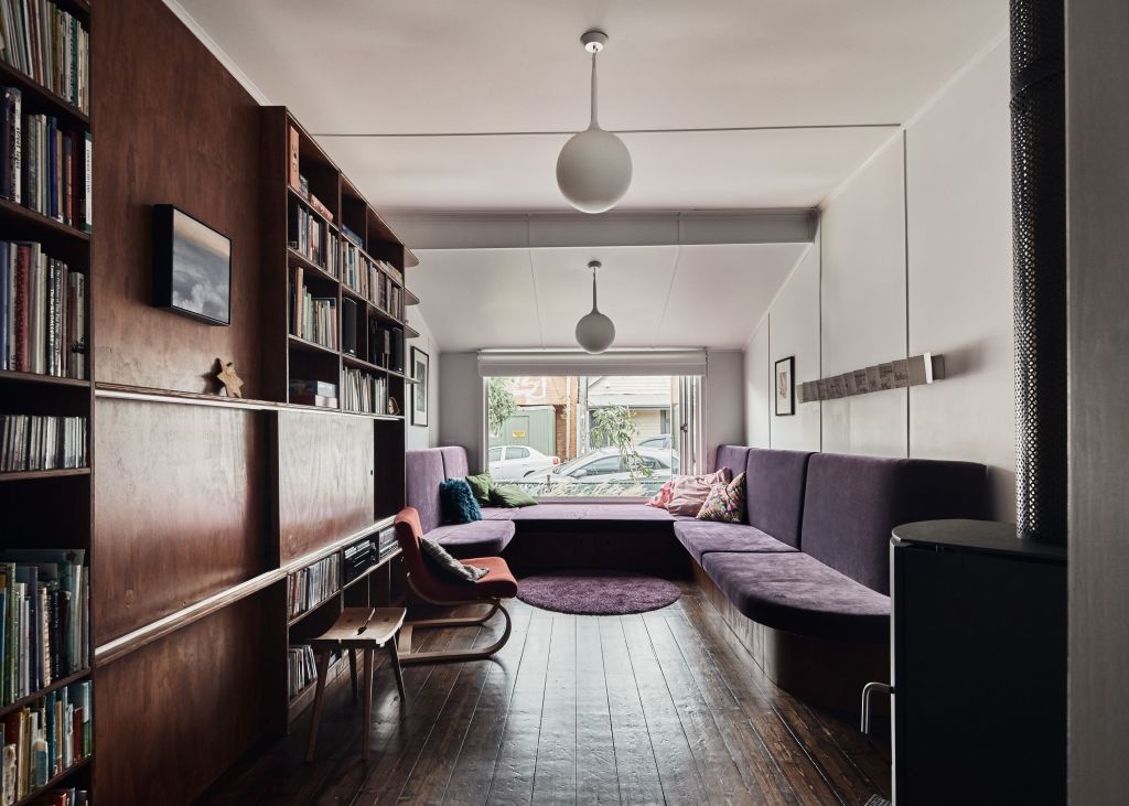
The main material refrains of ply and colour repeat down the 16-metre length that is kitchen through dining to the sitting room and window seat. All are built-in because the long room that hosts so much family life is just four metres wide.
The divan is upholstered in purple – Young says even when the upholsterers tried to steer them towards beige, the clients insisted on that colour.
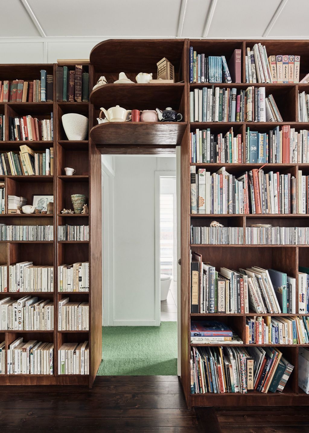
Exemplifying the architect’s claim that “it’s amazing what you can do with ply”, is the long installation of cabinetry bookshelves through which a hallway door enters.
It’s a big piece “because they have so much stuff. Quality stuff. Beautiful collections including teapots that are arranged with love. People who like to read and listen to music needed a lot of flexible storage where they could put everything.”
While the green of the kitchen reappears in the hallway carpet, the purple of the living room occurs again in the main bedroom, in three or four shades and tones.
On the facade around the windows and above the fixed garden seat are pixelated friezes of tiles laid to lead the eye through “the transition from the grey of the ground to the light of the sky”.
Ceramics on the street front was another joy-promoting client request. But Phooey Architects were happy to go with it and with a jewel-box palette of colour.
As Young says, “for people who are certain about it, using considered colour as transitions that can lead you from one space to the next can be really great”.
We recommend

We thought you might like
States
Capital Cities
Capital Cities - Rentals
Popular Areas
Allhomes
More
