Get The Block 2023 living and dining room looks for less
The couples on The Block have just completed their living and dining areas, and if we’ve learnt anything, it’s that to create a top-notch space, you need to balance style, planning and practicality.
Some teams nailed it, others missed the mark (we feel for you, Kyle and Leslie), but all presented rooms we can draw inspiration from.
We checked in with leading designers for their expert tips and how to replicate some of the show’s luxe looks for less.
Clever floorplan
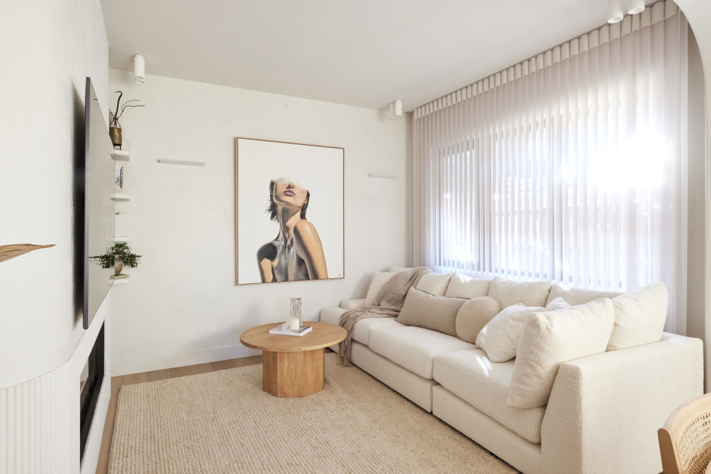
While Kyle and Leslie presented a beautifully styled living space, they lost points for poor planning. “It’s the Titanic!” proclaimed judge Shaynna Blaze.
“The secret to a great living space lies in its floor plan,” says designer Adela Sivewright. “Consider how you use the space or include two smaller living spaces focusing on different jobs.”
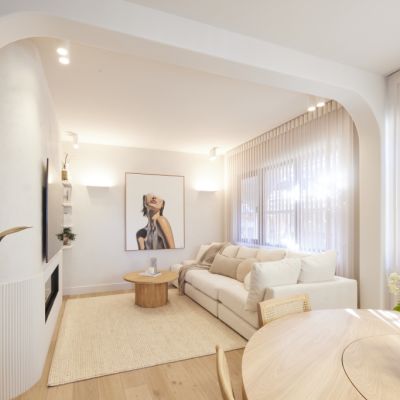
Interior designer Ruth van Overbeek agrees and says even the smallest living room can feel spacious. “Use low seating options if the ceiling is low or draw the eye to a high ceiling with a knock-out light,” she says. “Strategically placed furniture and decor like rugs create a feeling of space and delineate zones in an open-plan design.”
Subtle lighting – and lots of it
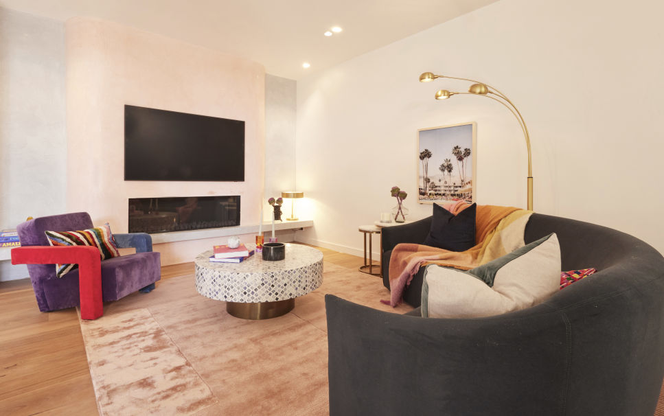
Judge Neale Whittaker is known for his obsession with lighting and was exasperated by Kristy and Brett’s lack of it. “There are no lamps, and this space is crying out for it!” he exclaimed. He was similarly unimpressed by Eliza and Liberty’s efforts. “No lamps is a major oversight; are we just going to sit under downlights?”
Leah and Ash scored points for their subtle evening ambience created by a simple corner table light and statuesque three-pendant floor lamp.
Luckily, say the experts, you don’t need a big budget to execute great lighting. “Draw up a simple floor plan for furniture and plot your lighting from there,” Sivewright says. “We’re moving away from grids of downlights, so place light where you need it. Wall sconces are affordable and provide soft light at night. Locate their switches separate from the ceiling lights to create different moods.”
Sexy surfaces
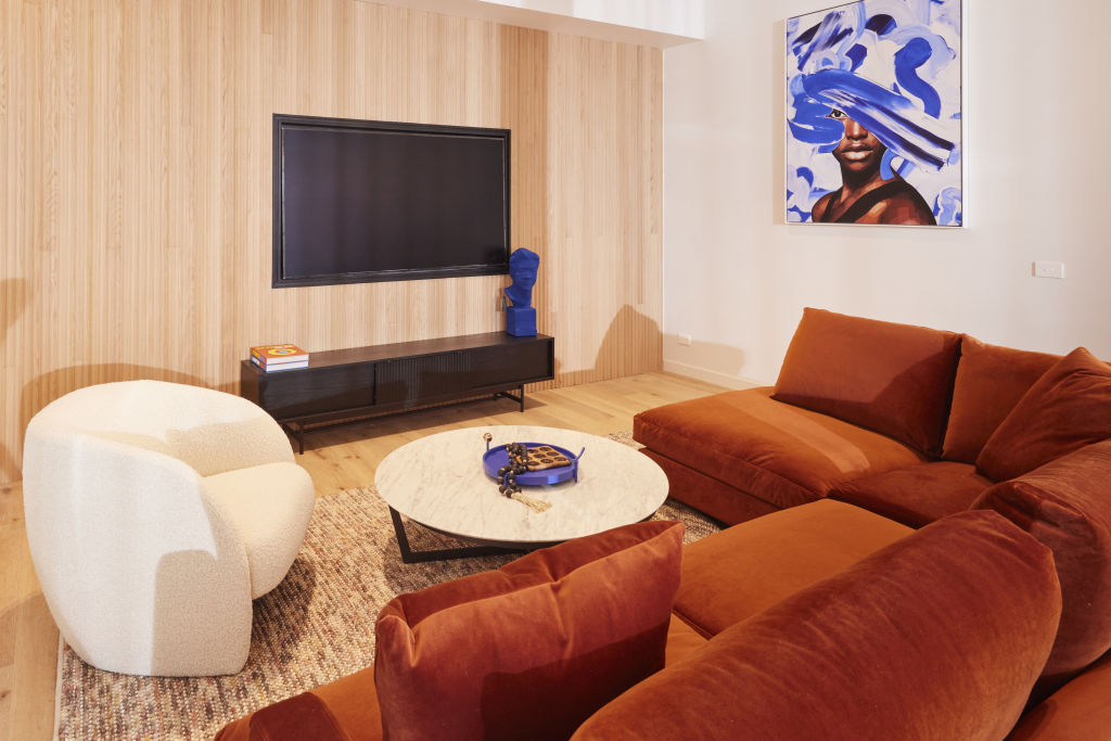
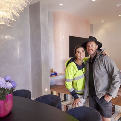
“It’s so hot!” said judge Darren Palmer (aka Mr Tactile) of Leah and Ash’s polished-plaster living space. Luckily for him, polished plaster featured heavily this week alongside luxurious wall detailing. The standout was Eliza and Liberty’s ribbed, undulating wall profile that perfectly matched their floor.
“It’s all about materiality and finishes,” agrees van Overbeek. “Wall finishes inject style into a space, especially one that lacks visual interest.”
Consider wall panelling, applied mouldings and trims, available in a wide range of prices, to add architectural dimensions that feel layered and luxurious.
“You can’t beat the opulence of natural stone,” she adds. “Its veining and colour variations are unbeatable, and custom joinery is worth every penny.”
In a busy space, hard-wearing flooring is crucial. “Solid and engineered timber flooring is the biggest splurge because they’re beautiful to walk on and provide warmth and personality,” Sivewright says. “Tiling is an economical option, and terrazzo, timber, and travertine are some of the patterns superbly imitated. Complement with coloured grout for easy maintenance.”
Tailored sofa
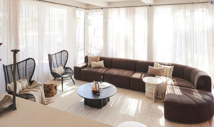
“It’s a bad sign when you see a modular sofa and then two of its other pieces in another room,” Palmer says of Kyle and Leslie’s placement choice. “It’s an indication the sofa didn’t go to plan!”
While this week revealed a plethora of stunning lounges, from playful to sleek modular versions, size and scale were a concern across the board.
“Functionality and size are critical,” says Studio Apercu’s Liz Hall. “Consider who uses the sofa most, and how, and measure your doorways. It’s too big if you can’t get it through the door!”
Scale and proportion are essential and should be appropriate for the room size. “Consider its shape and colour too, as dark colours or patterns make a sofa more visually dominant,” Hall says. “A lighter-coloured sofa with an open structure is perfect for a smaller space.”
Plan your other furniture to scale using online tools to visualise how it fits and relates to each other. “Their combined visual weight should be roughly equivalent to the sofa,” says Hall, who suggests marking the sofa on the floor with tape to imitate its volume and size.
Eclectic styling
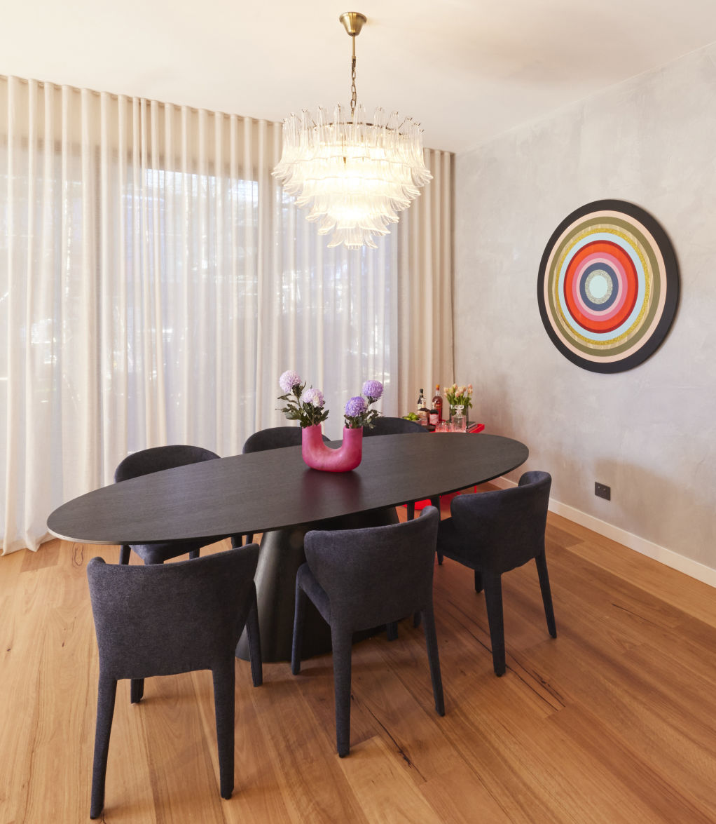
While the judges lauded Steph and Gian’s Japandi aesthetic, Whittaker felt it was overdone. “Is it a home or a store?” he pondered.
On the other hand, Leah and Ash’s space was a well-considered combination of playful pieces that provided a sense of “Brisvegas” to the room. Conjuring up different styles in one space, Whittaker says, is a risk that paid off.
“A cohesive living space combining harmonious elements feels balanced,” Hall says. “Get the major pieces right, then layer with art, lighting and decor. They don’t need to be expensive but should be consistent with your styling and colour palette.”
After splurging on big-ticket items, overspending on styling items is easy. “The cost of ceramics, books, and art adds up, so it’s an area to be conscious to save in,” she says.
Style treasured items alongside flea market finds to bring affordable charm to your space. “Mix high and low with handmade ceramics and fabrics for layers of texture and pattern for a personable curated interior,” suggests van Overbeek. “Vary heights so your eye wanders around the space and use lamps, vases and other pieces like a rug or a bold painting to introduce colour variations and textures.”


We recommend
States
Capital Cities
Capital Cities - Rentals
Popular Areas
Allhomes
More
