How a family room went from small, white and square to colourful Scandi-chic
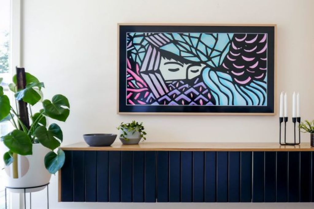
For interior designer Michelle Hart, a small space held big challenges. Here’s how she resolved them.
Tasked to transform an empty space into a stylish family-friendly living area, Hart, of Bask Interiors, was given two prerequisites – all decisions must be run by a Feng shui consultant and the focal point was to be a television.
“I was presented with an empty space to zone into a dual-purpose room that included a relaxation zone and dining area,” Hart says, “so the brief was quite open, but the stipulations certainly presented challenges.”
The first hurdle was the focal point of the room. “The client had Samsung’s The Frame television in their sights,” she says, “and they asked that the whole room be designed around it.”
To accomplish this, Hart first had to resolve the room’s proportions. “The space is square and open and flows beautifully on from the kitchen,” she says. “On the left are windows and a sliding door that opens out onto an al fresco area. On the back wall are two windows and on the right, very high highlight windows. It was tricky!”
It also presented another obstacle. “None of our furniture suited the space’s dimensions,” owner James Fong says. “Our old classic furniture needed to be replaced with clean and contemporary pieces, so we decided on a Scandinavian vibe.”
The Fongs contracted a Feng shui consultant to channel positive energy and create harmony in the space. “It had a big and positive impact on how the property feels and functions,” Hart says. “It was an interesting process, but it does throw restrictions at you in terms of layout, furniture placement and colour palette.”
Fong and his family had complete faith in Hart. “We gave her the keys and told her as long as she adhered to Feng shui principles, she could go crazy.”
Informed by the existing window and door placement, Hart carved out a dining zone leading out into the alfresco area. She defined it with a dining table and light pendants. The adjoining living area was mapped out with a large rug and a small wall next to the sliding doors was designated for the television.
“I didn’t want the TV sitting on a cabinet top,” Fong says. “I wanted it mounted and I knew the Samsung’s The Frame was launching soon, so I asked Michelle to make space for it and design around it.”
With the capability of switching between TV and art mode, The Frame, when not in use, appears as a piece of art. “It has 100 embedded works of art to choose from, or you can upload your own,” he says. “It makes a real statement, so the styling needed to complement the television perfectly.”
Beneath the television, Hart installed floating horizontal cabinetry featuring aesthetic V-grooves with deep drawers designed to house various devices such as a PlayStation and DVD player.
“The TV’s single cable runs behind the wall, through a small hole in the cabinetry, and into the Samsung Smart Hub, which is connector for all your devices,” Fong says, “so there isn’t lots of excess cabling to deal with.”
Next to it, Hart put in narrow, vertical open shelving, all in American oak. “We chose a similar finish for the television’s frame work,” Fong says. “There is not a lot of gap between the wall and television, so when the TV is switched off, it actually looks like a well-integrated piece of artwork.”
To complement, Papillion Furniture customised an L-shaped modular sofa for comfy viewing. “It’s quite a big sofa, but fits the space well,” Hart says. “It’s crafted in bistro denim which is durable, hard-wearing and easy to maintain. We chose oak legs and placed a small coffee table in the same materiality in the centre of the rug. The windows offered a view of the neighbour’s house, so we installed some stylish white shutters to let light in but block the view. It all works and blends beautifully.”
Hart says the colour palette was informed solely by Feng shui principles.
“All ideas were run past the consultant,” she says. “We had to avoid red and dark greens and stick to shades of blue, aubergine, grey and pastels. Luckily it’s a palette that works well with Scandinavian styling.”
In the dining area, Hart opted for a slimline Globe West table and elegant La Forma chairs that can be pushed right into the table to make access around it effortless. “The pendent lights above were crafted by Mark Douglas, who picked out the colours of the room, then added beautiful brass hardware.”
Fong says the high level of customisation installed solved all their dilemmas. “It made all the difference,” he says. “Buying off-the-floor is difficult for a space with unusual dimensions. Everything here looks just right. We put trust in our professional and it worked”.
We recommend
We thought you might like
States
Capital Cities
Capital Cities - Rentals
Popular Areas
Allhomes
More
