How designers created a 'playful and vibrant' family home in Sydney's Mosman
Paying homage to traditional Brooklyn brownstones and London townhouses, Mosman Residence on Sydney’s lower north shore is the perfect home for a young family of four.
“The owners are unafraid of quirky style or colour and wanted an injection of personality while respecting the heritage of the home,” says Tom Mark Henry Studio interior designer Jed Murphy.
Little was lost – the existing floor space remained – and much was gained.
The formal living and dining rooms on the street side of the house were transformed into adult spaces for entertaining, and the informal open-plan kitchen was made more spacious.
Eras merge seamlessly thanks to a new doorway at the end of the hall that creates a portal between the original house and an early-2000s rear extension.
“How we live in our homes today is so different from the original intention,” the designer says.
“The biggest challenge was updating the individual spaces to improve their amenities and work for a family in 2024 without losing the beauty of the traditional elements.”
A vision for the home’s spaces was drawn from its leafy location and the owners’ art and objects.
“They love to collect, and we drew inspiration, especially for colour, from their things,” Murphy says.
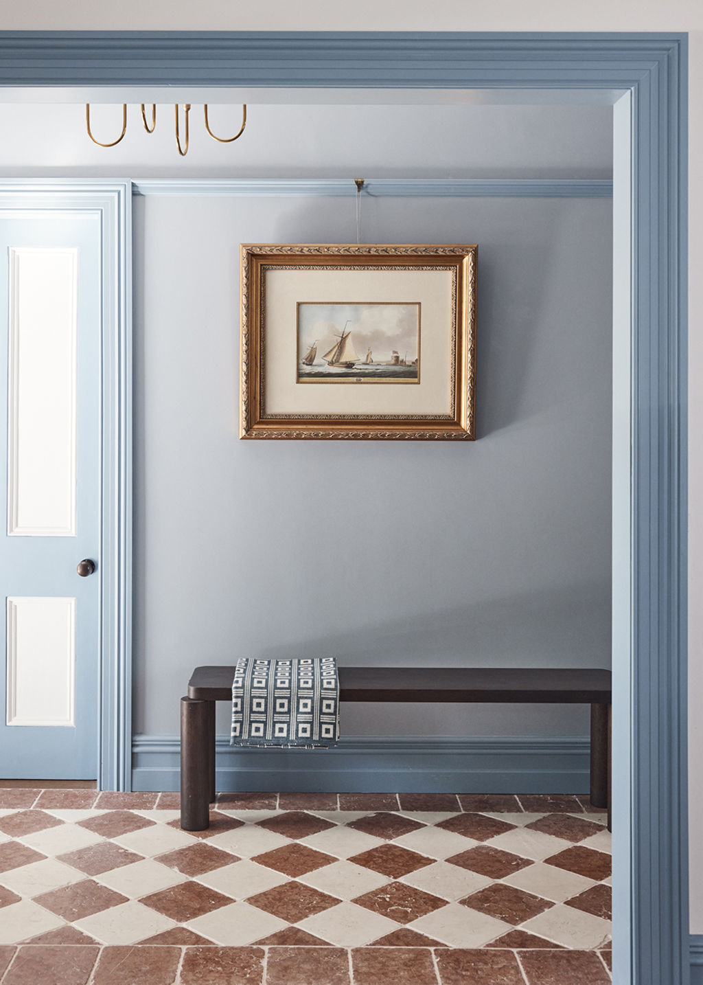
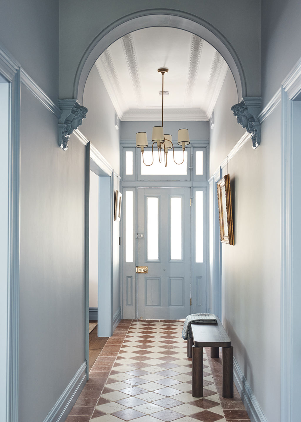
“They wanted the home to be playful and vibrant, so blue was a way to create a sense of impact on arrival in the entrance hall, which continues in the joinery and the trims in the more formal rooms.”
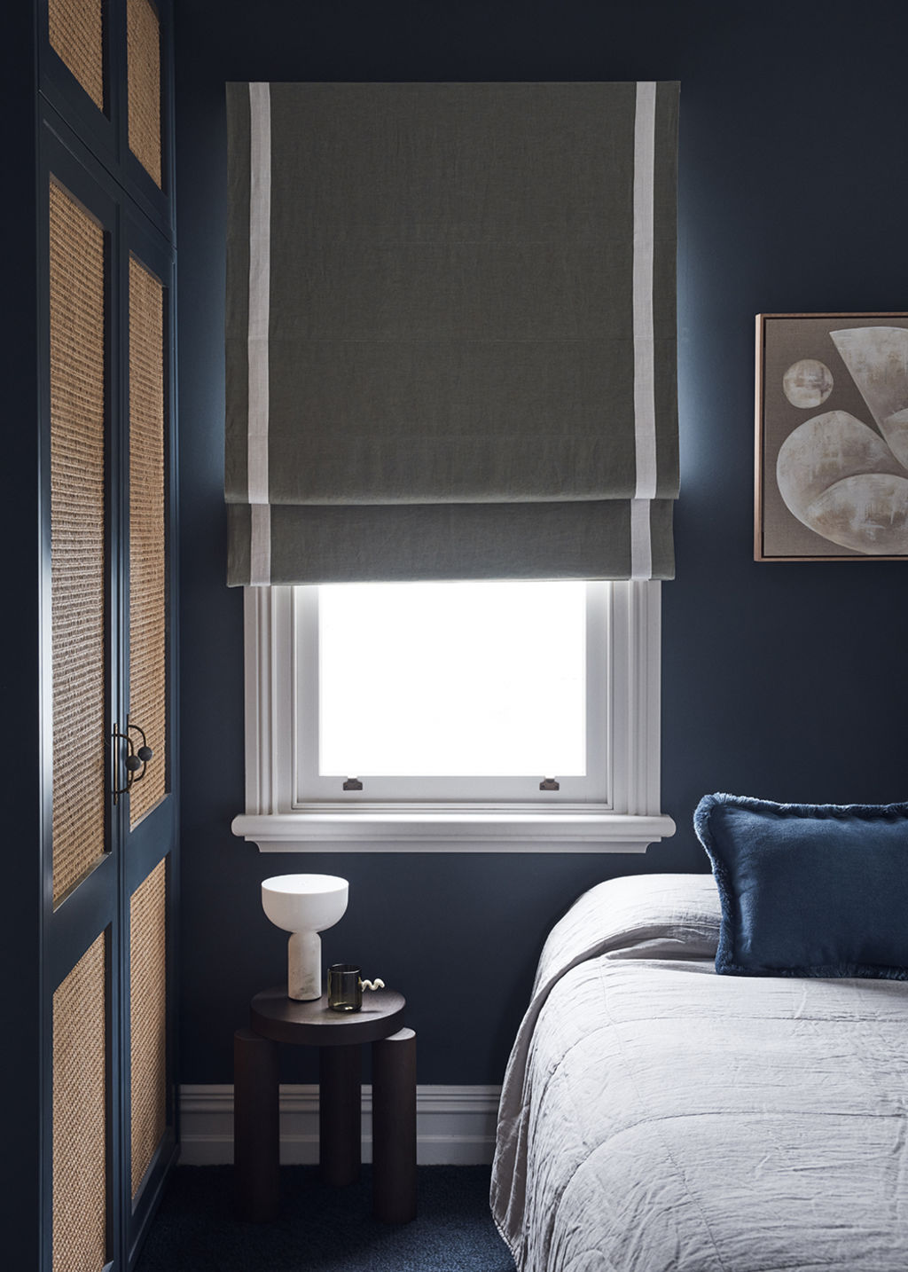
Variation was added by changing paint finishes from matte to glossy, and deeper tones of blue and subtle touches of deep red created impact throughout.
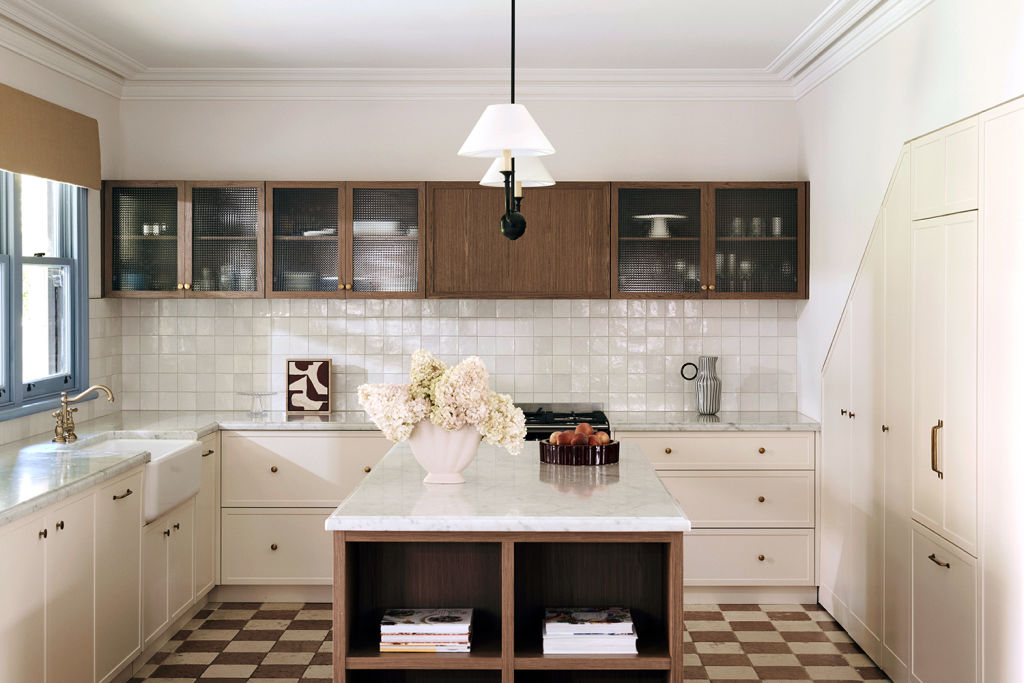
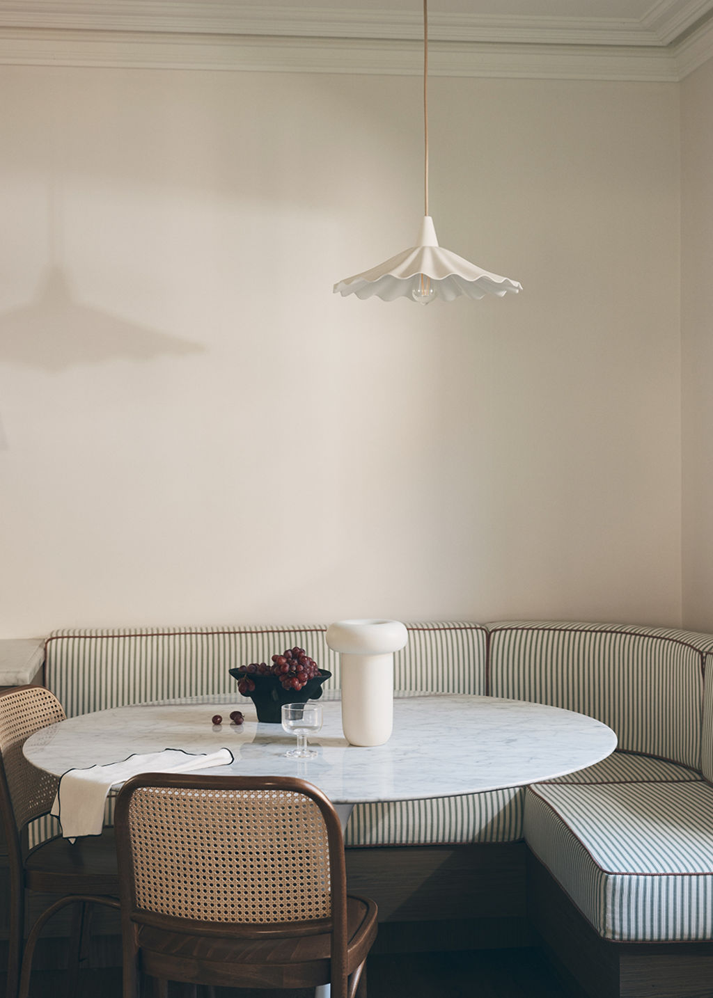
The kitchen and family room were updated with a curved, upholstered dining nook and made more spacious by relocating the fridge and pantry under the staircase.
A stunning walnut-finished kitchen island masquerades as a luxurious piece of furniture, and Murphy rotated the angle of the tiles to create a square checkerboard pattern, which speaks back to the original home.
The owners’ holiday in a classic New York City hotel reaffirmed their love of traditional bathrooms, and the design team created their version with glossy white tiles, floor mosaics, reeded glass, and brass accessories.
The home’s old-world timber trims, skirtings, picture rails, windows and doors, are all original, as are the decorative plaster ceilings and archways.
“They are so beautiful and interesting, and we wanted to champion them – so many older homes have had these stripped out,” Murphy says.
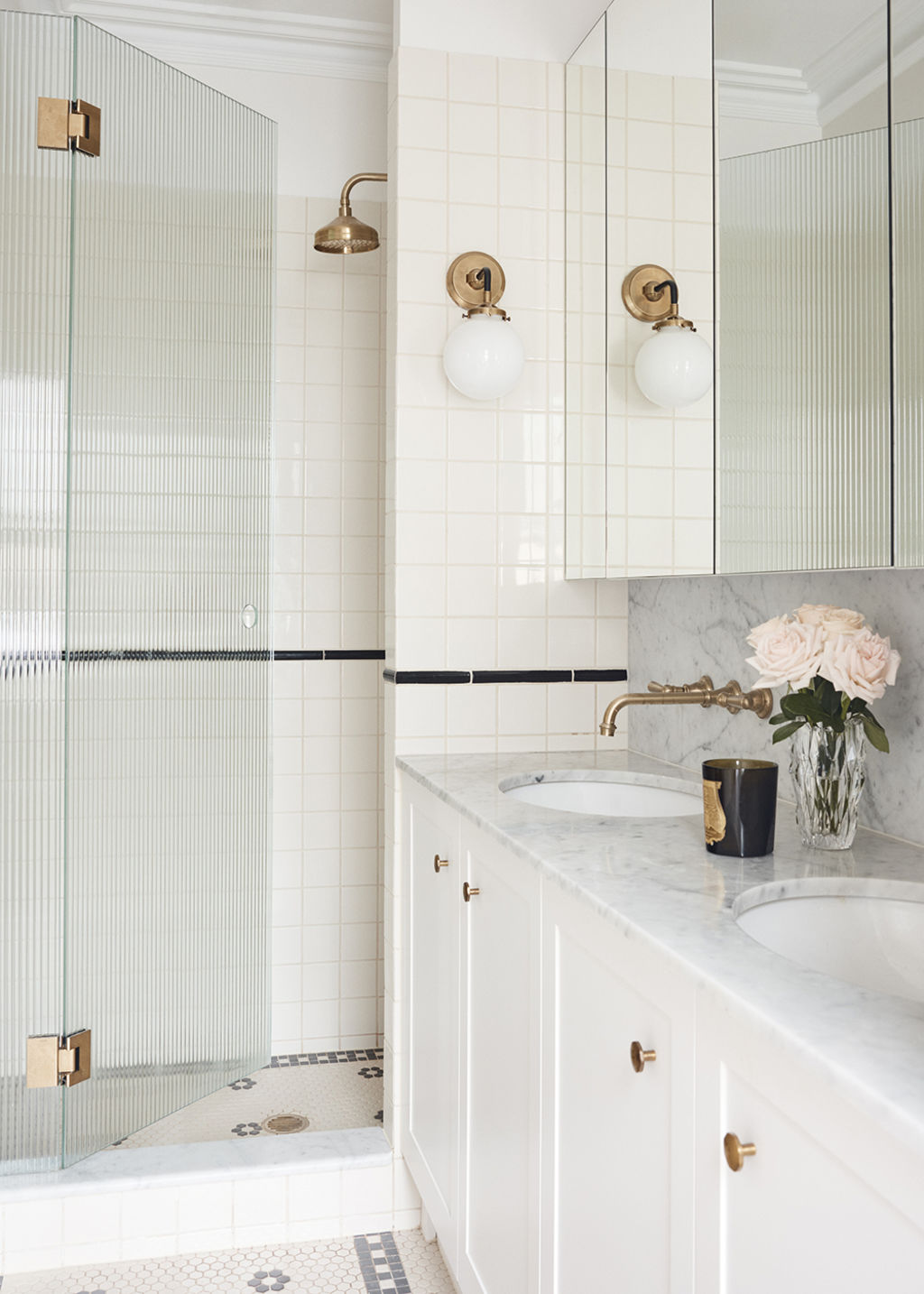
“Walnut and checkerboard floors were added to zone spaces in a way that felt traditional and contemporary at the same time.”
Texture was an important consideration for adding layers of detail.
Cole & Son’s Fornasetti Senza Tempo wallpaper, featuring atmospheric clouds, ushers you up a staircase covered by a sisal runner with rich wine edging.
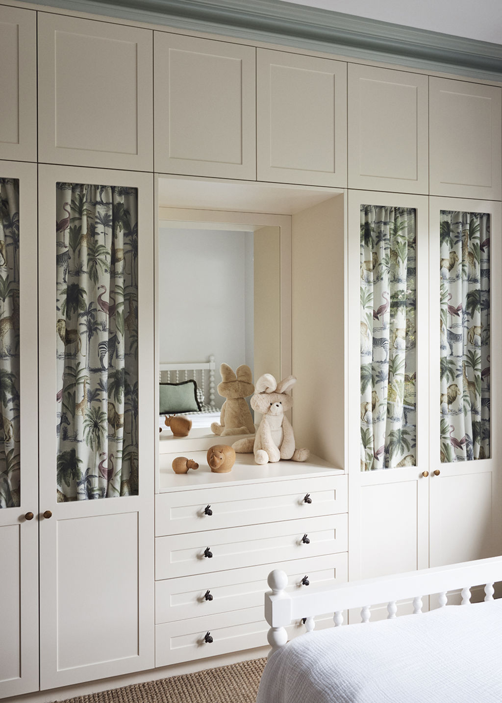
Glossy painted joinery meshes with natural woven rugs, and rattan is artfully paired with soft velvet.
Murphy reimagined much of the client’s existing furniture, such as a rattan-armed sofa that was reupholstered in a neutral Raf Simons velvet corduroy.
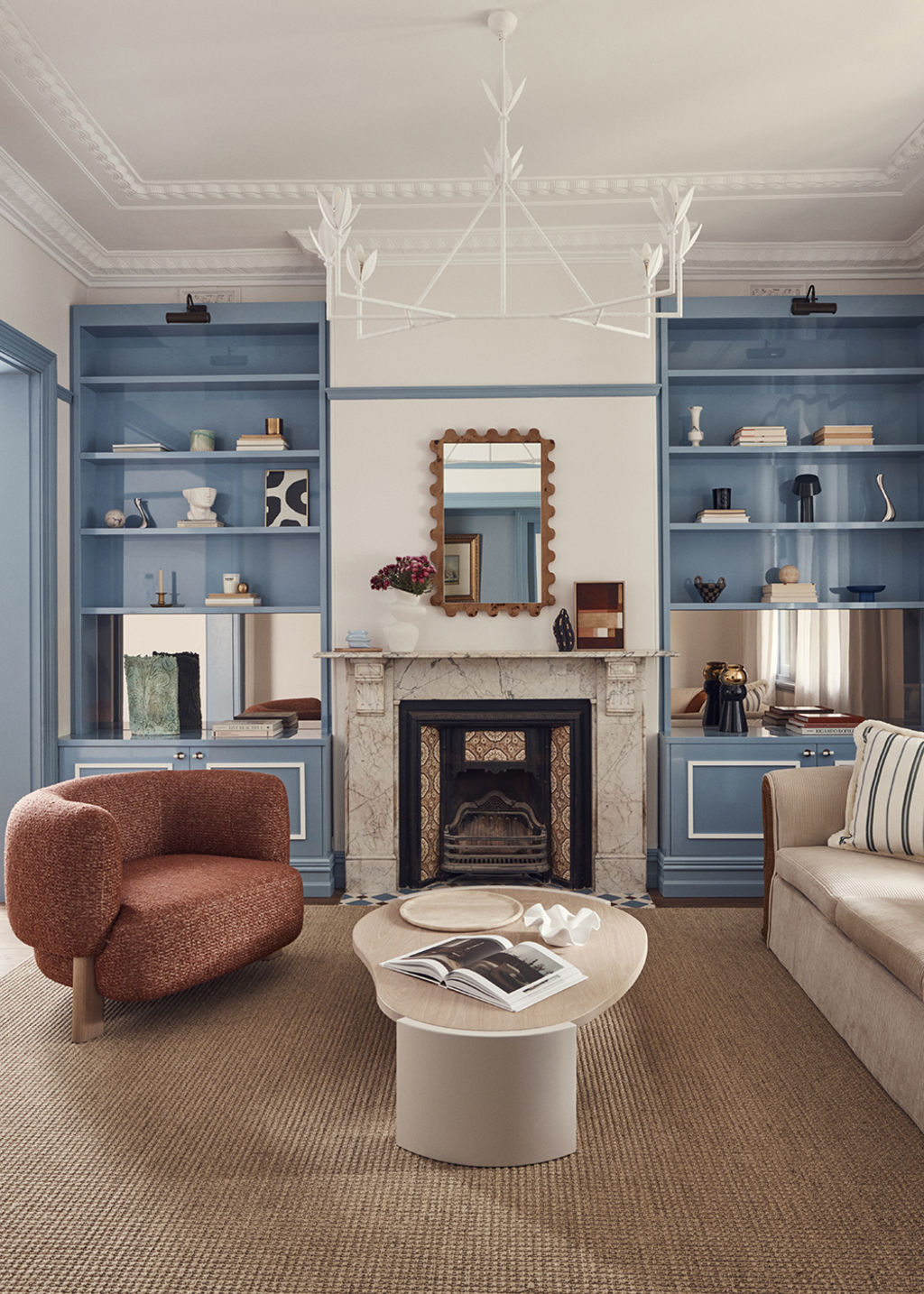
New items, such as Jardan’s Lola armchair and sculptural lacquered Frida coffee table, add contemporary polish.
“Combining the old and the new makes the home feel cohesive,” Murphy says. “We wanted to instil a sense of whimsy, and the finishes have one foot in tradition while also feeling fresh and contemporary in their use of colour.”
We recommend
We thought you might like
States
Capital Cities
Capital Cities - Rentals
Popular Areas
Allhomes
More
