How do I make my bathroom bigger? 15 tips and tricks

A good interior designer will use any number of design tricks to give a room a particular feel. Since bathrooms are typically on the smaller side, we are often called on to design them in a way that makes them feel more spacious than they really are.
Jazz up your bathroom design with a few of the following tips and tricks. You’ll be surprised at the difference a few of these will make.
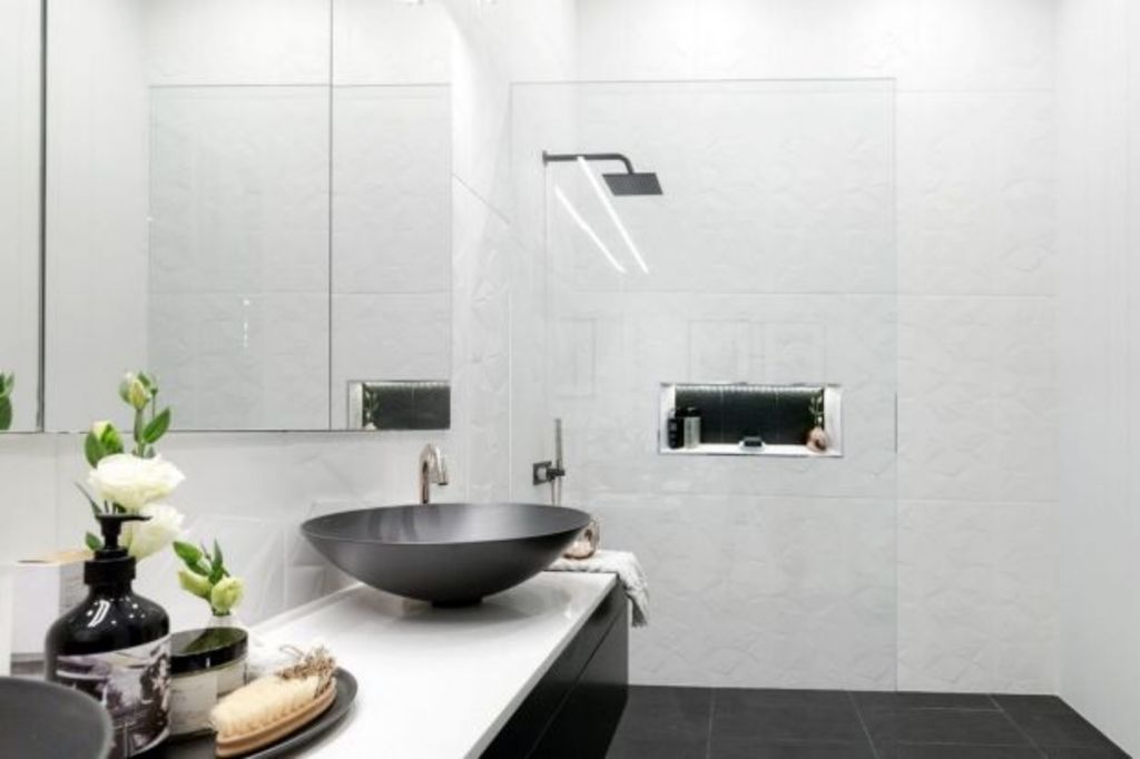
1. Keep the walls a light colour; it will automatically make the room appear larger.
2. Ceilings should always be white or at least a lighter colour than the walls.
3. The finish on your wall tiles contributes to the illusion of space, so choose polished or semi-polished rather than a matte finish if you want to maximise it.
4. The orientation of tiles makes a difference to the look you are trying to achieve. If you have rectangular tiles, position them vertically to make your ceiling appear higher or position them horizontally to make the room look wider.
5. Tile all the way up to the ceiling and use a square set cornice instead of a decorative cornice to make the room appear larger.
6. Use a wall-hung vanity to make the space look and feel bigger.
7. Ensure the vanity is streamlined without too many details on the door fronts and drawers. Go for discreet handles or magnetic handles.
8. Recess the mirror or medicine cabinet if possible so that the front face sits flush with the wall tiles.
- Related: Easy ways to transform a bathroom without renovating
- Related: Key ingredients that make tiny bathroom feel luxe
- Related: The most common bathroom renovation mistakes
9. Using white for everything will make the room look bigger, but it may also appear a bit stark. Consider installing a light timber vanity or painting the walls in a pale colour other than white.
10. Eliminate walls that are within the bathroom space, e.g. half walls or walls between the bath and shower or the shower and toilet.
11. Framed shower screens do not help the visuals of a bathroom, so use completely frameless shower or bath screens if possible.
12. Don’t use eye-catching light fixtures or anything that contrasts with the wall tiles too much. You want to avoid drawing attention to anything outside the frame of the bathroom so make the lighting as neutral as possible. Discreet downlights or lighting underneath the medicine cabinet are good options.
13. A freestanding bath needs space around it, so avoid installing one of these in a compact bathroom. If you really have to have a freestanding bath, go for a fine streamlined bath rather than a chunky style, or a semi-freestanding bath that hugs the walls with the tiles running up against it.
14. If your toilet is in the bathroom, aim for a minimalist style of toilet with clean lines. You can choose from a standard back to the wall style toilet where the whole outside casing hugs the wall or one where the cistern is concealed in the wall cavity. Wall-hung toilets are also a good option, but are a more expensive option.
15. If you need some window dressing, ensure it is inside the window frame with nothing protruding outside the frame.
Jane Eyles-Bennett is one of Australia’s leading home renovation and interior design experts. She is an award-winning interior designer with more than 25 years’ experience designing the interiors and exteriors of homes, specialising in kitchens, bathrooms and living spaces.
Contact Jane at jane@hotspaceconsultants.com or via her website.
We recommend
We thought you might like
States
Capital Cities
Capital Cities - Rentals
Popular Areas
Allhomes
More


