How Netherlee House went from dark and disjointed to serene and spacious
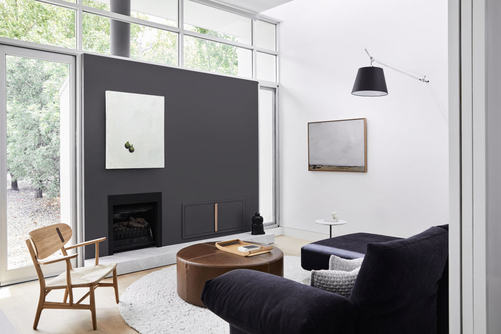
Infused with calm, light, sinuous spaces and clean lines, Netherlee House is bounded by Gascoigne Estate and Central Park amid stunning plane trees in Melbourne’s Glen Iris.
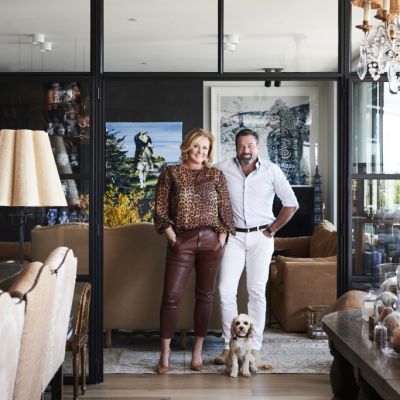
Owners Andrea Magee and husband Michael recognised the home, originally designed by architect John Castles, as a diamond in the rough.
“It fulfilled our criteria for light, location, and privacy,” she says. “It’s set 30 metres from the street with front northern-facing orientation, as well as north-facing courtyards, walled garden entryway and perennial garden at the rear. It’s very tranquil and private.”
With new architectural plans in place, award-winning designer Carole Whiting was recruited to overhaul the home’s interior spaces. “It was quite neglected with a disconnected kitchen and strong-coloured feature walls throughout,” she recalls.
“Luckily the original architecture was clean and well considered so we had a good foundation to work from.”
Magee, a New Englander from Boston, Massachusetts, came to Whiting with an appreciation of Scandinavian and Shaker design, which provided visual inspiration for the home. Using considered scale and form throughout, Whiting revised its spaces, including a new luxurious main en suite and generous home office. The garish colour scheme was replaced with a monochromatic palette of black, white and grey, which transformed the home from dark and disjointed to serene and spacious. The jewel in its crown? The kitchen.
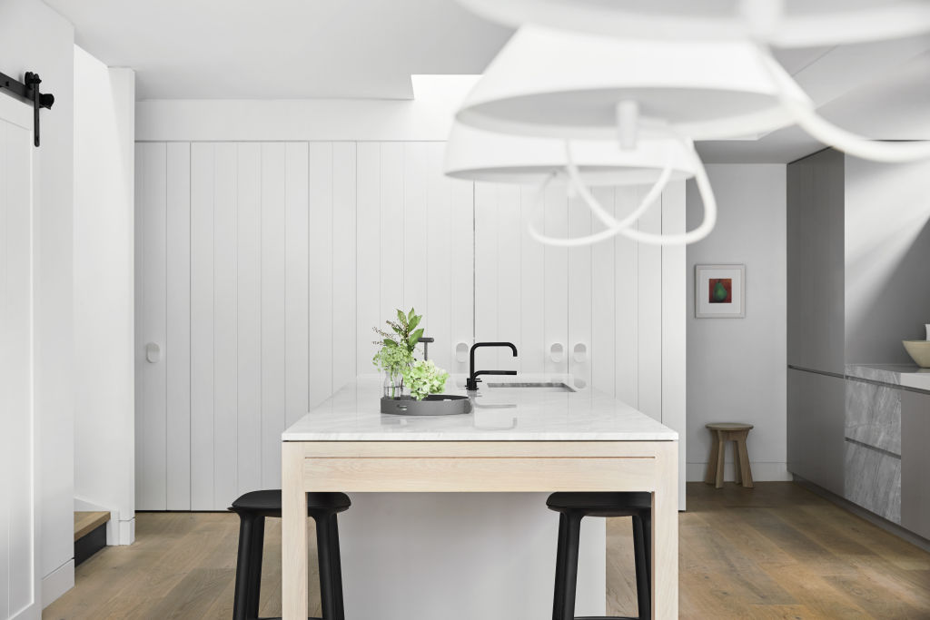
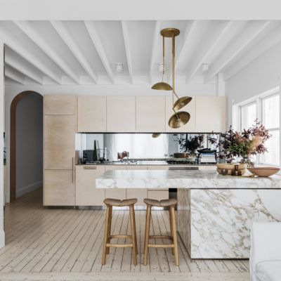
“Having returned from America where Andrea had become accustomed to a spacious kitchen, she specifically wanted a very large island bench and oversized scale of cooking amenity,” Whiting says.
Resolution was found in a central location anchored by an over-scaled island bench crafted in Elba stone, its size thoughtfully minimised by timber and soft grey tones.
Nearby, a long sweep of board containing a series of doors leads to a powder room, laundry, refrigeration and storage, and an oversized sliding door conceals wine storage and bar.
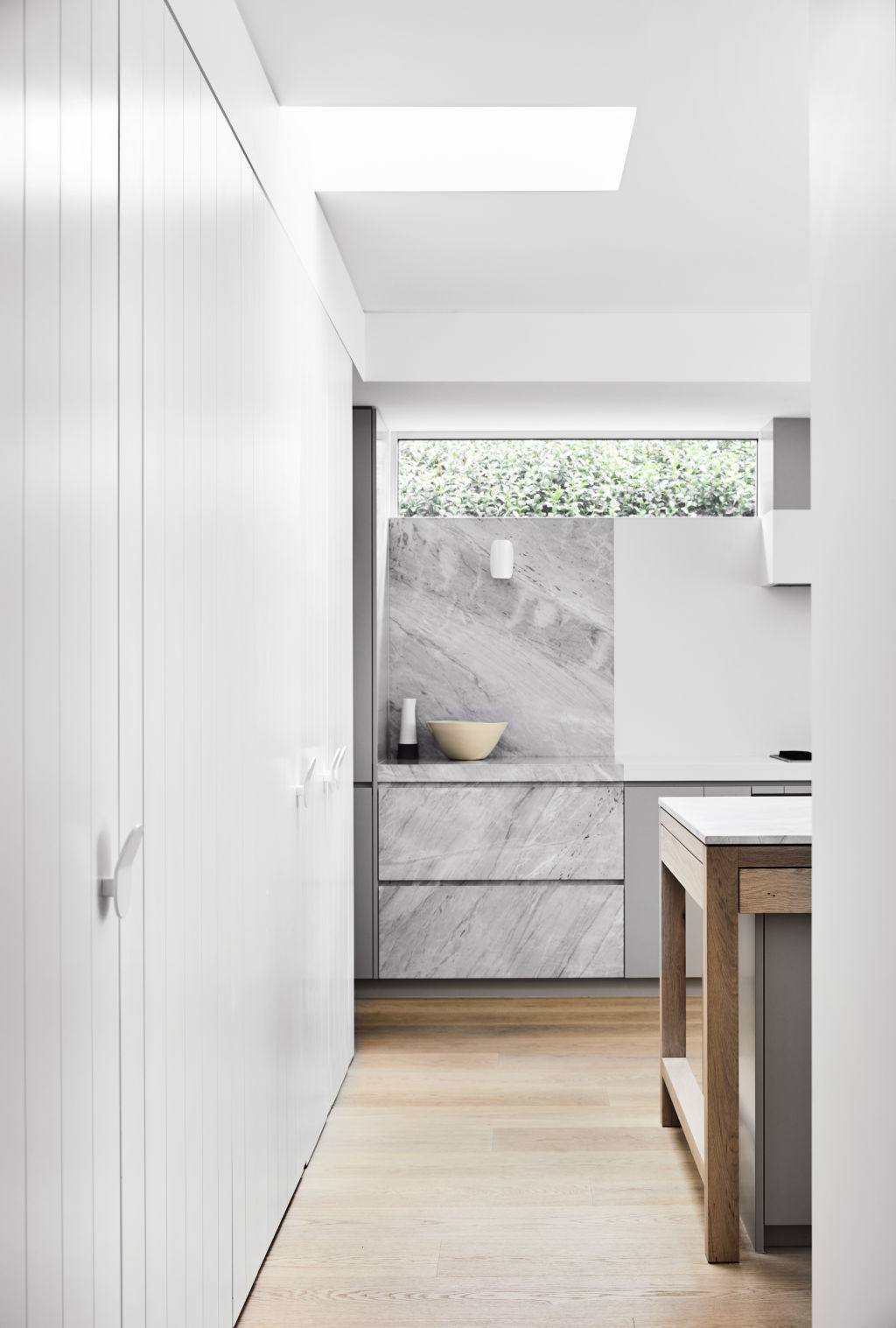
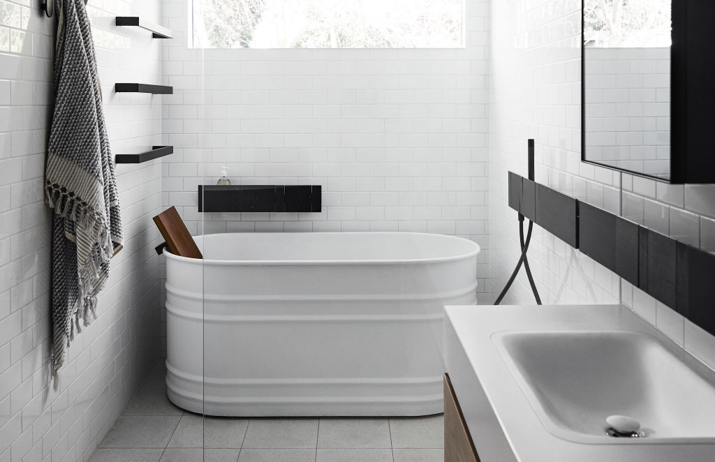
Materiality is rich, from the marble and timber island bench and timber floors, to glossy white bathroom tiles and ribbed steel bath. Hardware throughout is bold, robust and discreet, with its colours matched carefully to the doors.
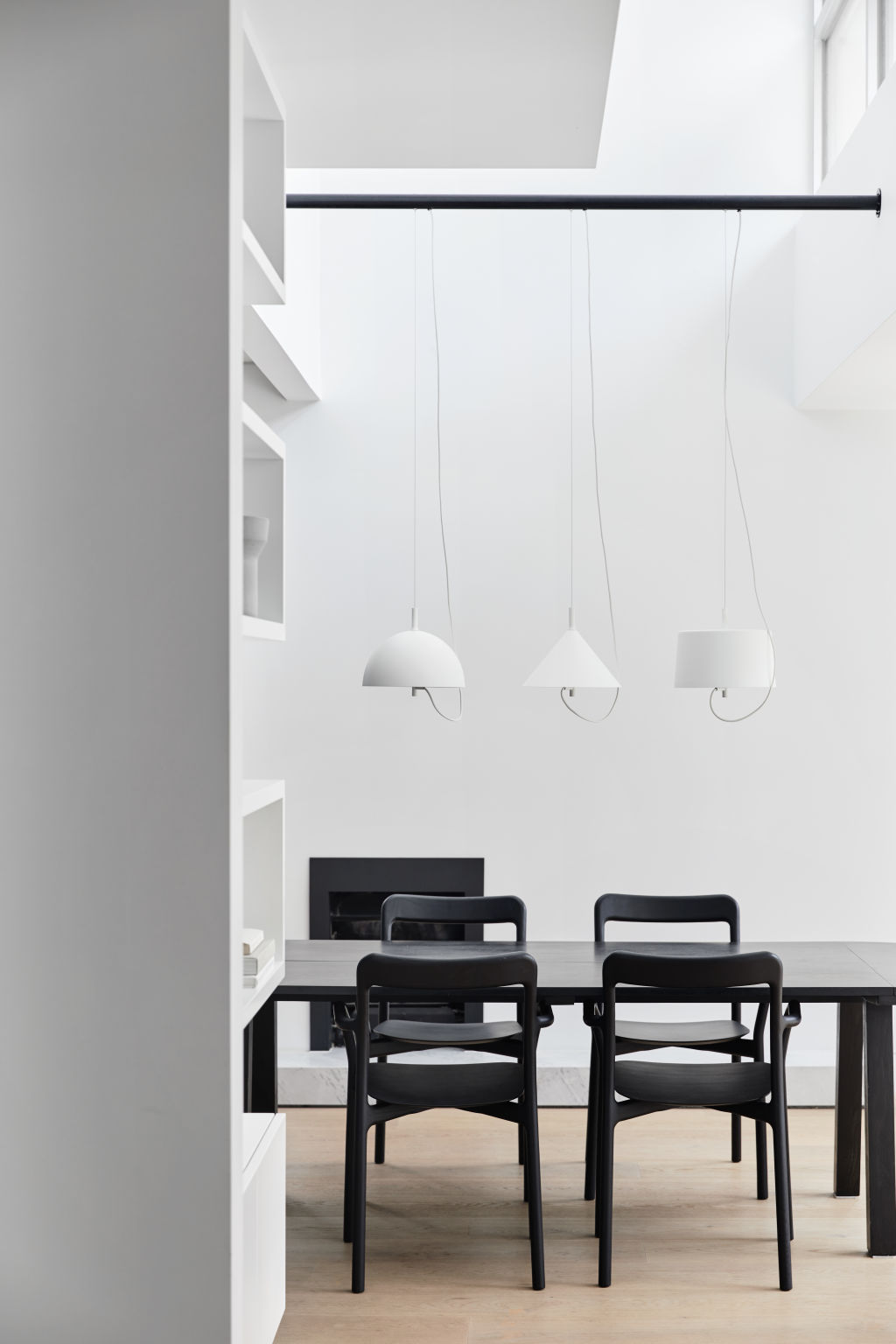
However, it is light that plays a starring role. A stark white cone pendant dominates the home’s double-height hallway, and in the dining room, a trio of graphic geometric lights hover elegantly above a table.
Whiting’s use of non-colour plays throughout, embracing natural light, architectural details, furnishings and artwork.
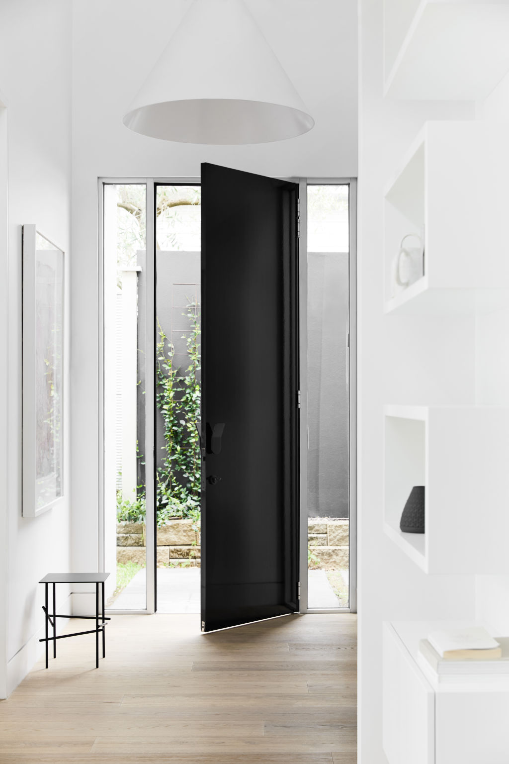
“White plays an important part allowing the forms of the lighting and the architecture to express,” she says. “Colour reduction is what allows this house to shine. By replacing a clashing colour scheme with a monochromatic palette, the original architecture of this home is respectfully given space to breathe.”
With a smooth flow between indoor and outdoor spaces, Netherlee House is dramatic and yet, most importantly, liveable.
“Our home and enjoyment of the space is absolutely transformed,” Magee says. “It’s a timeless and elegant hub for family and friends and indoor and outdoor living. We love being at home.”
Style notes
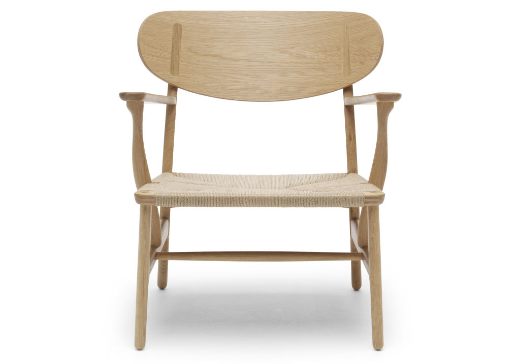
Chair
With its organic shape and tactile woven seat, the CH22 lounge chair by Hans J. Wegner is a cross between a lounge and a chair.
Lights
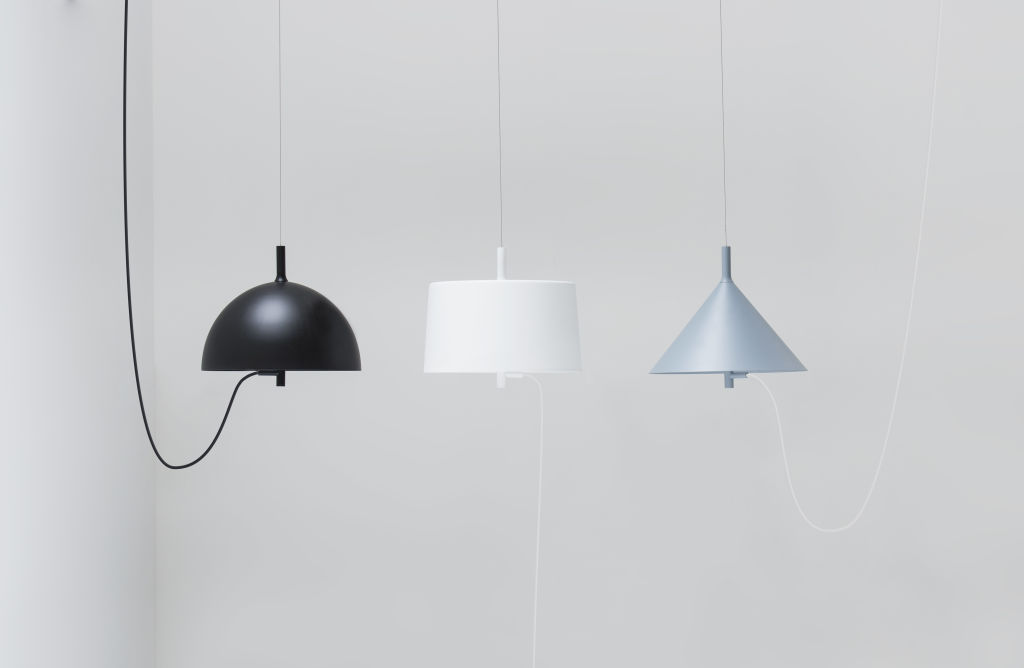
Graphic in shape and crafted in steel, this trio of cone, cylindrical and spherical lights hang in perfect unison.
Bathtub
A contemporary take on the old tub, the Vieques bath, made from metal with teak accessories, is industrial and luxe.
We recommend
We thought you might like
States
Capital Cities
Capital Cities - Rentals
Popular Areas
Allhomes
More
