How the ‘sprinkle strategy’ can help you transform the facade of your home
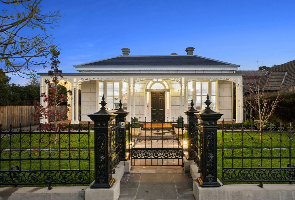
Re-painting the exterior of your home will update it in a way nothing else will, but a spectacular facade requires careful consideration about what other features will make an appearance.
One of the design strategies we use in my design practice is what I call the “sprinkle strategy”. The sprinkle strategy is used beyond your main house colours and is what gives your facade a more cohesive and balanced look.
When renovating your facade, it’s usually best to stick to three or four colours for the overall concept. These will include things like paint colours, brick, timber, windows/guttering colours and every other element that exists there (excluding the landscaping).
Listen to Karina’s story about renovating a chateau in France on Somewhere Else:
Out of these three to four colours, you will generally have one main colour, then one or two less prominent colours. Finally, you should have an accent colour.
Your accent colour is something that contrasts with the other colours on your facade. It could be a much darker or lighter paint or trim colour than the other colours. Or it could be a different coloured material like timber or stone. This accent colour or material is typically “sprinkled” around your facade three to four times.
For example, imagine you’ve painted your facade, done all the trims, painted the gutters and roof and you’re now ready for the accent or contrast colour – the sprinkle. You might choose timber as your sprinkle in which case you might choose a timber front door, timber accents on the letterbox or portico and a timber-look garage door.
There is no hard and fast rule about what colours or materials should be less prominent. Sometimes you need to work in with whatever is existing.
In the example below, I re-designed the house facade keeping the red brick intact (the main colour in this instance). I had to work with the existing classic cream window frames, so used an off-white/very light cream paint colour and timber detailing as my secondary colours on the existing house and new entrance portico. My accent colour was the dark grey coloured roof, the plant pots on the front of the facade and the driveway.
The idea behind the sprinkle strategy is to make your house look more visually interesting and cohesive but not overdone. It gives you a happy balance so that you don’t end up with a jumbled mix of too many colours and materials, nor a lack of interesting elements to break up a plain or uninteresting facade.
Each area of your facade links to the next, giving a cohesive and easy-on-the-eye aesthetic.
If you wish, you can take the sprinkle strategy one step further by repeating your accent colour and material on the inside of your home. This will, of course, depend on your choice of accent, but it will help you create that much-talked-about indoor/outdoor flow for your home.
Jane Eyles-Bennett is one of Australia’s top exterior designers and owner of design firm Hotspace Consultants. Join Jane in her Facebook group Home Renovators Network Australia for design and renovation inspiration and insider tips for your home improvement projects.
We recommend
States
Capital Cities
Capital Cities - Rentals
Popular Areas
Allhomes
More
