How the stylish live: At home with interior designer Suzanne Gorman

Suzanne Gorman’s approach to home design is very simple. “There are two elements – the invested and the interchangeable,” she says. “The joinery and floorboards are the constant mainstays, and the rest should be regularly changed-up, from the wallpapers and soft furnishings, to floor rugs and artwork. It keeps life exciting!”
The interior designer, and director of Studio Gorman, moved into her Willoughby home 18 years ago with her husband. Showing great restraint, the couple lived in the home for nearly a decade before renovating.
“I’m glad we did,” she says, “we were able to get a real feel for the house. We also had our family here, so in time, we knew who we were building our home for.”
An original 1920s bungalow, the house is characteristic of the area.
“The streets are lined with them,” she says. “They were the project home of their era. Very small with two bedrooms, living room, bathroom and kitchen. Teeny weeny, but this one has superb positioning.”
With a perfect north-east aspect, Gorman says the constant flow of natural light throughout is a real advantage.
“The sun rises at the back where the kitchen is, and then moves around the house, so we get sun and soft light all day. The right aspect can really change your mood.”
Before renovating, Gorman planted Leighton Greens around the property’s periphery.
- Related: At home with interior stylist Lucy Fenton
- Related: From tree to table: Stylist-approved Christmas tips
- Related: The colourful home of artist Kimmi Lee
“18 years later they are five metres tall, lush and provide absolute privacy,” she says. “It makes our garden feel like a secluded haven. It was a good move.”
Gorman says the decision to renovate wasn’t an immediate one. “We could have built a project home, which was popular at the time in this area, or renovate the original house. We chose the latter.”
“For us it was about wanting to maintain the streetscape and respect the home’s heritage. I love a good blend of old and new. For me, it is preferable to building a faux bungalow,” she says.
Gorman plotted her renovation, not just with her family in mind, but for future resale.
“Typically younger families sleep near their kids, while older families tend not to,” she says. “We created a home for both. We added a second level with a master bedroom and ensuite, a kid’s room, guest room and bathroom. Downstairs are two more bedrooms and a bathroom. It means a young family of four could live here with parents and two kids upstairs, and grandparents perhaps downstairs. It is a very flexible layout.”
In classic bungalow-style, the original front door was located front and centre of the home.
“It was too close to a designated bedroom, so we closed it off and transformed it into an alcove for the piano,” says Gorman. “We added a new story at the back, so you have to walk up past the original bungalow to arrive at the front door which is halfway up the side of the house. It’s much more private.”
Gorman says her personal style is very “Sydney-relaxed” and her house reflects this.
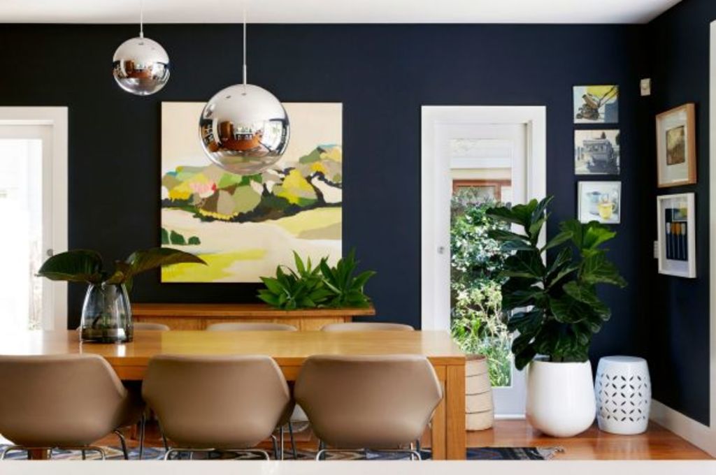
“It’s all white, we kept the natural timber floors and added American oak and charcoal joinery,” she says. “Timber brings warmth to a house, and the white walls and frames feel very fresh and casual. I don’t typically do glamorous so there is not a lot of gloss.”
To liven up the neutral palette, Gorman has used papered feature walls as points of interest.
“I find wallpaper is a fun way to play,” she says. “Renovating a house you need to be sensible, but something like wallpaper, that is $100 a roll, means you can shake things up quite economically every five years or so.”
A keen art collector, Gorman says along with the odd pop of indigo blue, her art provides plenty of colour.
“There are stacks of paintings, ceramics and sculptures, so while we have a very simple neutral palette, the house looks like it’s full of colour. In my kitchen, I have small circular mini artworks from Spacecraft Australia that are printed on ply that I have Blu Tacked to the wall. So simple but so impactful.”
Layers of decorative cushions and statement accessories also punctuate every space.
“I am drawn to texture, so most of my pieces are handmade,” she says. “I love handmade throw rugs, beautiful cushions by Shibori and Bonnie and Neil, and anything by Rachel Castle, like her art, cushions and bed linen. When people create with love, you can tell.”
Equally treasured are her graphic kitchen pendent lights by Muuto.
“They are in a wonderful shade of yellow that remind me of sunshine,” she says. “I am not afraid to use elements in my house that make me smile. I don’t tend to play it safe. Why choose black or chrome when you can have an emotional reaction to something colourful?” Indeed.
We recommend
We thought you might like
States
Capital Cities
Capital Cities - Rentals
Popular Areas
Allhomes
More


