How this renter keeps her home sleek, stylish and kid-friendly
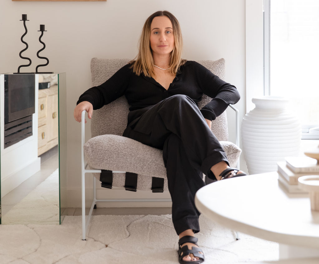
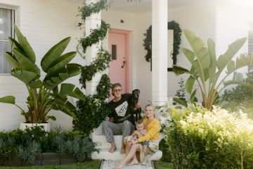
- Who: Billy and Ella Barba with Bobby, 4, Summer, 2, and Gia, 8 months
- Where: A three-bedroom townhouse in Berwick, Victoria
- Rent: $500 a week
The rented home of Ella and Billy Barba is an example of how to personalise a temporary space and make neutral tones work for a young family.
The couple began renting their Berwick, Melbourne, townhouse in 2020 after developing and selling their first property. They initially lived with Ella’s parents while building their dream home nearby, before deciding to rent independently as their family expanded.
With two young children (Bobby and Summer, now 4 and 2) and one on the way (Gia, now 8 months), the family’s number one priority was space. They spent a few months scanning online listings for something suitable in Berwick – where both Ella and Billy both grew up and are currently building – but most properties failed on this important criterion.
“The properties that were new and modern looking were incredibly small and did not offer us the space we really needed with a young family,” Ella says.
This two-storey townhouse won them over with its generous proportions encompassing multiple living spaces and outdoor areas for the children to play safely. In Ella’s words, it’s not an overly special place, but it offered everything they needed.
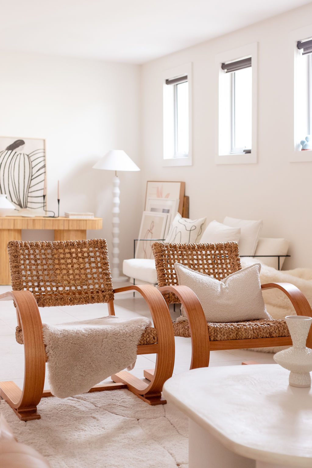
“We instantly snatched it up, not because it’s an amazing-looking house with a great design, but because it had the space, it had high ceilings, and it was open and airy,” Ella says. “We knew we could make it feel like ours by adding our furniture and styling pieces.”
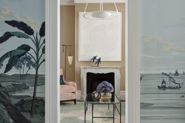
What’s made the home so attractive is Ella’s styling, which she describes as “minimalist, neutral, and contemporary—but not modern”, with hints of Scandinavian and mid-century influences.
As a mother of three, she’s selected furniture with functionality in mind, such as the white lounges with easily removable and washable covers, and the leather Coco Republic sofa for durability. “It’s bold and timeless and I just love it … When it comes to the everyday pieces that get used and used and used, then I definitely see value in spending a bit more and investing in that piece.”
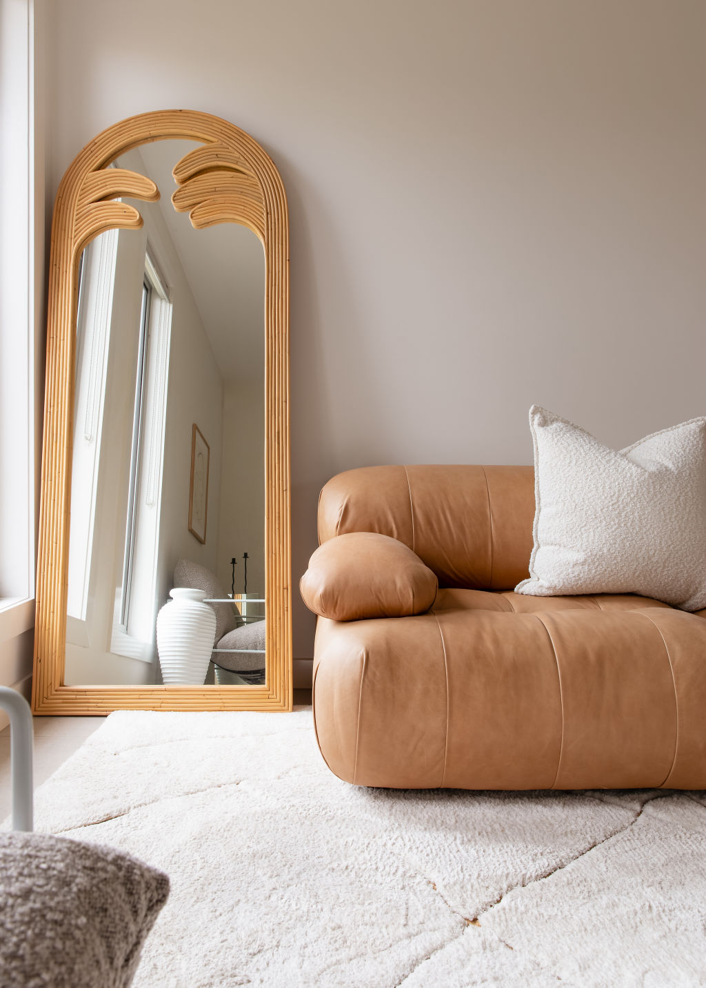
At the same time, Ella is happy for functionality not to guide her entire home, admitting some pieces are purely for aesthetics.
“My husband would tell you that I don’t have a practical bone in my body … I definitely lean towards shopping for pieces that look great but maybe aren’t that comfortable, for example,” she says. “There are many pieces in my home that are purely there for eye candy and I think that is totally OK. They bring a space to life, and they make me feel fabulous in that space.”
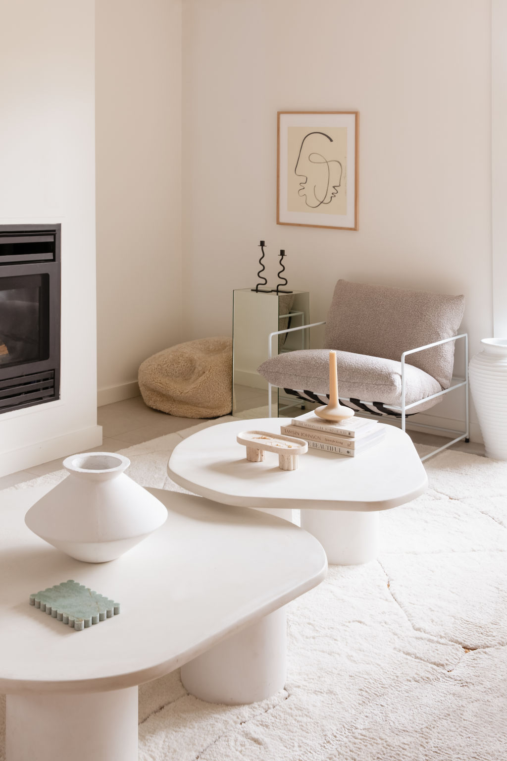
One of the renter-friendly ways Ella has modified the space is by introducing a plush rug to cover the tiled floors in the formal living room. Boucle cushions, irregular stone coffee tables and a chubby armchair bring added texture and warmth to this space, designed for quiet relaxation. “It’s cosy and the lighting is great in there,” Ella says. “My husband and I often sit up there when the kids are in bed and pump up the fire. It’s bliss.”
The home continues to evolve as Ella finds new pieces – a process she documents on her Instagram account @homesnob.
“It’s been a great home for us while we gear up for the next project,” she says. “We’ve been able to make it feel beautiful, light, and airy because of the pieces we’ve put inside it.”
We recommend
States
Capital Cities
Capital Cities - Rentals
Popular Areas
Allhomes
More
