How to dress a room in Pantone's Colour of the Year, Living Coral
Coral works for lipstick, nail varnishes and little girls’ frocks, but would you dress a room in Pantone’s Colour of the Year?
Pantone has selected Living Coral, a “life-affirming” and “nurturing” shade, as 2019’s colour of the year, which has us thinking.
Naturally, there are reasons behind the choice. “We’re looking toward colours that bring nourishment, and the comfort and familiarity that make us feel good,” says Laurie Pressman, the Pantone Colour Institute’s vice-president.
Living Coral was chosen because it conveys a sense of optimism. “In reaction to the onslaught of digital technology and social media increasingly embedding into daily life, we are seeking authentic and immersive experiences that enable connection and intimacy,” the company says, suggesting that the orange-pink hue would offer “comfort and buoyancy in our continually shifting environment”.
And yes, the reference to “living” coral was deliberate, with the environment being Pantone’s overriding influence this year. The tropically inspired colour choice evokes undersea coral reefs, which are rapidly dying due to climate change.
While most designers we spoke to agree you probably wouldn’t want to paint an entire room in the colour, they do have positive things to say about the shade.
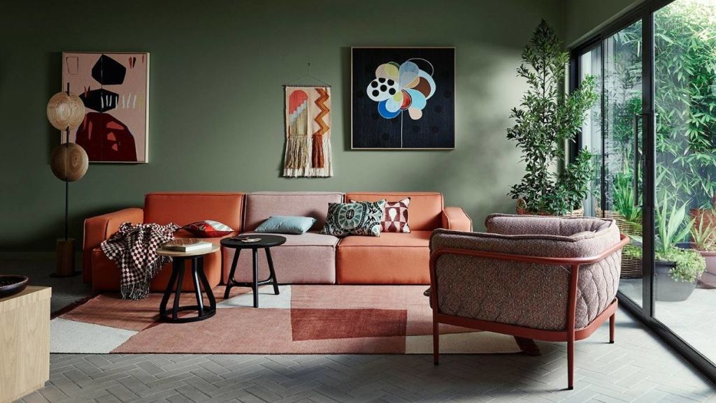
Interior designer Bridget Foley says it’s lovely to see a happy, positive colour as Pantone’s Colour of the Year.
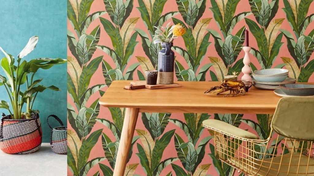
“I think it looks lovely with greys in all tones, dark teal, navy and muddy yellows,” she says. “The darker, more sombre colours play down the brighter coral and stop it from looking too ‘lolly’ and dating too quickly.”
Foley says a photo of Jenna Lyons, formerly of J Crew, wearing a coral pantsuit beside the dark teal walls of her home (similar to Resene Green Meets Blue) has inspired quite a few colour schemes for her clients.
Resene colour consultant Dianne Connell notes that coral can be very tricky to use, as it can quickly overtake a room.
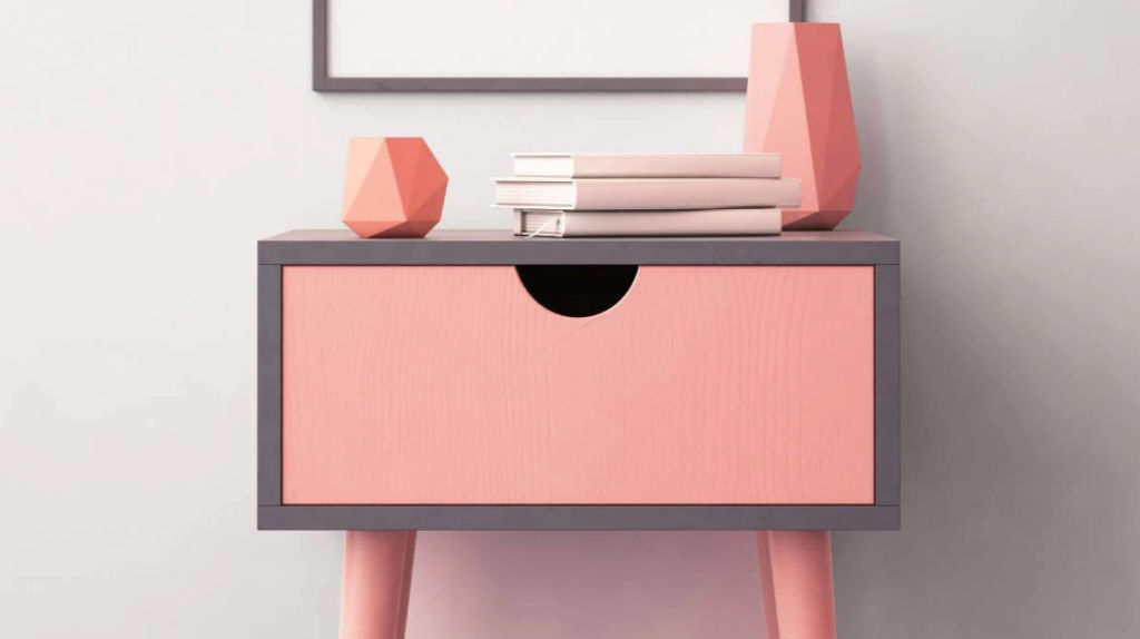
But she says there are ways to bring coral into your colour scheme without regretting it later.
She suggests using shades such as Resene Just Dance, in small doses. “Think a feature wall, cushions and accessories, a fun pop of colour on a front door or large garden pots outside. Focus on things that can be easily changed or updated later.”
Connell also suggests teaming coral with green, such as Resene Peace, a slightly grey olive, or Waiouru, a much deeper army khaki. “This will take some of the heat out of the coral and make the room more comfortable.
“Much as nature has lots of green with pops of flower colours, so too can your room. Or you can cool coral down with weathered blues.”
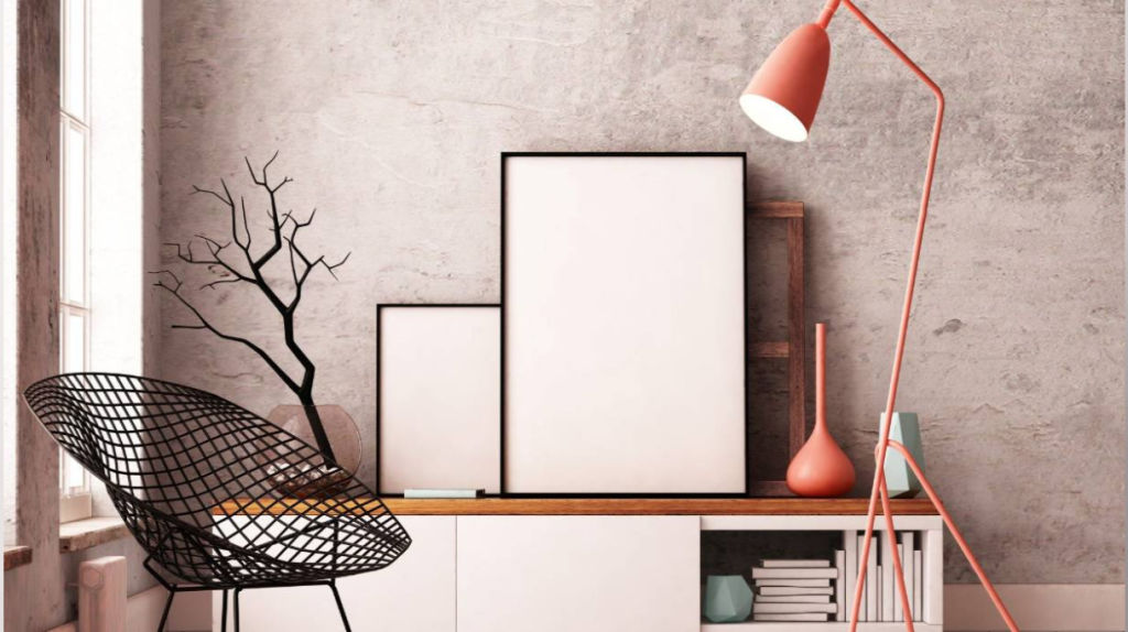
Connell also suggests, instead of a clean coral colour, consider one that is softer with more white in it, or a coral that is duskier, or deeper than the Pantone shade. These tones are easier to live with.
Teaming coral with shades of soft warm white, such as Resene Half Spanish White, will soften the effect.
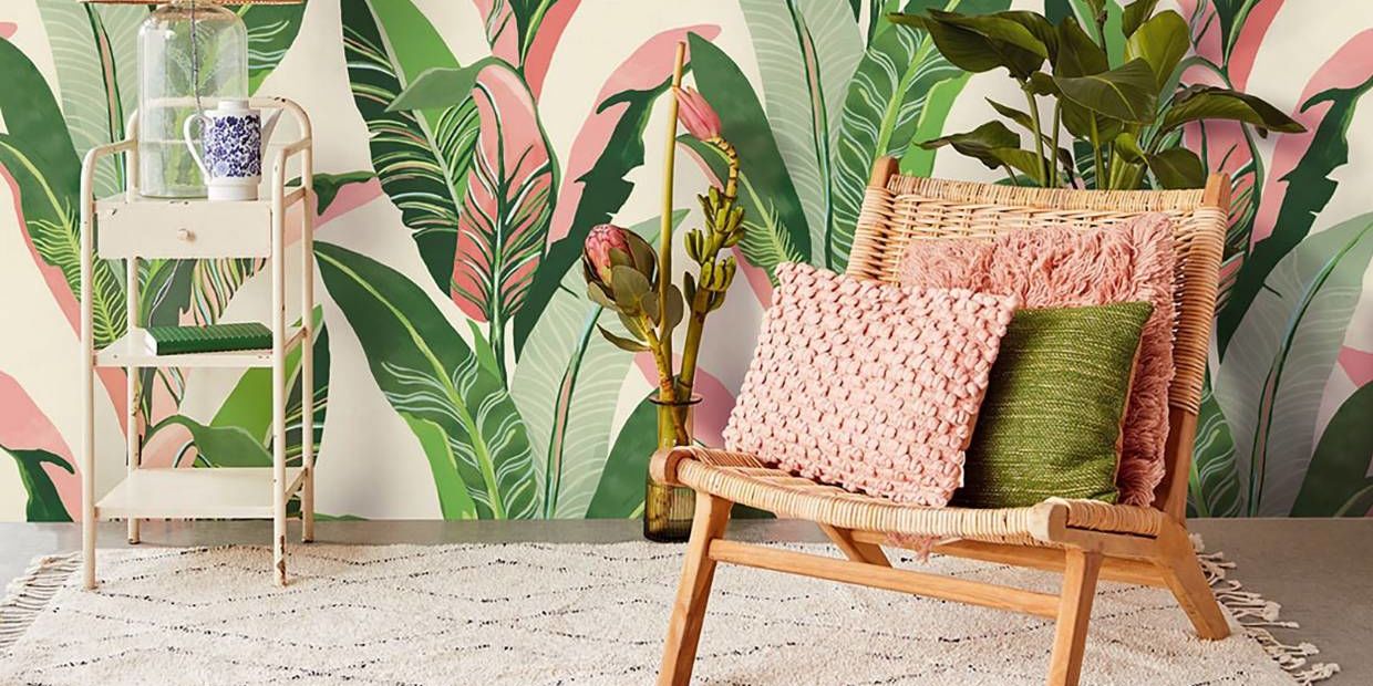
Coral also works very well with strongly textured elements, including knobbly rugs, rattan and jute, which offset the clean, fresh smoothness of the coral, bringing balance to a room.
Look out, too, for large-print wallpapers with coral accents – it’s a simple way to add a summery pizzazz to a room.
– This originally appeared on Stuff
We recommend
We thought you might like
States
Capital Cities
Capital Cities - Rentals
Popular Areas
Allhomes
More
